I agree that the larger display area made a much more "cinematic" impact. Remember those early TNG bridge sketches with the enormous viewscreen? That would have been fantastic to see on the Ent-E.I was never attached to the idea of the holographic screen, but to me the viewer design for INS and NEM seemed both overwrought and a step down from the expansive screen in TNG. I much prefer the more minimalist way it was presented in FC — just make it a regular viewer in the wall: A floor to ceiling screen bordered by segmented orange leds. Somewhat reminiscent of the old TOS screen with its blue border. It was streamlined and efficient. I love that the chasing lights under the screen are now wider like in TFF-GEN (ent B). The one thing that bugged me about the TNG design is that the chasing lights were so short and such a small part of the under screen area. Made them seem a lot cheaper - especially since the extra room was used for a couple Lcars panels that we never see used. On top of that, the lights changed to the “wrong” direction after season 1. (I recognize at the time the set was created, the only other example of those lights was TOS as the TMP-TVH bridge lacked them (save for a few short in-screen depictions and sound effects). But I digress. The Ins viewscreen was just too fat - too much plastic and too small of a viewing area. I never cared for how it tapered in at the top in a trapezoid shape. It really is at odds with the rest of the set.
The smaller screen in INS was a lot more in line with TV Trek of the time, which was having a real love affair with trapezoid viewscreens at this point in the franchise - regardless of how impractical they were. What if something important were to happen on the top corners of the screen?


 floor
floor

")


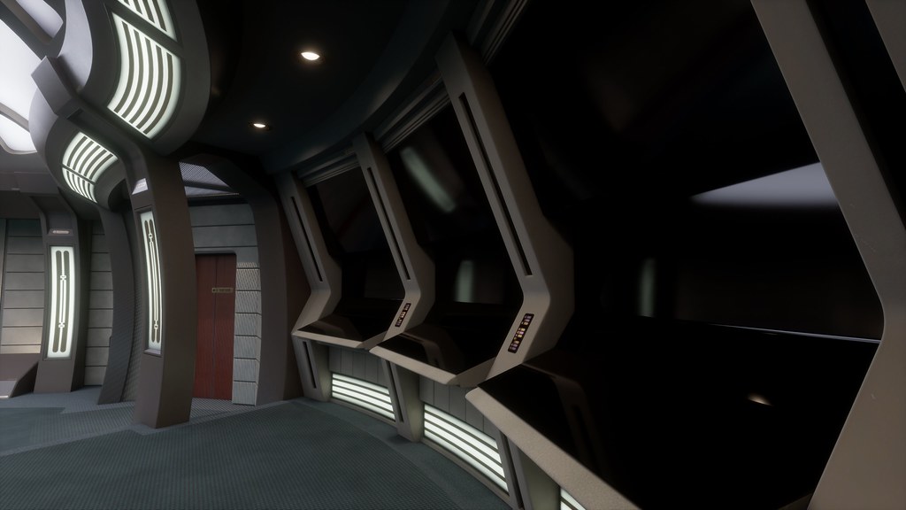
") ). The brushed gold bits are created by blending the black glossy material with a brushed gold material with the aforementioned mask as a blend between the two.
). The brushed gold bits are created by blending the black glossy material with a brushed gold material with the aforementioned mask as a blend between the two.