-
Welcome! The TrekBBS is the number one place to chat about Star Trek with like-minded fans.
If you are not already a member then please register an account and join in the discussion!
You are using an out of date browser. It may not display this or other websites correctly.
You should upgrade or use an alternative browser.
You should upgrade or use an alternative browser.
Classic Trek Font Update - "Roddenberry"
- Thread starter Vance
- Start date
Trek Font Update!
TTF - Probert
http://tfvanguard.deviantart.com/art/TTF-Probert-194794233
Replaces "Microgramma Extended" which was sadly very corrupted. Reworked from scratch.
Version 1.10 (March 1, 2011): Corrected the "W" width, reworked the asterisk.
TTF - Probert
http://tfvanguard.deviantart.com/art/TTF-Probert-194794233
Replaces "Microgramma Extended" which was sadly very corrupted. Reworked from scratch.
Version 1.10 (March 1, 2011): Corrected the "W" width, reworked the asterisk.
Hey, fellow font developing guy!")
Hello! So.. what do you have up for me to look at?
http://www.linguistsoftware.com/c2.htm
http://www.linguistsoftware.com/lhier.htm
http://www.linguistsoftware.com/lgla.htm
http://www.linguistsoftware.com/rn.htm
http://www.linguistsoftware.com/os.htm
http://www.linguistsoftware.com/oc.htm
http://www.linguistsoftware.com/op.htm
.....
")
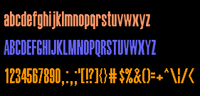
About the Okuda font, people who use Truetype with their LCARS graphics generally use Halvetica ultracompressed, which seems to match the shape of most of the LCARS fonts seen onscreen, but the problem with it and all other TrueType fonts that come close is that characters that are round at top and/or bottom fall one pixel short of the boundary.
I don't use TrueType for LCARS, since my LCARS system has its own font drivers, but people who embed fonts using Illustrator, etc. do have a need for an LCARS font that looks like that seen on VOY and DS9 but without the above-mentioned problem.
Mine, not Truetype, are like this:
I don't understand what this mean. I l have a TTF font called Lcars which looks fine to me
You can see in the example below that the C and S are just a little taller than the other characters. That's the problem people who use TrueType with LCARS are having. For them, there does seem to be a need for a font in this style that can display them at uniform height in every size.

You can see in the example below that the C and S are just a little taller than the other characters. That's the problem people who use TrueType with LCARS are having. For them, there does seem to be a need for a font in this style that can display them at uniform height in every size.
Mind looking over the Okuda font on my site and see if your errors are replicated.
Vance, I can see that you have successfully addressed that problem, but people who do MSDs with Illustrator want a font that exactly matches the style in the example above (Helvetica ultracompressed) but with that height problem fixed. If I could show them a version of your Okuda font that met both those criteria, I think they would be very excited about it. In other words, it should be pretty much identical to Helvetica ultracompressed (which is a little bolder than your Okuda font and perhaps a bit rounder where appropriate, etc.) but be able to fit perfectly if checked with horizontal guide lines. Maybe the example I posted is bold. I don't know. I don't use it myself.
I don't know about the font Solarbaby mentioned. An example would be nice, so we can see if that really does fit the need.
The two main Web sites and forums for those who do that kind of artwork are:
Okudagrams.com
http://www.joseralat.com/forum/forumdisplay.php?f=31
LCARS Community
http://www.lcarsc.com/forum.php
Here's the thread I started at LCARS Community about your font, where someone posted a comparison of your Okuda font and another LCARS font called GT J3:
http://www.lcarsc.com/showthread.php/545-Vance-s-Trek-fonts
I posted a link to this thread on both as soon as I saw your fonts. They like your other Trek fonts but are hard to please when it come to an LCARS font. It's not for me, since I generate interactive LCARS screens with my LCARS system, which has nothing to do with Windows or TrueType. But there are still people drawing LCARS displays and even Flash animations as art and depend on TrueType or other similar font formats.
Here's a sample of Helvetica ultracompresssed:
http://www.fonts.com/findfonts/Detail.htm?ProductId=12712
And for reference, here's an example of my own 3.5:1 LCARS font, which I'm not suggesting you try to duplicate, even though this type was also seen on screen sometimes and appears in the Star Trek Encyclopedia, at least the edition I have, on the page about the Bajoran Wormhole:
Last edited:
Finally caught up with all my fonts and dramatically updated and reworked my classic Trek font. This one adds the lower-case (based on the old CD font's release), completes the simple character set, cleans up errors.. the whole works. Freeware license.
http://tfvanguard.deviantart.com/art/TTF-Roddenberry-195763636

I just moved to a new office and had to print out a new name plate for outside my cubicle, Guess which font I used.

TTF Sternbach - based on the lettering for ST:TNG. Includes lowercase letters.
http://tfvanguard.deviantart.com/#/d3dqznm

http://tfvanguard.deviantart.com/#/d3dqznm
Updated the "Roddenberry" font today:
Version 1.10 - May 11, 2011
* Corrected accent glyphs
* Added numerous european characters
http://tfvanguard.deviantart.com/gallery/28137946#/d38jw6s
Also updated the "Fontana" font today:
Version 1.10 - May 11, 2011
* Added 'at' sign
* Some minor glyph corrections
* Added international characters
http://tfvanguard.deviantart.com/gallery/28137946?offset=24#/d36czbw
Version 1.10 - May 11, 2011
* Corrected accent glyphs
* Added numerous european characters
http://tfvanguard.deviantart.com/gallery/28137946#/d38jw6s
Also updated the "Fontana" font today:
Version 1.10 - May 11, 2011
* Added 'at' sign
* Some minor glyph corrections
* Added international characters
http://tfvanguard.deviantart.com/gallery/28137946?offset=24#/d36czbw
Last edited:
TTF - Schnaubelt
Click Me
A font I needed to hand-make in order to get some Trek homage projects done. This is heavily based on the engineering lettering found in the Franz Joseph Technical Manual. Updated version.
...Renamed to Schnaubelt: May 19, 2011
* Completed Accent characters
* Altered parenthesis, brackets, and braces
* Added Euro, Sterling, Lira, Yen glyphs
Probert Font Updated
Version 1.20 (May 25, 2011): Corrected accents, added Euro, accented characters.
http://tfvanguard.deviantart.com/art/TTF-Probert-194794233

Version 1.20 (May 25, 2011): Corrected accents, added Euro, accented characters.
http://tfvanguard.deviantart.com/art/TTF-Probert-194794233
TTF - Schnaubelt
Click Me
A font I needed to hand-make in order to get some Trek homage projects done. This is heavily based on the engineering lettering found in the Franz Joseph Technical Manual. Updated version.
...Renamed to Schnaubelt: May 19, 2011
* Completed Accent characters
* Altered parenthesis, brackets, and braces
* Added Euro, Sterling, Lira, Yen glyphs
ooo now this is a very useful font incase i ever use your TOS era ship parts and anyone else really

Probert Font Updated
Version 1.20 (May 25, 2011): Corrected accents, added Euro, accented characters.
http://tfvanguard.deviantart.com/art/TTF-Probert-194794233
Thanks for the updates on your fonts
Vance, your fonts are terrific ... what are the licensing rights you're looking for on these?
I take donations through www.dafont.com , which helps me keep up with tools and all that, but otherwise the licenses are freeware so long as the fonts are not modified and/or redistributed.
TTF - Montalban
Based on the title credits from "Star Trek II: The Wrath of Khan"
Includes Euro and accent characters
Click here for the deviant art page!
http://tfvanguard.deviantart.com/art/TTF-Montalban-212018840

Based on the title credits from "Star Trek II: The Wrath of Khan"
Includes Euro and accent characters
Click here for the deviant art page!
http://tfvanguard.deviantart.com/art/TTF-Montalban-212018840
Similar threads
- Replies
- 5
- Views
- 784
- Replies
- 3
- Views
- 682
If you are not already a member then please register an account and join in the discussion!