• Welcome! The TrekBBS is the number one place to chat about Star Trek with like-minded fans.
    If you are not already a member then please register an account and join in the discussion!

Classic Trek Font Update - "Roddenberry"

Vance

Vice Admiral
In Memoriam
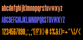
Finally caught up with all my fonts and dramatically updated and reworked my classic Trek font. This one adds the lower-case (based on the old CD font's release), completes the simple character set, cleans up errors.. the whole works. Freeware license.

http://tfvanguard.deviantart.com/art/TTF-Roddenberry-195763636

ttf___roddenberry_by_tfvanguard-d38jw6s.png
 
I probably should post the rest of the Trek fonts I've done here too...

Probert - based on the Microgramma lettering used on starships and through various technical manuals...

http://tfvanguard.deviantart.com/gallery/#/d37z46x

ttf___probert_by_tfvanguard-d37z46x.png


Jefferies - based on Star Trek's version of Amarillo, used for the lettering of TOS starships.

http://tfvanguard.deviantart.com/gallery/#/d37i055

ttf___jefferies_by_tfvanguard-d37i055.png


Okuda - based on the Okudagrams from TNG and onward

http://tfvanguard.deviantart.com/gallery/?offset=24#/d373psq

ttf___okuda_by_tfvanguard-d373psq.png


Fontana - based on the old-style Pocket Books lettering for their Star Trek novels.

http://tfvanguard.deviantart.com/gallery/?offset=48#/d36czbw

ttf___fontana_by_tfvanguard-d36czbw.png


Tech Manual - based on the stencil-letting within the original Star Trek technical manual.

http://tfvanguard.deviantart.com/gallery/?offset=48#/d35lh37

ttf___tech_manual_by_tfvanguard-d35lh37.png


Trek Arrowheads - a ridiculous amount of glyphs based on arrowheads used in Star Trek

http://tfvanguard.deviantart.com/gallery/?offset=48#/d35ley2

ttf___trek_arrowheads_by_tfvanguard-d35ley2.png
 
About the Okuda font, people who use Truetype with their LCARS graphics generally use Halvetica ultracompressed, which seems to match the shape of most of the LCARS fonts seen onscreen, but the problem with it and all other TrueType fonts that come close is that characters that are round at top and/or bottom fall one pixel short of the boundary.

I don't use TrueType for LCARS, since my LCARS system has its own font drivers, but people who embed fonts using Illustrator, etc. do have a need for an LCARS font that looks like that seen on VOY and DS9 but without the above-mentioned problem.

Mine, not Truetype, are like this:

FONT21.png
 
I ran into that when I first worked on the font, but the ascent and descent SHOULD be corrected for that problem now. If anyone still runs into the upper-lower bounds on these, just let me know and I'll hammer it out.
 
Love the arrowheads, too! I notice, however, that the line weight of the "w's" in Okuda and Probert is about 10% too much; it seems to only be the w's, though.
 
Love the arrowheads, too! I notice, however, that the line weight of the "w's" in Okuda and Probert is about 10% too much; it seems to only be the w's, though.

They're literally double-Vs, so I probably didn't thin them out a smidge when I narrowed their angle down. Next update I'll take a look at them and reign in the weight by a mark. That should take care of it.
 
About the Okuda font, people who use Truetype with their LCARS graphics generally use Halvetica ultracompressed, which seems to match the shape of most of the LCARS fonts seen onscreen, but the problem with it and all other TrueType fonts that come close is that characters that are round at top and/or bottom fall one pixel short of the boundary.

I don't use TrueType for LCARS, since my LCARS system has its own font drivers, but people who embed fonts using Illustrator, etc. do have a need for an LCARS font that looks like that seen on VOY and DS9 but without the above-mentioned problem.

Mine, not Truetype, are like this:

FONT21.png

I don't understand what this mean. I l have a TTF font called Lcars which looks fine to me
 
Hey, fellow font developing guy! :)

Hello! So.. what do you have up for me to look at? :)

Excelent job! Thanks for sharing!
Any chance of an updated TNG set too? :)

I'm taking a brief break from font-making at the moment, due to updating and, in many cases, redoing the 78 of them that I've made over the years. Gah! I'll probably do the TNG titles in the near future, though - since there's a lot of call for them.


I -do- take donations. ;)
 
If you are not already a member then please register an account and join in the discussion!

Sign up / Register


Back
Top