It's not a matter of technology, it's a matter of taste.Dude it's an universe where magic rings exist and people regularly come back from the dead, the technology required to make costumes without seams is neither here or there.
-
Welcome! The TrekBBS is the number one place to chat about Star Trek with like-minded fans.
If you are not already a member then please register an account and join in the discussion!
You are using an out of date browser. It may not display this or other websites correctly.
You should upgrade or use an alternative browser.
You should upgrade or use an alternative browser.
Batman Inc. The Yellow Oval Is Retunring!
- Thread starter Admiral_Young
- Start date
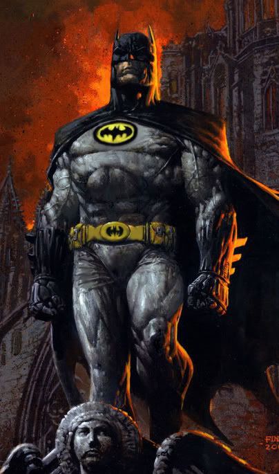
It seems to me that if there are going to be multiple Batmen, Bruce Wayne's version of the costume should be the most basic, classic one. This design is too revisionist, and too derivative of the Burton films. And yes, the raised oval with the rim is too pronounced; it might work all right in live action, but that doesn't make it the best design for something that's drawn on paper.
Anyone else remember the old "Brotherhood of Batmen" story from, jeez, maybe the fifties? (It's been reprinted a lot ... I'm not that old, either!)
"Criminals are a superstitious and cowardly lot... I shall become... Naked Grey Man!"

Actually I think that looks scary as hell - in the right way.
Dick is using the black on grey symbol and I don't see how the costume is derivative of the Burton costume. The only thing on the costume that resembles anything from the Burton costume is the elevated oval.
Interesting there's no blue piping on that version of the suit...
Interesting there's no blue piping on that version of the suit...
I think it's a safe bet that Grant Morrison remembers it, and I'll bet is (at least partially) where his Batman Inc. idea originated.Anyone else remember the old "Brotherhood of Batmen" story from, jeez, maybe the fifties? (It's been reprinted a lot ... I'm not that old, either!)
Morrison has been incorporating and using for inspiration stories from the 50's and 60's and considers that era just as legitimate as any other era of Batman. In fact there was a trade that came out last winter collecting stories that inspired "Batman RIP" I believe that it was collected under the title "The Black Casebook". It's not been a secret that he's used those old stories as inspiration.
J
Jetfire
Guest
"Criminals are a superstitious and cowardly lot... I shall become... Naked Grey Man!"Imagine this costume drawn...no piping and the oval is only slightly raised.
I actually like it.

Looks like Bruce is going to China in the second issue...
http://robot6.comicbookresources.com/2010/09/batman-heads-to-the-far-east-in-batman-inc-2/
http://robot6.comicbookresources.com/2010/09/batman-heads-to-the-far-east-in-batman-inc-2/
I don't see it. Just looks like extra padding and reinforced kevlar or whatever to me. I kind of like Chinese Batman.
J
Jetfire
Guest
For some reason the artwork for that issue looks better. 
http://robot6.comicbookresources.com/2010/09/batman-heads-to-the-far-east-in-batman-inc-2/
http://robot6.comicbookresources.com/2010/09/batman-heads-to-the-far-east-in-batman-inc-2/
It's because that cover is done by the interior artist while the cover for the first issue was done by cover artist David Finch. They're styles are both vastly different and noticeable.
If you are not already a member then please register an account and join in the discussion!