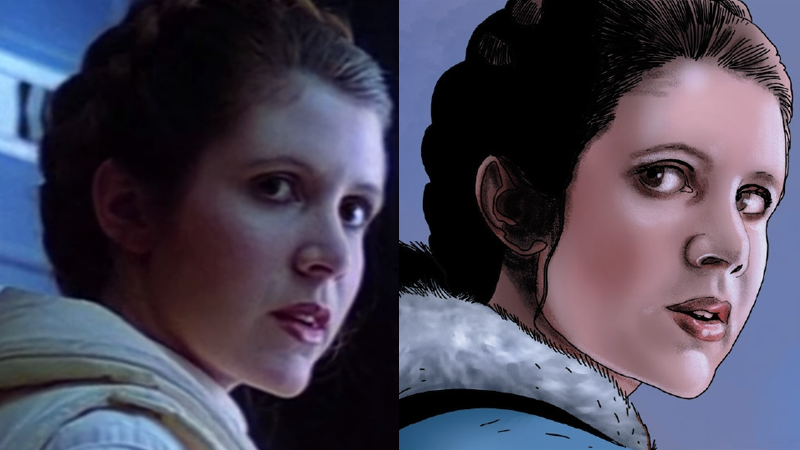
Deryl Skelton's art on DC's ST:TNG comics went beyond tracing character and set photos to direct photocopying sometimes, or at least it seemed that way.
-
Welcome! The TrekBBS is the number one place to chat about Star Trek with like-minded fans.
If you are not already a member then please register an account and join in the discussion!
You are using an out of date browser. It may not display this or other websites correctly.
You should upgrade or use an alternative browser.
You should upgrade or use an alternative browser.
Art in Star Trek Comics
- Thread starter JD
- Start date
different scifi series, but there were some comic adaptations of Honor Harrington books with... artistic discrepancies... that i made the ultimate decision not to buy when they got to a scene of a space station and there were just flat out UNSC frigates from halo 2 front and center...
Here is one of many cringeworthy examples of tracing in IDW's 2010s shovelware, courtesy of Star Trek: Boldly Go #4 (2017-01-11). Not only is Spock's mental battle against the Borg copied from his hearing at the Vulcan Science Academy, but the Romulan ship bridge is copied from Donatra's warbird Valdore in Star Trek Nemesis, complete with a guy standing to the viewer's right side!
(To my fury, Mike Johnson claimed on Twitter or somewhere that the D'Deridex class name had indeed surfaced over a century ahead of schedule due to the Kelvin timeline, but that is a rant for another thread.)


(To my fury, Mike Johnson claimed on Twitter or somewhere that the D'Deridex class name had indeed surfaced over a century ahead of schedule due to the Kelvin timeline, but that is a rant for another thread.)
That's actually the Aegis-class U.S.S. Endeavour (NCC-1805), James T. Kirk's interim command while awaiting the completion of the Enterprise-A. But given the Aegis class's similarity to the Constitution class, I have to assume those bridge scenes are traced from the Kelvin movie scenes.on the one hand, using those scenes of previous whatsit during a mind battle, not entirely stupid
on the other hand, very obviously just putting screencaps through a cel-shading filter to do it...
also, wtf is wrong with that enterprise?
I liked the idea of the Boldly Go series, and I wish IDW would do more Kelvin comics, but alas.That's actually the Aegis-class U.S.S. Endeavour (NCC-1805), James T. Kirk's interim command while awaiting the completion of the Enterprise-A.
Since this is a comics art thread, I'll just say that Commander Valas, Kirk's Romulan first officer aboard the Endeavour in the first story arc, was really attractive. She's one of the threads I wish IDW would follow up on, but who would care about a dangling plot point from almost ten years ago today?
There's definitely a smallification going on in some panels, but I think it's (at least partially) due to the artist wanting to cram as much as possible in. The whole book feels "crowded".
View attachment 51980
View attachment 51979
It seems very weird but with the Enterprise-D bridge I can understand—the TV directors found it a very hard set to shoot on, and rewatching TNG it’s noticeable how often Picard and Riker are turn around-and-back-again to talk to everyone on the bridge and viewer, how they use a handful of specific angles to give the impression Geordi’s in on the action when he’s at the engineering station, and moving from the rear to the front of the bridge is basically a scene change. In contrast one could fit a bunch of characters into a “wedge” of the TOS/TMP-TWOK bridge naturally and you could go right from a little confab into action (even the Defiant’s bridge is better—small enough and the side panels angled enough that you could shoot a convincing-looking conversation, even if the characters weren’t actually looking each other).
Speaking of artists tracing to the extreme, there's an inverse case that comes to mind. I don't remember who it was, but I remember one of the big-name artists drawing an archer (Green Arrow, I guess) holding a bow in his fist reacting to the idea that he might, perhaps, want to look at a photo of an archer notching a bow rather than just guessing where his fingers would go with unbridled hostility and offense. I think he got pretty colorful.
The TNG bridge really is the worst of both worlds. While the concept of the TOS design was that the captain should be able to see what anyone on the bridge is doing from their chair and shoulder-surf to get any detail they want about the ship at any moment, and later bridges added a bunch of enclosed stations so the crew could be looking towards the viewscreen (and, thus, the camera) without having to turn around, TNG's split-level design with a barrier in the middle means the captain can't see anything being done on the bridge, and the audience can't, either.
It seems very weird but with the Enterprise-D bridge I can understand—the TV directors found it a very hard set to shoot on, and rewatching TNG it’s noticeable how often Picard and Riker are turn around-and-back-again to talk to everyone on the bridge and viewer, how they use a handful of specific angles to give the impression Geordi’s in on the action when he’s at the engineering station, and moving from the rear to the front of the bridge is basically a scene change. In contrast one could fit a bunch of characters into a “wedge” of the TOS/TMP-TWOK bridge naturally and you could go right from a little confab into action (even the Defiant’s bridge is better—small enough and the side panels angled enough that you could shoot a convincing-looking conversation, even if the characters weren’t actually looking each other).
The TNG bridge really is the worst of both worlds. While the concept of the TOS design was that the captain should be able to see what anyone on the bridge is doing from their chair and shoulder-surf to get any detail they want about the ship at any moment, and later bridges added a bunch of enclosed stations so the crew could be looking towards the viewscreen (and, thus, the camera) without having to turn around, TNG's split-level design with a barrier in the middle means the captain can't see anything being done on the bridge, and the audience can't, either.
Seen, you might be right. But Trip and Reed do talk about comics in Shuttlepod One.SFA had the first in universe comic (IIRC) in the new episode
Seen, you might be right. But Trip and Reed do talk about comics in Shuttlepod One.
Trip specified Superman, so perhaps NCC meant it was the first comic that only exists in-universe.
Oh ho ho, you have barely scratched the surface of the current decade-old Marvel Star Wars comic license, full of not only lazy tracing but also fanart theft!I can't remember who, but I heard people accuse one of the Star Wars comics artists of just repeatedly tracing or at referencing stills for for all of his characters' poses and stuff. I think it was obvious that people were able to exactly what scene he used just based on how he drew the characters.
Spoiler tags for vertical scrolling and disturbing "artwork":
Salvador Larroca Shocks Star Wars Fans With Obi-Wan Tracing
Salvador Larroca has come under fire multiple times for using still frames from Star Wars, and in a new Obi-Wan Kenobi comic he's taken lazy art to new lows.
 delarroz.com


Who. Drew. This. Crap. (Star Wars 38)
Posted in r/comicbooks by u/Terrywolf555 • 277 points and 88 comments


Marvel is Using Fanmade 3D Art in its Star Wars Comic Series
Posted in r/StarWars by u/GenRhysDallows • 65 points and 17 comments


Marvel Stole a Fan's Star Wars Designs (again!)... and REFUSES to acknowledge them!
Marvel stole a fan's custom ship and astromech, and included it in two comics with no credit given at all. This is the continuation of a series of videos I w...
 www.youtube.com

Marvel stole EVERY CAPITAL SHIP for their latest Star Wars Comics... from FAN designs!
Marvel's art theft is worse than we thought! Every single capital ship in Star Wars Allegiance is STOLEN FAN ART. We're covering this, further examining Marv...
www.youtube.com

Star Wars Books are STEALING fan art... and it has to stop
Today we examine allegations against Star Wars artist Joe Corroney, specifically that he stole fan art from FractalSponge and artists from the Empire at War ...
www.youtube.com
I've read the main comic up until it hits Empire, so I've seen a lot of Larroca's artwork, I just never realized he was that directly tracing pictures. I had liked his artwork because it was so realistic, but I've definitely lot of respect for him now that I understand why it was so realistic. If he had done all of that freehand, it would be pretty impressive, but I don't know if that would even be possible to be that exact wihtout tracing.
Would it even be legal to directly trace a picture from a movie or TV show that directly in a comic like this? I would think there would be likeness and copyright issues that would come into play. I guess you could maybe get away with it with when it's all from Star Wars, but for the ones where he appears to have used Natalie Tena in Game of Thrones, should he have gotten permission HBO and/or Tena to actually use them?
Would it even be legal to directly trace a picture from a movie or TV show that directly in a comic like this? I would think there would be likeness and copyright issues that would come into play. I guess you could maybe get away with it with when it's all from Star Wars, but for the ones where he appears to have used Natalie Tena in Game of Thrones, should he have gotten permission HBO and/or Tena to actually use them?
I can't remember who, but I heard people accuse one of the Star Wars comics artists of just repeatedly tracing or at referencing stills for for all of his characters' poses and stuff. I think it was obvious that people were able to exactly what scene he used just based on how he drew the characters.
One of my favourites:

Chinese Star Wars comic... looks familiar? by Ian McLean, on Flickr
I can't remember who, but I heard people accuse one of the Star Wars comics artists of just repeatedly tracing or at referencing stills for for all of his characters' poses and stuff. I think it was obvious that people were able to exactly what scene he used just based on how he drew the characters.
The Marvel Transformers run would often do this, using stock character art originally designed for things like character bios and the toy packaging. It became something of a running joke with a few characters like Ravage, who was almost always portrayed in the leaping pose used for his toy art.
 You can see some amusing examples here. The FIRRIB problem with Rumble and Frenzy evolved into its own meme.
 Sometimes oddities and errors would creep in, and even be used consistently even though they weren't accurate. Many of the cartoon character models were based on only seeing one view of the toy, so the animators would wind up making up details out of whole cloth for rear views. Characters like Astrotrain had errors based on prototype toy details that were changed by the time the toys actually hit the shelves, with Broadside's prototype looking entirely different from his final toy.
In other cases the animation models were deliberately a bit off to make the characters easier to draw or to keep the same-mold characters more distinct, like how Sideswipe lacks his shoulder wheels and is slimmer than Red Alert, even though they use the same toy mold. Or the three later Decepticon jets (Dirge, Ramjet and Thrust) keeping their nosecones up as "helmets" which became a signature aspect of their designs.
... keeping their nosecones up as "helmets" which became a signature aspect of their designs.
Midway through the "V: The Visitors" comic series, one of the colourists misinterpreted the green scaly lips of the Visitors as white teeth -- and suddenly any of the reptilian aliens seen without their latex human faces seemed to be grinning madly. The cover art was usually fine, but the internal artwork was often bizarre.
That's crazy. It's funny how one little mistake or misunderstanding can have an effect for so long.The Marvel Transformers run would often do this, using stock character art originally designed for things like character bios and the toy packaging. It became something of a running joke with a few characters like Ravage, who was almost always portrayed in the leaping pose used for his toy art.
Sometimes oddities and errors would creep in, and even be used consistently even though they weren't accurate. Many of the cartoon character models were based on only seeing one view of the toy, so the animators would wind up making up details out of whole cloth for rear views. Characters like Astrotrain had errors based on prototype toy details that were changed by the time the toys actually hit the shelves, with Broadside's prototype looking entirely different from his final toy.
In other cases the animation models were deliberately a bit off to make the characters easier to draw or to keep the same-mold characters more distinct, like how Sideswipe lacks his shoulder wheels and is slimmer than Red Alert, even though they use the same toy mold. Or the three later Decepticon jets (Dirge, Ramjet and Thrust) keeping their nosecones up as "helmets" which became a signature aspect of their designs.
There were a couple of times Carl Barks accidentally drew a fourth Duck nephew alongside Huey, Dewey, and Louie. This fourth, accidental nephew became known as Phooey Duck. Art mistakes happen, and sometimes they're fun, like Phooey.That's crazy. It's funny how one little mistake or misunderstanding can have an effect for so long.
That's crazy. It's funny how one little mistake or misunderstanding can have an effect for so long.
Bluestreak, rather infamously, had the color problem a lot worse.
 When Hasbro worked with Takara to create the Transformers line, they basically took toy molds from two pre-existing toylines (Microman and Diaclone) and put them in a single line for the first couple waves of Transformers. In some cases Hasbro invented entirely new paint schemes for characters who shared the same mold type, like Skywarp. His mold mates Thundercracker and Starscream essentially kept their existing colors. The Diaclone toys were also designed to have small humanoid pilots and not to actually be sentient machines, which is why some molds like the Dinobots and Insecticons have vestigial articulated panels that don't seem to serve any particular purpose.
The mold that was used for several Autobot cars (Bluestreak, Prowl and Smokescreen) had a number of color variations in the Diaclone line, as like Hasbro they would often repaint or remold some designs to have more options for kids while also saving money. The original Diaclone toy that became Bluestreak was blue with a silver hood, and this version (left) was used for his Transformers art and instructions despite the fact that the toy didn't use this scheme. Hasbro repainted him entirely grayish silver (middle) for the toy line, and for many years there was an urban legend that supposedly Diaclone type Bluestreaks were released very early in Transformers but none have ever been found.
The cartoon continuity made things more confusing by using an alternate Diaclone color scheme that was more silver with a blackish hood (right), almost an inverse of the primary Diaclone scheme. The fact that Prowl has a black and white police scheme didn't help, leading to the animators occasionally mixing them up in scenes or just making the colors wonkier than usual.
Prowl's cartoon model omitted the shoulder missiles to make him look less like Bluestreak's, while Smokescreen's launchers were given a more boxy design compared to his toy.Confused yet?

")
Similar threads
- Replies
- 2
- Views
- 215
- Replies
- 3
- Views
- 294
- Replies
- 2
- Views
- 820
If you are not already a member then please register an account and join in the discussion!