I wouldn't mind having those various meshes, but I'd certainly understand if the Lensman would rather keep those close to his chest. Distributing them would dilute their unique aspect.
It generally never occurs to me that anyone would want these meshes as they're pretty basic affairs. A lot of the "magic" (for lack of a better word) in these images, IMO, is created during the Photoshop part because these *are* pretty basic meshes and to my eyes look pretty bland without all the Photoshop processing (see the sideview pics), YMMV. I tend to create these with a specific time period in mind, and then try to present them true to that time period, especially with lighting. I don't know that I've ever tried to light the Japaniprise in a more realistic way.
Also, my models are embarrassingly messy looking if you saw them in wire frame mode. For example, the bridge is a slightly smooshed sphere on all of these, and I never eliminated the rest of the sphere. I also just recently figured out that I could type in positioning of objects instead of doing it by hand, so I can probably get the warp engines on all these more uniform on how they angle out from the secondary hull. I'm always seeing something off that needs correcting because of this.
Thank you!

Thanks! I had seen some of that show, but it's in German, although a guy on DA posted a link to the first episode with subtitles. I enjoyed it.
OK, #1, I didn't even know that German show
existed. I just found it on YouTube... I know what I'll be watching tonight after I kick off the next rendering session!!
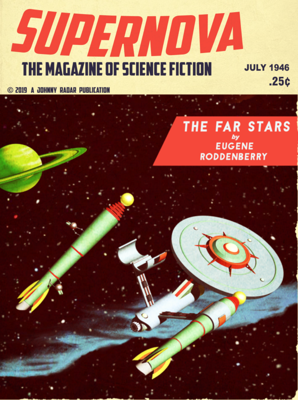
#2, I want a poster of that cover,
@The Lensman. Chesley Bonestell himself could have whipped this up for the latest issue of
Galaxy Science Fiction.

Thanks! High praise indeed, though Bonestell's spaceships weren't as fanciful as this 40's version of the Enterprise. I do have one or two non-Trek Bonestell inspired ships I want to do art with though.
This particular image made me aware of DA's compression when posting. I'm trying to get to a point where I can sell some non-Trek original art, so I've been experimenting with making my images larger. I spent more time trying to get this to post to DA without it looking like shit than I did working on the image! Ultimately, keeping it around ltr size at 72 res kept it true to life. I'd been wondering why the Compelling (and another non-Trek cover I posted there) looked off.
I've been wondering just how these alternate Enterprises fall in regards to selling images with them. I generally think of it as off limits, but often see Trek images on shirts and so on that I always wonder how they're getting away with it.
I know it goes back a bit in the thread,
@The Lensman, but I can’t help but wonder, since it’s meant to evoke the ‘60s Japanese aesthetic, if the lights on the rocket engines of the Japaniprise are inspired by the underslung headlamps of the Mach Five?
That's exactly what they are inspired by! I'm surprised no one has commented on it before now to be honest. The Mach 5 is one of my all time favorite fictional vehicles. Initially I was going to have the same light shape, but on top of the engine, but felt like it looked too much like the Ent-E, a ship I have zero love for.