-
Welcome! The TrekBBS is the number one place to chat about Star Trek with like-minded fans.
If you are not already a member then please register an account and join in the discussion!
You are using an out of date browser. It may not display this or other websites correctly.
You should upgrade or use an alternative browser.
You should upgrade or use an alternative browser.
Abram's Enterprise, Version 4
- Thread starter MadMan1701A
- Start date

http://www.3dtotal.com/services/cds_new/v7.asp
That looks like the new version, but the version I have is alot older than that. The High School I worked at actually bought it originally, but is no longer using them, so I copied some of the stuff out for my use. There were about 12 cds back then, I think.
That looks like the new version, but the version I have is alot older than that. The High School I worked at actually bought it originally, but is no longer using them, so I copied some of the stuff out for my use. There were about 12 cds back then, I think.
Could the perception of yellow be an optical illusion caused by contrast with the blue background field, perhaps? For example, if I invert the colors in the saucer bottom view, the color opposite of that background is sort of a pale orange-yellow.......
Having said that, in the last 2 images i think your lighter colored panels have too much yellow. it reminds me more of cobblestone than metal.
Yellow? That's odd, since there is absolutely no yellow i the image, or shouldn't be. I did a desaturate on the original image, and it should be shades of blue and grey.
Liking how this one's coming along, btw.

hmm, maybe that's it.Could the perception of yellow be an optical illusion caused by contrast with the blue background field, perhaps? For example, if I invert the colors in the saucer bottom view, the color opposite of that background is sort of a pale orange-yellow.......
Having said that, in the last 2 images i think your lighter colored panels have too much yellow. it reminds me more of cobblestone than metal.
Yellow? That's odd, since there is absolutely no yellow i the image, or shouldn't be. I did a desaturate on the original image, and it should be shades of blue and grey.
Liking how this one's coming along, btw.
Thanks.
") I'm plugging away at texturing... I should have some updates tomorrow sometime.
I'm plugging away at texturing... I should have some updates tomorrow sometime.Thanks.I'm liking those textures so far, Madman.
Here's some more...
I built spec maps for this one, that actually correspond to the color maps.
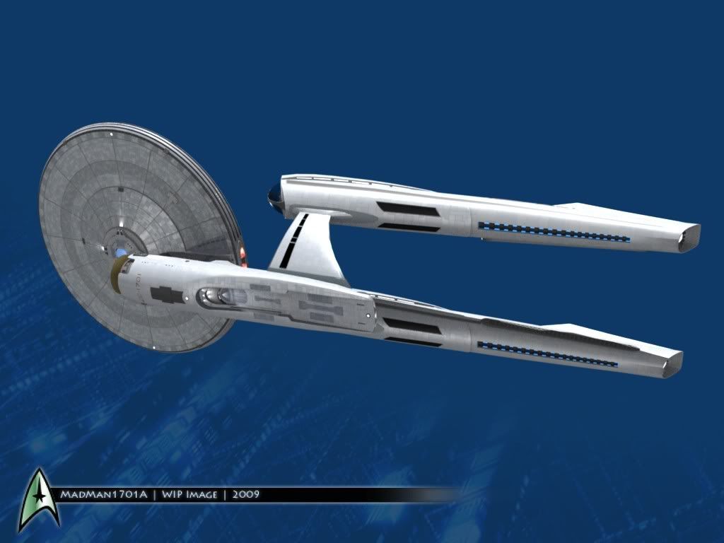

Texturing is about 80% done, I guess. I have to do something about that dark ring around the edge. I didn't notice that until I uploaded the image.
Yeah, the lines did come out a little heavier than I intended, but it gives it a look different from what I normally make. Usually, from a distance, it's hard to tell if my models are textured at all.The outlines on each panel are somewhat distracting. It makes it look more like cheap linoleum than metal (or whatever) sheets. Otherwise a very nice job though.
I took a few more pictures...

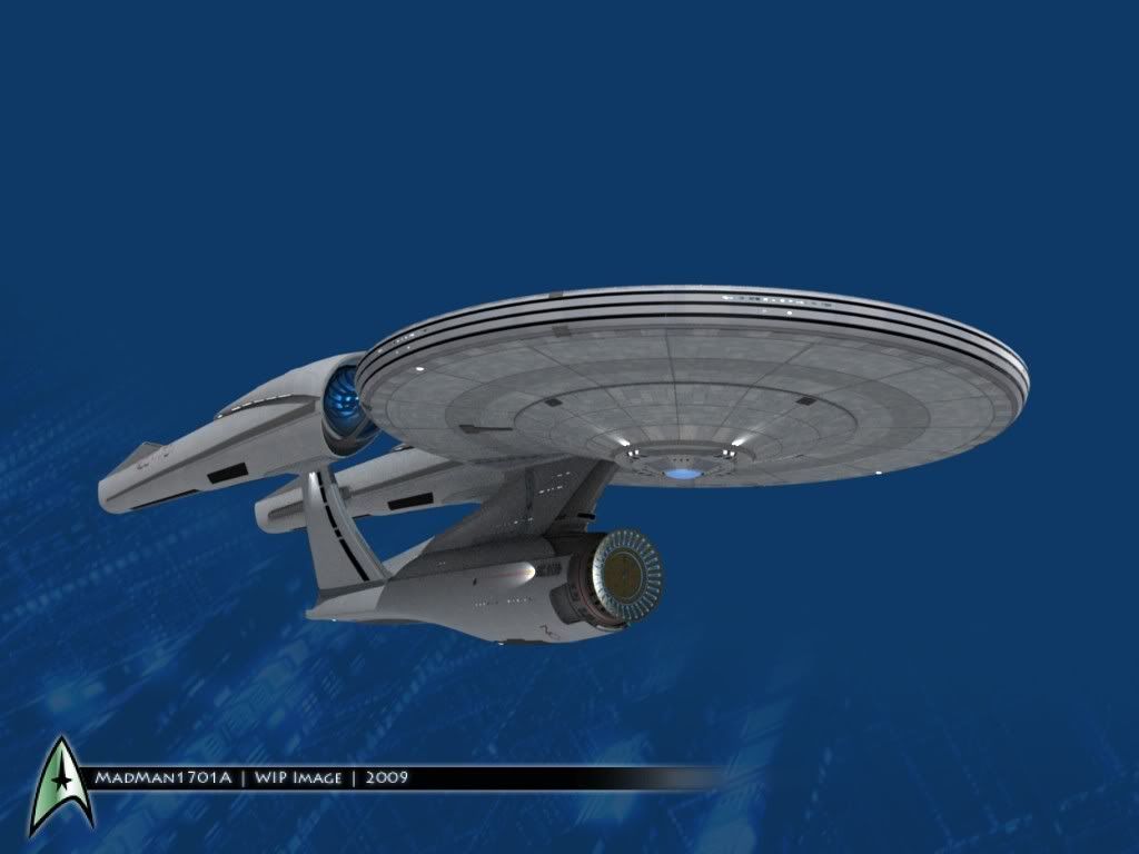
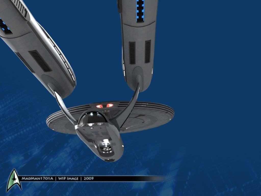
I can see from these I have some cleanup to do, and I want to re-build the inner vents on the nacelles, and I need a new texture on the impulse engine. Maybe I'll get it done before the end of the week.
I'm planning on making a couple of tshirts with this thing, to wear to the show on the 7th. Does anyone have any ideas of Trek shirts that they've liked in the past?

The front three-quarters view is definitely not this design's best side, but those views from below kick ass.
Thanks.
OK, I was trying something with the textures.
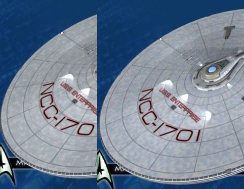
I removed the border around each panel... the original is on the right, new on the left. Also, it's more blue, and not as much grey as before....
Which one do you guys think is better? Also, the new one is twice the resolution of the old. Should hold up for better closeups...
OK, I was trying something with the textures.
I removed the border around each panel... the original is on the right, new on the left. Also, it's more blue, and not as much grey as before....
Which one do you guys think is better? Also, the new one is twice the resolution of the old. Should hold up for better closeups...
OK, one more image to show the texture up closer. This is much better.

She sure is a beauty. Some of your best work yet!
It's not a "bad" looking model, per-se (talking about the root design, not Madman's exemplary work replicating it). It's just that it's so different that it can't be treated as "the same ship" in any fashion.I have to admit, this Enterprise is finally starting to grow on me and watching you progress with your model has a lot to do with it... although I still am having a really hard time getting past that truncated secondary hull, oversized deflector dish and ginormous warp nacelles.
Sure, there are things I personally dislike about the style, but that's just personal taste. There are things that don't work, mechanically, but that's not something that the folks responsible for making the flick seem to be bothered by, and I'm sure most of the audience won't be either.
I said it the first time I really saw the movie model, and having seen it onscreen now (and here, I thought I was going to see TWOK the other day!), I can safely say... it's most effective when it's in blurry, high-action shots, where you could easily mistake it for the original ship. It would be just fine as another ship based upon the same basic design principles. I think that it would be a fantastic TNG-era ship, designed as an homage to the Constitution.
Several things are absolutely true, however. This ship is FREAKIN HUGE. Possibly twice the length, if you judge by the "interior hangar deck" sequence (even presuming that the hangar on this ship runs the entire length of the secondary hull, it's still going to be significantly larger than the TOS ship). (And no, I'm not confusing the Academy departure shots for the interior hangar deck... BOTH are in the film.) I really think that the shots in the teaser trailer, showing people walking around on top of the nacelles, were in correct scale. Those nacelles are as large in diameter, or larger, than the TOS ship's secondary hull was.
The original ship... even at 1080-ish scale... just isn't that large.
Madman, have you seen that sequence yet? I hear that they've got the "shuttle drop" sequence online someplace. It would be interesting to see if you can create a shuttlebay for this thing... and perhaps a shuttle to give it scale? You could determine (within +/- 5%) how long the ship really is that way.
As for me, well... I guess I'll think of this ship as a "Galaxy-in-TOS-era" design... and honestly, I think Madman's work has captured it nearly perfectly. It's not a bad ship... just not the Enterprise.
")
Thanks.
OK, I was trying something with the textures.
Which one do you guys think is better? Also, the new one is twice the resolution of the old. Should hold up for better closeups...
Borderless, definitely. Having lines around all the panels just looks cartoonish.
Agreed. And the more subtle the paneling is, the better.Thanks.
OK, I was trying something with the textures.
Which one do you guys think is better? Also, the new one is twice the resolution of the old. Should hold up for better closeups...
Borderless, definitely. Having lines around all the panels just looks cartoonish.
Definitely borderless. My personal preference would also be to reduce the delta in colors between the various shades of blue and gray... but that's just strictly a personal preference.
I did see that clip, in a very low-res fashion.
About the design... it can never be the original, and I'm glad they didn't try to play it off that way. From what I understand, the Enterprise was built a little later in this timeline, which kind of explains why it looks more like the Refit and other ships in the future. (For the record, the Refit is my favorite of all time. That design will never be surpassed. )
I guess my attachment to this ship is that it's the first one that's really been brand new to me. I'm 26, so the everything up until the D came out before I had a chance to really pay attention to these ships, and their designs. The Enterprise E was new when I was 14, but I never REALLY liked it. This new ship, though..
About the design... it can never be the original, and I'm glad they didn't try to play it off that way. From what I understand, the Enterprise was built a little later in this timeline, which kind of explains why it looks more like the Refit and other ships in the future. (For the record, the Refit is my favorite of all time. That design will never be surpassed.
)I guess my attachment to this ship is that it's the first one that's really been brand new to me. I'm 26, so the everything up until the D came out before I had a chance to really pay attention to these ships, and their designs. The Enterprise E was new when I was 14, but I never REALLY liked it. This new ship, though..
Ok, borderless it is.Definitely borderless. My personal preference would also be to reduce the delta in colors between the various shades of blue and gray... but that's just strictly a personal preference.
I think I might tone down the blue some also... It does look really too blue sometimes.
I'll have some updates out shortly...
Similar threads
- Replies
- 19
- Views
- 946
- Replies
- 32
- Views
- 2K
If you are not already a member then please register an account and join in the discussion!