-
Welcome! The TrekBBS is the number one place to chat about Star Trek with like-minded fans.
If you are not already a member then please register an account and join in the discussion!
You are using an out of date browser. It may not display this or other websites correctly.
You should upgrade or use an alternative browser.
You should upgrade or use an alternative browser.
A TrekBBS Logo
- Thread starter AstroSmurf
- Start date


Here's my 15-20 worth of brainstorming. I figure the colors could rotate around as the user browses the site (much like AstroSmurf's idea for the site's color theme.)


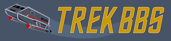
I LOVE these... but I'm also royally fond of the TOS shuttle logo, and the gold Generations arrowhead version.
you guys really blow me away; what 15-20 minutes of your creativity can produce. Awe-inspiring. I like them all but, for some reason, I think I like the shuttle one best on this page, as well.
Wow! I am thrilled at all the responses and work so far. Amazing stuff. 
I am thinking that maybe we could do a poll for all of these. Maybe in two weeks? That would give everyone who wants to create something enough time to put it together. Of course it would have to be outside the monthly contest. What do you think? I don't want to step on any toes here.
Keep them coming! I have a couple more on the way myself.
(I am seriously thinking about changing the font I used on mine to more of a Trek font. I am not sure yet. What do you folks think?)
")


^ I am not to enthusiastic about it either. But it was similar to what Anthony was using. When I get a minute today I am going to find something else.
A
Amaris
Guest
Here's my contribution:

I like both AstroSmurf's and your communicator riffs.
And Astro, definitely like to see a version with more of a traditional "Trek font". Just to see what it looked like.
And Astro, definitely like to see a version with more of a traditional "Trek font". Just to see what it looked like.
 When it comes down to all the ones you've made so far, I can't choose between the galaxy and the shuttle.
 I think we have consensus on that font.  I couldn't agree more though. My time is limited at the moment and it was just something I had laying around so I just dropped it in as a place holder. I was more concerned about the image than I was the text.
But I am now working on changing all of them to include a Trek font that fits the image. It may take me some time to choose something that works though. I am struggling to find something that works with the galaxy spiral. The others will hopefully be easier.
(And some history... the font featured in my examples was actually a part of Trek but you may not recognize it. The art department used it for the headings on the computer readouts and all the console labeling for Enterprise.)
I couldn't agree more though. My time is limited at the moment and it was just something I had laying around so I just dropped it in as a place holder. I was more concerned about the image than I was the text.But I am now working on changing all of them to include a Trek font that fits the image. It may take me some time to choose something that works though. I am struggling to find something that works with the galaxy spiral. The others will hopefully be easier.
(And some history... the font featured in my examples was actually a part of Trek but you may not recognize it. The art department used it for the headings on the computer readouts and all the console labeling for Enterprise.
)I'm not much of an artist, but this sounded like fun so I gave it a shot.
TMP Style:

Here's the full size version in case anyone wants to add a T'Bonz head staring off into space") (click on thumbnail):
(click on thumbnail):

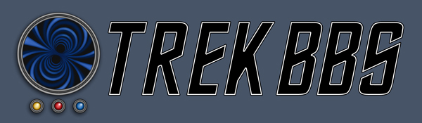
Borg Cube made up of the board colors:


TMP Style:
Here's the full size version in case anyone wants to add a T'Bonz head staring off into space
(click on thumbnail):
Borg Cube made up of the board colors:
Last edited:
This beyond awesome. This ought be the one.
Here are six revised... and one brand new logo.


I am very happy with several of these, including the new one. But I just can't find a font or a color to go with the spiral galaxy logo. It looks like monkey pooh so I intend to keep trying when I get a free minute. I also have maybe two or three more logos gestating in my brain. I will post them if and when they are finally birthed.
Keep them coming! Looking great!
Edit to add: Never mind about the spiral logo. I did some more tinkering and finally found a balance. I ended up color correcting the logo a bit to get it look good with the yellow I wanted. Couldn't see the forest for the trees. I have updated this post to reflect the final version.
Last edited:
A
Amaris
Guest
Those look fantastic!
Some more ideas, more on the simple side. The same logo with slightly different color schemes


Both of these are awesome! And I hate you. I had some similar ideas, but you've pulled it off much better than I was doing.
^ NO! NO! Please don't stop on my account. I think you should do them anyway.
A
Amaris
Guest
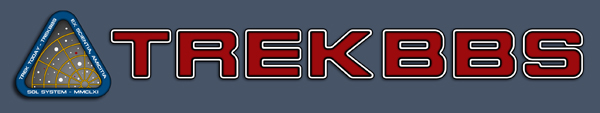
I love them all, but these two stand out to me. I love the color scheme on the SF badge with the red and white lettering. Simply gorgeous, and the spiral galaxy logo is still a winner.
Of course, they're all terrific, and I'm insane with anger!


Anyhoo, here's another submission:

Similar threads
- Replies
- 25
- Views
- 985
- Replies
- 5
- Views
- 776
If you are not already a member then please register an account and join in the discussion!