-
Welcome! The TrekBBS is the number one place to chat about Star Trek with like-minded fans.
If you are not already a member then please register an account and join in the discussion!
You are using an out of date browser. It may not display this or other websites correctly.
You should upgrade or use an alternative browser.
You should upgrade or use an alternative browser.
A matter of Color.
- Thread starter Thanos007
- Start date
By Season 3, Theiss finally found a fabric, dye combination that gave him his ideal color on screen regardless of the lighting, film processing and laundry fading. Here it is (bam):Since later productions used mustard/gold, I'd say from an overall franchise perspective they are mustard/gold.
Really, TAS answers this question pretty definitively.

By Season 3, Theiss finally found a fabric, dye combination that gave him his ideal color on screen regardless of the lighting, film processing and laundry fading. Here it is (bam):
If I was ever in the right tax bracket, I would want the season three tunic. I think it is the best looking one.
No baby blues for me. I like the dark-to-medium shade of blue. (GO BLUE!)But are there dialog references to blue being blue?
For what it's worth, I saw some props at the Pop Culture museum in Seattle last winter. The command shirt sure looked gold to me in person. Yeah, they're 50 years old etc., but "for what it's worth"...
I'd post pics if I knew how on this site, but it seems they need to be hosted somewhere besides my hard drive.
I'd post pics if I knew how on this site, but it seems they need to be hosted somewhere besides my hard drive.
Which season were they from?For what it's worth, I saw some props at the Pop Culture museum in Seattle last winter. The command shirt sure looked gold to me in person. Yeah, they're 50 years old etc., but "for what it's worth"...
I'd post pics if I knew how on this site, but it seems they need to be hosted somewhere besides my hard drive.
You can upload pics to https://imgbb.com for free, don't even need an account.
Kor
Season 3 as far as I can tell. I couldn't get that close, but the torsos look long.
I'll try this picture thing.
https://ibb.co/j8bZ5dw
https://ibb.co/sFv0tPw
https://ibb.co/Zff73m0
https://ibb.co/1sHF3V2
https://ibb.co/9bmtCBb
I'll try this picture thing.
https://ibb.co/j8bZ5dw
https://ibb.co/sFv0tPw
https://ibb.co/Zff73m0
https://ibb.co/1sHF3V2
https://ibb.co/9bmtCBb
It's wasn't really a question of what we saw or why but what we "should" see. We KNOW they were green but for whatever reason we saw then as gold. The question is for canon sake what color are the shirts. I grew up believing they were gold, so regardless of Theis' and the production's intentions I say stay with gold. Especially since other in universe sources have stated they are gold.
Since later productions used mustard/gold, I'd say from an overall franchise perspective they are mustard/gold.
Really, TAS answers this question pretty definitively.
Absolutely. I was coming in here to make the same point.

The green/gold thing is an interesting piece of trivia. But in reality, the sheer weight of later evidence canonizes gold. The tunics in TAS are gold. The Next Generation, Deep Space Nine and Voyager all use gold. "Trials and Tribbleations", a Deep Space Nine episode set in the 'past' of TOS, even has dialogue confirming the colour to be gold. And the JJ Abrams movies update the classic colour scheme... retaining the gold colour. And Discovery, again with Captain Pike's uniform, favours gold. Whatever the intended colours were "meant" to be, the fact remains that the TOS command uniforms are canonically gold.
")

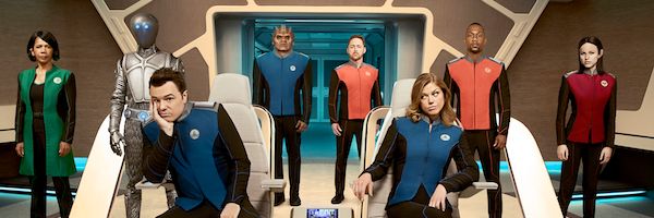
That being said, I wonder if Seth Macfarlane deliberately chose Blue/Red/Green as the colour scheme for The Orville as a nod towards this 'controversy'?

There's orange, too.That being said, I wonder if Seth Macfarlane deliberately chose Blue/Red/Green as the colour scheme for The Orville as a nod towards this 'controversy'?
As long as you told the developer that the thing or person you were photographing was actually green, that is.I'd like to point out that the Eastman Kodak film used for Star Trek had no trouble finding the green in anything else...
I'm suddenly reminded that they similar trouble finding the right shade of green to use for Cesar Romeo's Joker wig on the 60s Batman series. In some stills it photographs as orange....but when the Command tunic is shot in bright light, we're supposed to think the film stock is making it yellow, because suddenly this film can't see green. Baloney. The film stock captured colors accurately, as the eye would see it:
http://tos.trekcore.com/gallery/albums/3x03/The_Paradise_Syndrome_006.JPG
I doubt that they even thought about it. I'm sure that what you said earlier is the right answer: There weren't any other command division personnel among the regular cast.I wonder if they put Archer in green, Montgomery in red, and avoided putting anyone else (it would have had to have been an extra because there were no other command division personnel among the regular cast) in gold because of the well-known case of Gold v. Green?
I think I've found the theme for this thread, BTW...
I doubt that they even thought about it. I'm sure that what you said earlier is the right answer: There weren't any other command division personnel among the regular cast.
Yeah, but that doesn't explain why they made a green wraparound for Archer as opposed to a gold shirt, which presumably would have been easier, nor does it explain why they put Montgomery in red as opposed to gold. Just seems interesting to me.
And purple for admirals.There's orange, too.
So. Many. Threads.
Part of it was the velour which has nap and is tricky to photograph. Even on the clamshell dvd s before the remastering the unis are chartreuse , not gold, occasionally, under outdoor conditions iirc.
i saw the S3 command tunic in Detroit under white light in a dark room. It was chartreuse, a very 60s color like the red with a bit of cherry and the gray blue. See other threads where I 've posted links to 60s pallettes and greeting cards.
I admit it is canonically gold btw.
Oh, and you give Archer wraparound green cuz that's how that material photographed.
Wasn't there a story about doing a screen test for the Orion dancer's make up from the 1st pilot and the lab kept correcting her to not green? They were painting Majel for the test.
I'm sorry I probably read it on this forum, could something like that have caused some of this?
BTW, Red, Blue, and Yellow are the three primary colors, Green is a secondary color although probably the most used of the secondary colors as well as one of the three main colors in a television (red, green, and cyan)
Yes.Wasn't there a story about doing a screen test for the Orion dancer's make up from the 1st pilot and the lab kept correcting her to not green? They were painting Majel for the test.
The specific primary colors depend upon whether you're talking about additive or subtractive processing. For subtractive processing, the colors are generally cyan, magenta, and yellow. For additive processing, which also encompasses the technology in the color cathode ray tubes (TV), the colors are red, green and blue. See this link or this one for more details.BTW, Red, Blue, and Yellow are the three primary colors, Green is a secondary color although probably the most used of the secondary colors as well as one of the three main colors in a television (red, green, and cyan)
Last edited:
BTW, Red, Blue, and Yellow are the three primary colors, Green is a secondary color although probably the most used of the secondary colors as well as one of the three main colors in a television (red, green, and cyan)
Theiss's rationale for making the uniforms red, green, and blue was to highlight the value of color television. If I'm not mistaken, RCA was the parent company of NBC, they wanted to sell color sets to a public who mostly hadn't switched yet, and the 1966 fall season was when NBC was going "all color" in prime time. So Star Trek had to be in big-time, super color, way over the top by today's standards. And Theiss implied somewhere that the R-G-B costume scheme was directly related to making RCA happy.
I saw Star Trek strictly in b&w as a kid. Then one day I saw color stills from the show, on the back cover of The Making of Star Trek, which my Dad came home and stunned me with one day.
And then seeing that one episode in color at a friend's house comes next. The die is cast. You need a color TV.
Last edited:
It's because the Kirk green wraparound is AWESOME.Yeah, but that doesn't explain why they made a green wraparound for Archer as opposed to a gold shirt, which presumably would have been easier, nor does it explain why they put Montgomery in red as opposed to gold. Just seems interesting to me.
Yes. That's the first story that I linked to above.Wasn't there a story about doing a screen test for the Orion dancer's make up from the 1st pilot and the lab kept correcting her to not green? They were painting Majel for the test.
I love how nothing, but NOTHING, brings out some of the best posters on this board like another installment in the case of Gold v. Green. 
Similar threads
- Replies
- 56
- Views
- 14K
- Replies
- 18
- Views
- 4K
- Replies
- 2
- Views
- 1K
If you are not already a member then please register an account and join in the discussion!