• Welcome! The TrekBBS is the number one place to chat about Star Trek with like-minded fans.
    If you are not already a member then please register an account and join in the discussion!

The reason for the bright colors in TOS???

Mage

Vice Admiral
Admiral
Long story short...


For the Addams Family show back in the day, the set was predominantly pink. The reason for that, was since hues of red become dark shades of black and pink gives the right shade of grey they needed.

So, knowing this, could that have been a reason for some of the bright colors, to give more dimension to the image, since most people would still have black and white tv.

Just a thought, anyone know anything more?
 
Isn't the story that NBC wated to become known as the channel of colour? Besides if you know a certain technology is coming soon i.e. colour TV. Would you not want to future proof your shows?
 
Much has been written about this in many sources. Yes, color TV was new, and TOS was designed to be IN COLOR! One of the things I most enjoy about the TOS production design is the "theatrical" lighting—lots of colored gels, "cookie" patterns, etc. For me, it is a constant visual reminder that the show is speaking in parables, a completely different approach from ultra-realistic lighting and sets.

As the OP noted, red is dark in monochrome systems, which is the reason a reddish skin tone was rejected for Spock.
 
Yeah, it's kind of the opposite reason...TOS was colorful to show off color TV. Had it been colorful with black-and-white TV in mind, they would have been "off" colors...like Superman's brown and gray suit and Car 54's red and white paint scheme.
 
The bright colours are a huge part of the appeal The Original Series has for me, and I think for everyone in general. The stagelights shining multiple colors through patterns, making odd shadows on the walls and interesting pools of light everywhere. It's like a live-action comic book, from back in the day! Whatever the reasons for it, whether it's to exploit colour television for the first time, or just as a stylistic choice ... whatever the reason, I love it! Never say never, I guess, but I can't see colour being used like that again, to that same effect, in television. It's like watching a stage production, with just a little more money, almost. I don't know ... I'm very charmed by it all, really.
 
It's like a live-action comic book, from back in the day! ...Never say never, I guess, but I can't see colour being used like that again, to that same effect, in television.

I doubt "comic book" was the effect the TOS designers were going for, but that is the reason for the color schemes used in DICK TRACY (1990) and SPEED RACER (2008), to name just two movies that come to mind. LOGAN'S RUN (1976) also depicted a shiny-new future with bright colors. Then along came STAR WARS (1977) the very next year and introduced the dirty, lived-in future which set the new fashion trend.

SPACE: 1999 (1975) was very sterile, perhaps taking a cue from 2001: A SPACE ODYSSEY—and perhaps even DOCTOR WHO, where the circular, back-lit walls of the TARDIS may have influenced the look of Alpha's interiors. Yet some episodes of SPACE: 1999 feature "TREK-like" lighting where the normal white lights of Alpha's walls showed color, perhaps for mood (bright reds), a suggestion of "natural" lighting (soft yellows and greens), or an iconic color such as Medical Center's blue.

Koenig-Wild-03.jpg

Some movies use color "grading," such as the conflicting olde fashioned sepia and antiseptic-futuristic green in GATTACA, or the color cues in THE MATRIX to indicate which environment the characters are in. Color grading has become cliché now—every movie must be tinted with the dreaded "teal and orange," which is very comic book-like.

There are always trends—depending on how old you are, consider the changes in "CG" titling on TV and broadcast news sets over the years. Things went from rainbow colors to steel and glass, then muted pastels. We now have natural tones like wood and brick. The news networks have come back around to loud, primary reds and blues.

At the time, TOS was a trend-setter. Nothing else looked like it. Was it an influence on SPACE: 1999 lighting? I can only guess.
 
I've always thought of science fiction as the most theatrical form of filmed entertainment since so much of what is seen is artificial. I've always felt TOS did that theatricality better than anyone else due to the lighting, sets, and how some episodes are obvious morality plays.
 
I love the use of colored gels in TOS. I was lucky to have worked as crew at the TV studio for my university when enrolled and had to set up lights with gels all the time. I remember from somewhere the term "painting with light".

I think the colors might be the effect of the type of film used at the time. A photographer before everything became digital was very aware that the different brands of film Kodak, Fuji etc. each had a different color balance and you could get different effects by the type of film you used. I imagine it was the same for movie film. Also I think film at that time had a lot silver in it which later was too expensive to use when the Hunt Brothers tried to corner the silver market. Just guessing about that :confused:
 
Last edited:
I love the use of colored gels in TOS. I was lucky to have worked as crew at the TV studio for my university when enrolled and had to set up lights with gels all the time. I remember from somewhere the term "painting with light".

I think the colors might a lot be the effect of the type of film used at the time. A photographer before everything became digital was very away that the different brands of film Kodak, Fuji etc. each had a different color balance and you could get different effects by the type of film you used. I imagine it was the same for movie film. Also I think film at that time had a lot silver in it which later was too expensive to use when the Hunt Brothers tried to corner the silver market. Just guessing about that :confused:

The color and detail has to do with the amount of light needed to get an exposure, which creates this heightened look. Once you started seeing faster filmstocks, things looked more 'natural' (not as awesome, more believable), and it has now progressed with digital in recent years to the point where cinematographers are having to subtract light out of scenes in order to keep things cinematic (opposite of before when they had to pour light in to sculpt the scene.)
 
As others have said, NBC wanted their shows to all be as colorful as possible, because they wanted to sell color TVs. NBC was owned by RCA, who produced and sold television sets. RCA even used Star Trek in contemporary magazine/newspaper advertisements for their color televisions as a reason why people should upgrade their sets to the new color systems (one such advert is reprinted in the Herb Solow/Bob Justman authored making of book 'Star Trek: The True Story').

For an in-universe explanation, I like the idea put forward by some circles that bright primary colors would be desirable to avert space madness. Kind of like the homely pastels and wood trim in TNG. Things that remind people of 'home', or bring a rich and inviting feel to what might otherwise be very sterile enviroments.
 
For the Addams Family show back in the day, the set was predominantly pink. The reason for that, was since hues of red become dark shades of black and pink gives the right shade of grey they needed.?


I've heard that during the b&w era, some movie sets were painted eleven shades of brown and tan. Pink might perform similarly, depending on the film stock being used.

I always enjoy seeing color stills from the set of b&w productions. You just have to be careful to spot the ones that were taken in b&w and colored later.

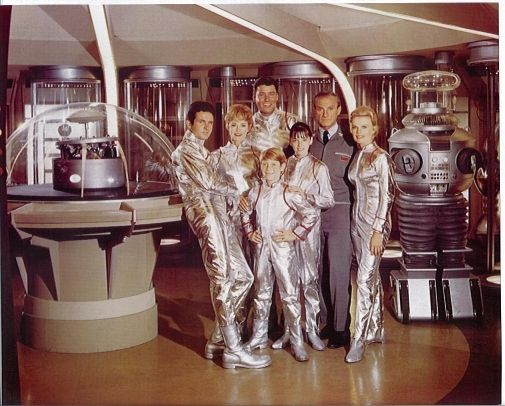
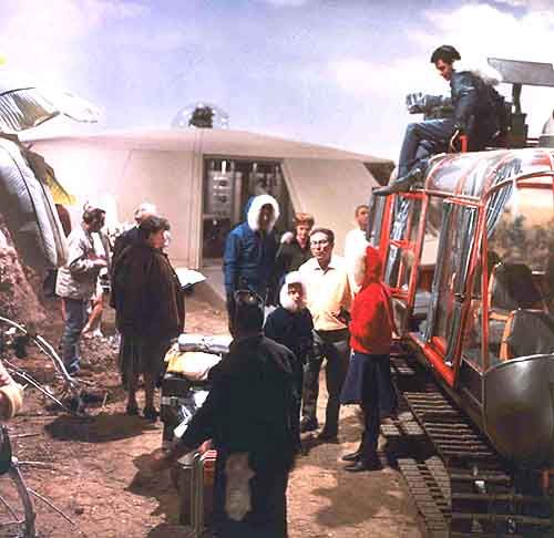
The Lost in Space robot had gray claws and less colorful buttons in his original incarnation. The Jupiter II interior was bland, but lots of bright colors showed up in the costumes, and the Chariot was red:

LIScastsuitsyr1_zps905747b7.jpg


LIScastyr1color-bwfilmingofpilotchariotallen_lis_zps0105bdc0.jpg


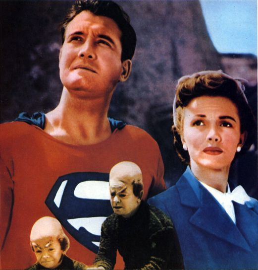
Here's an example of fake color in a 1951 publicity still, from the Nov 1983 issue of Starlog magazine. Apart from accuracy issues, it's pretty good. But it doesn't reveal anything about true colors in the production:

SL831160SupermanPart2-k1detail2_zps9e6b3761.jpg
 
I've either seen a color photo of George Reeves' original costume, or it was on display in a museum, can't remember which. Gray leotard, brown cape, trunks, and boots.
 
Here's an example of fake color in a 1951 publicity still, from the Nov 1983 issue of Starlog magazine. Apart from accuracy issues, it's pretty good. But it doesn't reveal anything about true colors in the production:

SL831160SupermanPart2-k1detail2_zps9e6b3761.jpg

The reversed colors on Superman's outfit remind me of a GREATEST AMERICAN HERO episode. In "Dreams" a gangster previously bagged by Hinkley and Maxwell has double-talked a parole board into letting him out. While trying to turn the tables on our heroes, the gangster sees Ralph in action again. The problem is, neither of his henchmen see Ralph doing his superguy routine, and neither was present to see it when the gangster was caught the first time—

Johnny: There he goes. This guy can fly. He can fly, I don't believe it!

Thug 1: We lost him. There was a holdup across the street. He slipped out the back.

Johnny: Did you see him fly past here? He came around the side of the bank about ten feet off the ground. Flies after them—you seen that, right?

Thug 1: Fly? I, uh...

Johnny: Yeah!

Thug 1: Well, Johnny, I was kind of ducking for cover in the bank, there. (To Thug 2) You must have seen him!

Johnny: I ain't nuts here! I seen him fly past here! And I wanna hear you see it, too! I wanna hear it!

Thug 2: I kind of saw this blue streak going by, or something like that, I guess.

Johnny: Red streak! The super guy wears red!
 
Bonanza and The Virginian were also vehicles designed (at least partially) to exploit the potential of color TV.
 
Shows from the color era of the 60s in general are very colorful...Batman, Laugh-In, and the color season of I Dream of Jeannie and Gilligan's Island come to mind immediately.
 
If you are not already a member then please register an account and join in the discussion!

Sign up / Register


Back
Top