Best uniform goes to the probe-Ilia.
Probe Ilia didn't have a uniform. Censorship meant Kirk had to give her the robe, unfortunately.
I know, it wasn't a uniform...I was being facetious..,,but one can dream.
Best uniform goes to the probe-Ilia.
Probe Ilia didn't have a uniform. Censorship meant Kirk had to give her the robe, unfortunately.

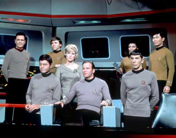
I always liked the TWOK uniforms, I think they worked well with that particular story, which was essentially a "Hornblower in Space" war movie.
I think the TMP uniforms were a better match for the concept of the overall franchise, which was first and foremost about scientific exploration first and shoot-em-up space battles second.


")
 )
)")
LMFAOschwarz, that looks great. One suggestion, taking a cue from some of Warped9's colorizations, would be to make the bridge elevator door some (toned down) shade of red. That adds just an extra touch to remind us that we are watching "real" Star Trek.
 Thanks to Warped9 for being the first person I saw to do that.
Yeah, this look is definitely working for me.
I liked McCoy's medical whites, so I left that untouched. In contrast to the other colors, it really seems to say 'doctor'.
Another nice thing is that this look lets everyone have their cake, or however it goes: the crowd that can enjoy the updates, and also those who say "This is what it always really looked like." (i.e., the 'new' Klingons).

Shouldn't Decker be a gold shirt? He's the XO subbing for the science officer.Yeah, this look is definitely working for me.
I liked McCoy's medical whites, so I left that untouched. In contrast to the other colors, it really seems to say 'doctor'.
Another nice thing is that this look lets everyone have their cake, or however it goes: the crowd that can enjoy the updates, and also those who say "This is what it always really looked like." (i.e., the 'new' Klingons).
We use essential cookies to make this site work, and optional cookies to enhance your experience.