• Welcome! The TrekBBS is the number one place to chat about Star Trek with like-minded fans.
    If you are not already a member then please register an account and join in the discussion!

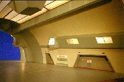
Photo request -- Enterprise hangar deck studio miniature

I honestly don't see any difference at all. :confused: No matter how hard I squint.

I'm not sure I would presume the side of the ship so easily, since the shuttles have a tendency to spin on their little turntables before launching.

Exactly. And in fact, if the shuttle rests on the turntable, then a person peering through one of the angled doors marked "ELEVATORS" would see it side on only if the shuttle were rotated at something like 45 degree angle.

In which case the background would not be the clamshell doors, nor the side walls of the bay. The background would be that relatively broad, featureless grey "collar" that goes between the bay doors and the side walls!

How was this done in the "Journey to Babel" and "Immunity Syndrome" remasterings, BTW? Was anything inserted on the live-action background at all? I gather not, since it's not on the VFX reels. Which sort of means that the 45 degree angle thing is the easiest way out.

...And I mean that literally. If one wants to create a redshirt line of honor from the shuttle to the angled elevator door, the most stylish way to do that would be to rotate the shuttle 45 degrees, and have the straight line at 45 degrees to the ship's walls but 90 degrees to the shuttlecraft door and the elevator door.

Timo Saloniemi
 
Timo said:
I honestly don't see any difference at all. :confused: No matter how hard I squint.
No need to squint.

Remastered CGI Enterprise:
remastered_enterprise.jpg


11' studio model Enterprise:

smithsonian_enterprise.jpg


Look at the shape of the rounded characters, such as the C in "NCC" or the S in "U.S.S.". But most noticeably, look at the thickness of the characters... the strokes in the characters on the CGIprise are distinctly thinner. The font of the registry on the CGI Enterprise is completely different.

(The image of the studio model is courtesy of Mike Trice and his excellent Enterprise model photographs website.
 
Thanks... But I'm still having serious difficulty telling the fonts apart. To me, the thicknesses look identical, and the seeming roundedness of the CGI version appears to me a mere matter of "softness" of focus - the upper corners of the CGI "C" look rounded (that is, with very short 45 degree segments) from this angle, but the lower ones are still sharp / with long segments.

Then again, I've never understood the font thing. I'm just not the sort of person capable of fathoming why a typeface with short serifs should cost hundreds of dollars while one with long ones is free, so I guess I tend to actively avoid seeing any uniqueness or merit to specific fonts...

(And yeah, Mike Trice rules! As do certain other sources linked to good old IDIC Page.)

Timo Saloniemi
 
Thomas C Lai, the designer of the Long Beach USN and Amarillo USAF fonts, tells me they are not the official names but were given by him in honor of the defunct Long Beach Naval Shipyard and Amarillo Air Force Base. Mr.Lai's fonts are based on official military fonts but are not themselves official. In the USAF 1998 version of USAF Technical Order 1-1-4, which specifies the shape and spacing of the letters, the type face is referred to by the catchy name "VERTICAL BLOCK TYPE."
 
Masao said:
Thomas C Lai, the designer of the Long Beach USN and Amarillo USAF fonts, tells me they are not the official names but were given by him in honor of the defunct Long Beach Naval Shipyard and Amarillo Air Force Base. Mr.Lai's fonts are based on official military fonts but are not themselves official. In the USAF 1998 version of USAF Technical Order 1-1-4, which specifies the shape and spacing of the letters, the type face is referred to by the catchy name "VERTICAL BLOCK TYPE."

I've heard the name before, but it's nice to know that it's "official."
 
This topic and the amazing photos in post #8 deserve to be revived. Any better resolution versions of these ever show up? They are amazing!
 
This topic and the amazing photos in post #8 deserve to be revived. Any better resolution versions of these ever show up? They are amazing!

Thank you for reviving this post. I haven't seen it back in 2007 (I don't think I was regularly reading TrekBBS at the time) and I missed those amazing pictures. I don't think they were ever released before and they have not been seen since.
Anybody knows where they come from?

Maab
 
Not to hijack the thread.. does anyone know if there were any publicity shots taken for these episodes:

The Doomsday Machine
The Ultimate Computer
The Omega Glory
The Tholien Web

Thanks!
 
This topic and the amazing photos in post #8 deserve to be revived. Any better resolution versions of these ever show up? They are amazing!

Six year old threads never deserve to be revived.

:scream:


Sorry about that but my purpose in reviving it was to see if any better resolution photos of the hangar bay ever showed up. I didn't feel that starting a new thread was warranted.

I understand, and to be fair I have left it open.

It's better to start new threads than to resurrect old ones, especially because you may be replying to people who no longer post here.

This case seems fine, but I don't want it to become normal to resurrect threads that are long, long dead.

Fair enough?
 
My usual approach to things like this is to start a new thread and link then quote or link posts from the mothballed thread where necessary.
 
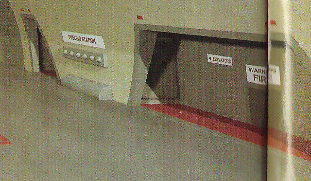
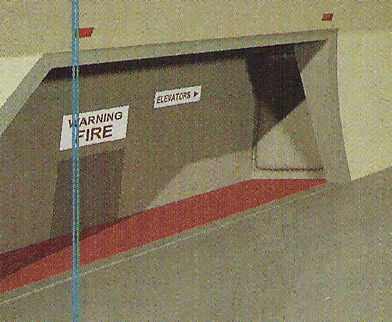
Thanks, Maurice, I hadn't been able to see the port side close-up before.

Although I really don't want to be a party pooper I have to express my doubts (already did so in blssdwlf's WIP Enterprise thread) whether these close-up shots are genuine pictures of the original model (and not just an almost perfect reproduction of it):
  • On Richard Datin's Website (the ones with the bluescreen in the background) he also illustrated a decal sheet (featuring the exterior text signs on the 11-footer VFX Enterprise) saying that some of the texts made it into the shuttlebay VFX model. None of these text signs we see here is one from that decal sheet, in addition the font style is a different one than the style on the decal sheet
  • The Datin picture clearly shows the full length of the large port (and starboard) side embayment (in contrast to the actual VFX footage in the episodes where the embayment was "cut in half"). The Datin picture clearly shows that the middle of the embayment is just right of the "Warning Fire" sign. In the close-up shots from a magazine (which magazine?) the middle of the embayment is left of the "Warning Fire" sign.
I think this is substantial evidence that the close-up shots come from a very, very passionate attempt to faithfully reproduce the shuttlebay model, :techman:
but the model artist lacked reference materials revealing the actual length of these embayments and the original decal sheets.

Bob
 
If you are not already a member then please register an account and join in the discussion!

Sign up / Register


Back
Top