For season 2, is the text (font) size of the main menu still ridiculously small (especially for the episode titles and the info below them) as it was for season 1?
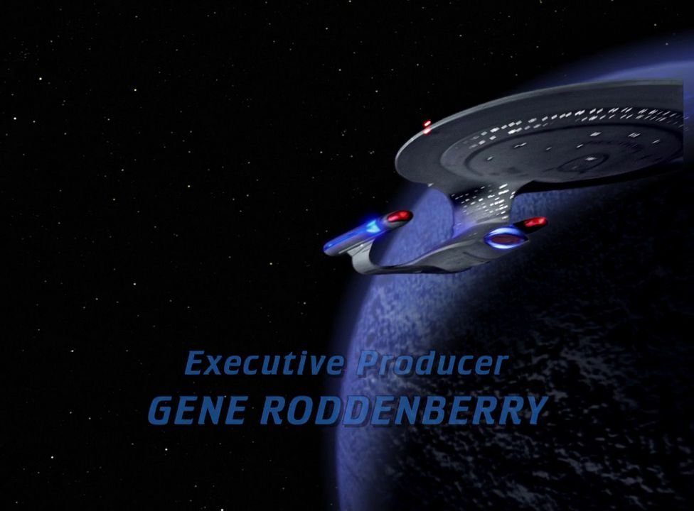
It looks the same to me. The "buttons" for the menu remain in the LCARS-like graphics on the edge of the screen with the center and bulk of the screen being mostly blank. They have filled it in with a "scanning graphic" of the Enterprise. But, still, it's a large empty area that'd be better used for the menu or episode previews.
I've watched both Q-Who and MoaM with the Okuda/Director commentary. Both decent and all but would love to have the text-only commentary from the Okudas on most of the episodes like the TOS sets had or audio commentaries from them. I understand their work in the projects makes commentary from them impractical but it'd be nice to have.
I watched "The Dauphin." Not an episode I really like but I was curious how they did the shape-shifting of the character in the episode. In the original episode it was done by painted cells overlaid on the film. In this HD version it seems to be a CGI-recreation which looks better with smoother transitions between the creatures.
Thanks for the info. This leaves me with 2 options:
1) "Exchange" my 32" HDTV set for a much bigger one
or
2) Continue (as now) to get up from the couch and go towards the TV set when we want to read the menu.


