-
Welcome! The TrekBBS is the number one place to chat about Star Trek with like-minded fans.
If you are not already a member then please register an account and join in the discussion!
You are using an out of date browser. It may not display this or other websites correctly.
You should upgrade or use an alternative browser.
You should upgrade or use an alternative browser.
Gazomgs Art & Images
- Thread starter gazomg
- Start date
- Status
- Not open for further replies.
Nice work
thanks Titan
following the retro theme
MARINA SIRTIS
[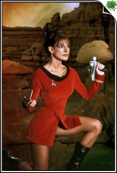
This one is pretty well done, except the insignia badge and (less obviously) the details on the phaser clearly indicate a flipped image. Those things shouldn't be too hard to fix though.
The one of the busty Yeoman Rand... very well done. I had to look a while to see where the seems of the image were. I would recommend altering the color on the hand though, it just seems weirdly pale against the tone of her chest and face. The funny thing is, I wonder if the contrast between hand an cleavage color is actually present on the image of the original model. If so, well, it's still a little distracting and weird.
--Alex
Nice. The phaser details are easily overlooked. The silver colored knob near her thumb and the copper colored stud at the rear of the Phaser I unit are both only found on the left side of the weapon. Unless you're speculating that this is a never before seen "leftie" version! 
If you do decide to remove these, you may as well remove the screw holes on that side of the toy being used as a prop as while you're at it.
Neat stuff!
--Alex
If you do decide to remove these, you may as well remove the screw holes on that side of the toy being used as a prop as while you're at it.
Neat stuff!
--Alex
loving this stuff...
I'll just make one suggestion... look into AfterEffects to pair with Photoshop... you can export animated scenes from there in full colour... transcoding to .gif from there brings out .gif's that are a bit larger in file size, but generally better colour quality than you'd normally get")
M
I'll just make one suggestion... look into AfterEffects to pair with Photoshop... you can export animated scenes from there in full colour... transcoding to .gif from there brings out .gif's that are a bit larger in file size, but generally better colour quality than you'd normally get
M
On both of those her head seems too big. And the blending into the clouds in the background of the second image are, to be frank, crap. I know you can do better. You've done a lot better up-thread.
Also, where are all of these source images coming from? I'd kinda like to see more...
--Alex
Also, where are all of these source images coming from? I'd kinda like to see more...
--Alex
That looks much improved.
I use Photoshop all the time. Let me make a couple technical suggestions...
1) This last image is a good candidate for learning a bit about color overlay layers. Both the actress's head and the model's arms look a little pale to my eye. Now, I realize the model was probably shot there on location, so her arm is technically right, but if you wanted her to look a little bit more tanned, you could use an overlay layer and paint over the skin parts with a kind of gold color. Overlay layers can do unpredictable things if you're not familiar with them, so experiment.
2) More importantly, the shadows on the head do not match the shadows for the rest of the image. It's pretty easy to paint in fake shadows and highlights with the Dodge and Burn tools. Go in many very faint brush strokes and build the effect in gradually, a little goes a long way. This too can behave unpredictably if you're not familiar with the tool.
It's not Trek related, but if you want to see something I've done along these lines go to my website where you'll find a pic of a girl I know that I did some adjusting to. The original image in the description part, and you can see that the lighting on the Photoshoped piece looks more incandescent; that's the overlay. Also, you'll note that the shoulder it not in a coat. The shoulder is actually a pic of another girl I know that I played with the color and even the shape of it and made it fit the first image. The back of her neck is a total fabrication which I just painted in place using color samples from the other skin parts of the image. Also, the red dress was originally a brown dress; I changed the color using the curves tool.
I don't know if you already know this stuff or not. You mentioned you were self-taught and I know Photoshop is big enough that the cool stuff can be overlooked if no one points it out to you.
I hope this helps!
--Alex
Yeah, the heads are almost always too big. Time to look at a figure-drawing book or something. And the "erotic" Nazi Gates McFadden -- it's either ignorant or sick.
tells you what you know.The head on the original bodyshot was even bigger.
Doubt it. But why don't you show us the photo you ripped off and prove it to us?
But then again if you dont like them dont bother replying although you seem to like picking fault at peoples work.
Look, I'm not the only one telling you the heads are too big. It is a common mistake most novice artists make. And I gave you a suggested solution to your problem.
As for Gates, it was based on the nazis from the original series in keeping with the retro theme , but you obviously were to thick to grasp that.
Riiiight. Hope you enjoyed surfing for Nazi porn to make that image.
Hey, guys, I'm not a moderator or anything like that, but let's dial it back a bit before it comes to that...
gazomg, I think it would be constructive for us to see, for example, the unmodified original image which McFadden's head is applied to in that last image. I would be happy to help you see why the proportions are wrong, but I'd need the original image to do so.
As for the Nazi stuff, you have to realize that people are still pretty sensitive over that sort of thing. I get what you're doing there with the reference to "Patterns of Force". I'm personally not into the BDSM Nazi dominatrix thing myself, but I won't call you names for presenting that. But do be careful, as it's a fine line that could easily be crossed unintentionally and this is supposed to be a family friendly board. It's good practice to provide a clickable link to any image which someone might take as NSFW.
Anyhow, I hope that helps a bit.
--Alex

Thanks Kaiser
Good Picture Manips
 and Darn Cardassians thems our Space Rocks!
- Status
- Not open for further replies.
Similar threads
- Replies
- 30
- Views
- 1K
- Replies
- 3
- Views
- 592
- Replies
- 4
- Views
- 418
- Replies
- 21
- Views
- 12K
If you are not already a member then please register an account and join in the discussion!