• Welcome! The TrekBBS is the number one place to chat about Star Trek with like-minded fans.
    If you are not already a member then please register an account and join in the discussion!

Why didn't Theiss find a shirt that photographed green, then.

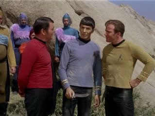
Another outdoor shot with the greenish cast. Must all be in the lighting...

fridayschildhd1412.jpg
 
Well, to further complicate matters, I got a response back from Bjo, and she remembers the shirts being golden yellow, not green, so now I'm not sure what the hell is going on.

That's awesome - that you know her, not the answer.

As to the lighting - those greenish pics are in natural lighting, which lends them credence. Yet we have "the swatch" and Bjo's memories. Yet we have all other command uni's being greenish!

WHEN WILL THE MADNESS STOP!?
 
I know there is "the swatch", but do we know that all of the command tunics came from the same dye lot? Is it possible that some uniforms really were slightly different shades? Some more greenish, some more gold. I would guess given 1966 - 1967 camera and film technology TPTB may not have cared too much about slight differences in shades.
 
Well, David says that velour looks different depending on the lighting, and it fades rather quickly.

Best guess, Mr. Sulu.

... And, really, that says it all.

The truth is out there.

If you held a gun to my head to make me choose what I think they were; and there was definitive proof of what was right; I'd go with greenish. Avocado. Chartreuse.

Swatches can fade. Every other S1&2 command shirt was green. S3 was greenish; why switch from gold to green then? Photography in natural light shows them green.
 
And all the other command division uniforms (jumpsuit, dress, wraparound) were varying shades of green, so, again, we can say with a certain degree with certainty that they were at least supposed to be green.
 
Well, David says that velour looks different depending on the lighting, and it fades rather quickly.

As we've said before, if you brush velour back against its nape, the colour changes abruptly. Get someone to brush a finger over those swatches (wearing a white cotton glove if necessary), photograph them, then rub it back down the other way, and photograph them. You'll find avocado flesh green one way, then golden the other way.

My grandmother had vibrant red velour cushions in the 60s that were dark brown when rubbed the wrong way. After a few years, the red faded to a pale brown colour.

And all the other command division uniforms (jumpsuit, dress, wraparound) were varying shades of green, so, again, we can say with a certain degree with certainty that they were at least supposed to be green.

But... thanks to TAS and DS9, it is a canonical acceptance that the characters see the command shirts as gold. Commodore April's dress greens were painted as green in TAS, but the regular shirts were gold. And the DS9 crew mention that the command colour was gold in TOS's era.
 
But... thanks to TAS and DS9, it is a canonical acceptance that the characters see the command shirts as gold. Commodore April's dress greens were painted as green in TAS, but the regular shirts were gold. And the DS9 crew mention that the command colour was gold in TOS's era.

For sure. It's just the mystery of the actual, out-of-universe fabric that is fun.
 
Here's a pretty crappy scan done on my printer of my unfaded viewmaster reel. This photo shows the color at its most greenish, the other photos in the set have varying degrees of green.


trek2.jpg
 
Another data point:

Bill Theiss had just designed another uniform for me in a new red color Gene ordered, which was different from the pea-green one I wore on the first show.

Nichelle Nichols, Beyond Uhura, p.170
 
The more I read this topic, the more I think command division shirts are an insidious Talosian illusion! Starfleet command division officers are shirtless to project an image of strength of bravado. Their rank cuff cordons and ship badge are just bits of adhesive cloth. The cake, err, shirt is a lie!


The truth is out there.

If you held a gun to my head to make me choose what I think they were; and there was definitive proof of what was right; I'd go with greenish. Avocado. Chartreuse.
185px-Madred%2C_four_lights.jpg


To paraphrase Picard under torture "I... See... Gold... Shirts!"


As we've said before, if you brush velour back against its nape, the colour changes abruptly. Get someone to brush a finger over those swatches (wearing a white cotton glove if necessary), photograph them, then rub it back down the other way, and photograph them. You'll find avocado flesh green one way, then golden the other way.
To be or not to be, that is the question. To be and not to be, that is the answer. That may be the answer, the shirts are both green and gold.


Ah, what next, Gorn are actually yellow under indoor lights, they only photograph green under natural lighting?
 
Here's a pretty crappy scan done on my printer of my unfaded viewmaster reel. This photo shows the color at its most greenish, the other photos in the set have varying degrees of green.


trek2.jpg

Well the captain's chair and the console in the background look very different in color to what we are used to in this scan, i've never seen that parts of the bridge being bright blue before.

Those viewmaster things are some sort of reversal film, right?

Chemical films can do weird things depending on brand and quality.

- to my knowledge such films could age without external stimuli due to internal chemical processes.

-i've actually seen films of comparable quality and age but different brand showing slightly different colors on photographs of the same object.
 
If you are not already a member then please register an account and join in the discussion!

Sign up / Register


Back
Top