Not a fan of the background though.
It's very Briar Patch.
~Belisarius
Not a fan of the background though.

") ) and here I think it shows.
) and here I think it shows.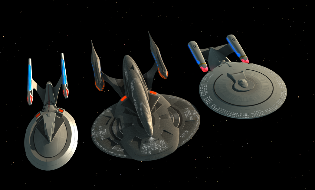
Not a fan of the background though. Have you ever played with the "Glitterato", "Lunar Cell" and "Solar Cell" plug-ins from "Flaming Pear?"

How about something like this instead?
It's good but I need to see at least a bit of the horizon line, say in the corner, or my mind doesn't want to accept it as a planet and tries to turn it into a nebula.
You might also angle it so the cloud strata isn't straight up and down. Might be a bit more dynamic.
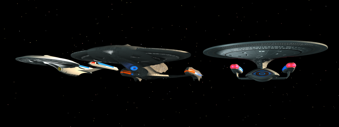
And why not? After all, the Sovereign class is one of the best looking ships, at least IMO. If it isn't broken, don't fix it, but improve it.
That is sort of the direction I headed towards with my design.
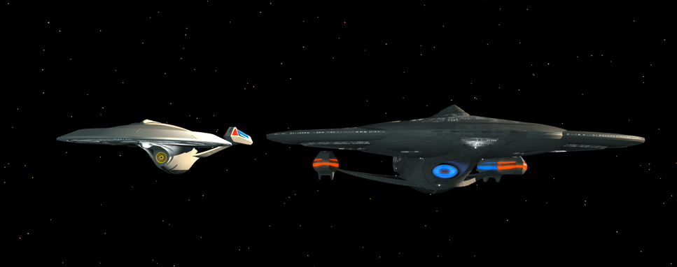
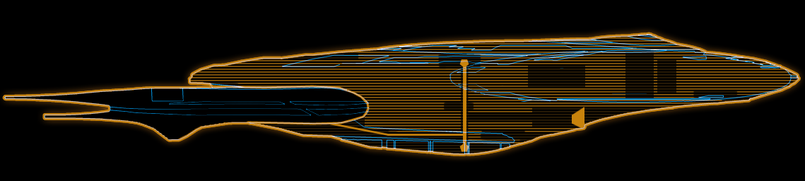
Dac, the only real criticism I would have for your design would be the appearance of two saucers overlapping. If the smaller oval shape had some cutouts or somesuch additional complexity it wouldn't bother me so much, but as it is I can't help but see two different ships one on top of the other.
Dac, I really like your design -- it's really nice. The only thing that bothers me, and others may disagree, is how the nacelle pylons attach to the secondary hull. I feel like it's attached with a few bolts on the bottom of the hull, especially when viewed from above the centerline and from the back. Perhaps that's deliberate -- a number of engines can be strapped onto this design for testing. But to my eye, it looks fragile and incongruent with the robust saucer/secondary hull connection, and its seems like a complex path for the conduits between the warp core and the nacelles. I'd like to see the pylon assembly embedded more in the secondary hull, I think.
) 
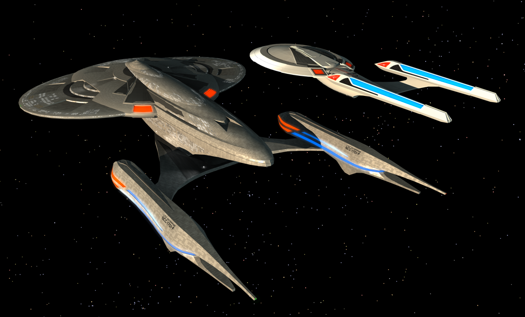
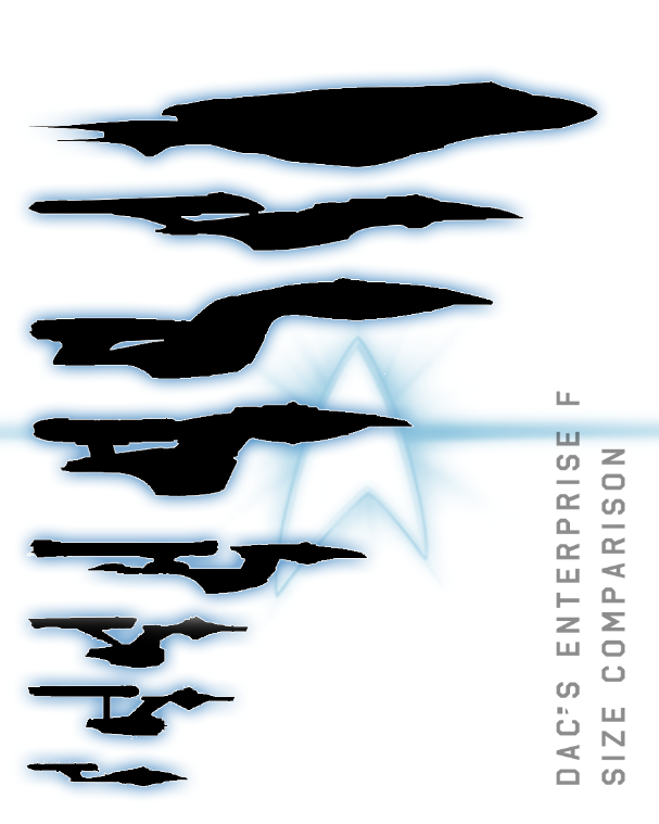
Wow! That's a big ship!... 44 decks? Hell of a lot of internal volume too. Low long is she?
Another small update to my "painting":

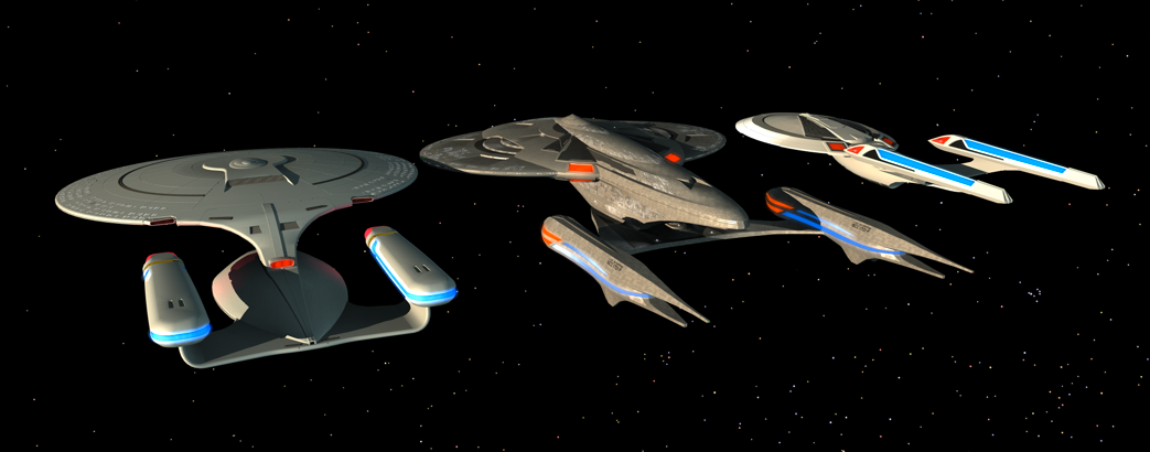
And Dac, that scale looks just about right. Very cool comparison!
I have to say it's not the wow factor your first submission had.
I have to say it's not the wow factor your first submission had.
Well, the first submission was the only submission. The stuff I've done since is just for my own edification. The latest update has been posted on my blog, by the way.
I really wish we knew whether those notifications have been sent out yet or not. Win or lose, I'd just like to know.
I really wish we knew whether those notifications have been sent out yet or not. Win or lose, I'd just like to know.
We use essential cookies to make this site work, and optional cookies to enhance your experience.