Re: Green Lantern's Light!
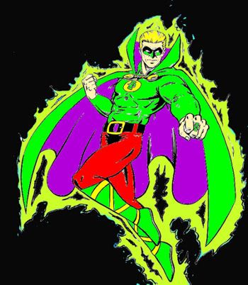
I really liked his costume in Zero Hour. It updates the 40s design without dramatically altering its feel. (As it happens, Zero Hour was only the third Alan Scott story I read; I didn't even realize that his costume had changed until I read an issue of JSA about ten years later.)
Well, Alan's a special case. But I do love him. How can you not love a character named Green Lantern whose costume features so much red and purple?

Oh, I love him too, being a JSA fan. Though I can't decide if it's in spite of the costume or because of it...
I've always loved the Golden Age feel (and the naiveté) of Alan's costume. Whenever they try to modernize or change his outfit, it just leaves me cold. He's a character from the 40s, and I have no problem with him looking it.
I really liked his costume in Zero Hour. It updates the 40s design without dramatically altering its feel. (As it happens, Zero Hour was only the third Alan Scott story I read; I didn't even realize that his costume had changed until I read an issue of JSA about ten years later.)


")