• Welcome! The TrekBBS is the number one place to chat about Star Trek with like-minded fans.
    If you are not already a member then please register an account and join in the discussion!

the old old Bridge...

The Better Bridge...

  • The bridge featured in most of the TOS episodes

    Votes: 21 61.8%
  • The WHERE NO MAN HAS GONE BEFORE bridge

    Votes: 13 38.2%

  • Total voters
    34
  • Poll closed .
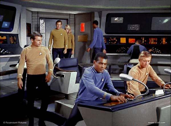
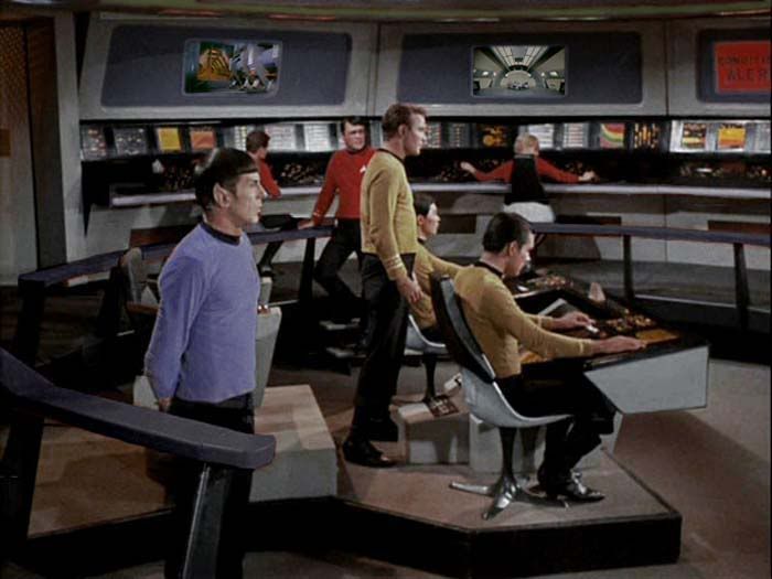
I finally got around to watching WHERE NO MAN HAS GONE BEFORE, the Bluray print, and I have decided that I really like that old old bridge. I think the color patterns and overall look was more, I don't know, serious looking. Nothing against the bridge as it turned out to look in TOS, but that bridge set on WHERE NO MAN.. has a quality to it that I think is missing in later seasons.

Rob
 
I'd rather have the bridge from "The Cage." A much better colour scheme than the WNMHGB bridge. That said if not "The Cage" bridge then I'd prefer the TOS bridge.

Keeping "The Cage" aesthetic.
FicPic63.jpg
 
The bridge set from “The Cage” had a more monochrome, military color scheme, which perhaps made it look more “serious.” But those monitors on goosenecks looked dated by the time the show went into production. Funny thing is, today they look practical in a kind of retro way.
 
I'd rather have the bridge from "The Cage." A much better colour scheme than the WNMHGB bridge. That said if not "The Cage" bridge then I'd prefer the TOS bridge.

Keeping "The Cage" aesthetic.
FicPic63.jpg

Loose the 'gooseneck viewers' and this would've been the perfect bridge.
 
The production bridge was better - better viewscreen, better camera angles (they rotated the captain's chair halfway between two sections for WNMHGB). I kind of like the black surround for the upper wall viewers better than the grey surround, but that's the only thing better about the WNMHGB bridge.
 
My vote goes to the bridge from The Cage. Much more timeless design in its use of shapes and colour.
 
Once they stopped trying to see color tvs, show design got much more believable, IMHO.
 
. . . I liked the look of KIRK's chair in WHERE NO MAN HAS GONE BEFORE. There seems to be a wooden arm rest that I dont remember seeing later on.
The wooden arm rests were always there, in the two pilots and through all 3 seasons of production. They were parts of the Madison office chair that the captain's chair was based on.

two-chairs.jpg

Once they stopped trying to see color tvs, show design got much more believable, IMHO.
Do you mean sell color TV's? Color TV was fairly uncommon in the mid-1960s -- a majority of American households still had only black-and-white television. So Trek's sets, lighting and makeup had to look acceptable in black-and-white as well as color. For example, Spock was originally meant to have a reddish skin tone. The red-tinted makeup tested OK in color, but looked heavy and fake in black-and-white. So he was given a yellowish complexion instead.
 
I like the goose-neck viewers, though I thought they looked silly and '50s B-movie-ish back when I was a kid. (I still do, actually, which is why I like them.)
 
For me, it doesn't matter whether it's the Cage version, WNMHGB version, or production version, or even the Animated version, the TOS styled bridge was always my favorite of all the Star Trek bridges. That bridge IS Star Trek for me. Just a shame the makers of STXI didn't even try to emulate the original bridge.

Were the gooseneck lamps a partial inspiration for the later added 'Sulu-scope'?
 
. . . I liked the look of KIRK's chair in WHERE NO MAN HAS GONE BEFORE. There seems to be a wooden arm rest that I dont remember seeing later on.
The wooden arm rests were always there, in the two pilots and through all 3 seasons of production. They were parts of the Madison office chair that the captain's chair was based on.

two-chairs.jpg

Once they stopped trying to see color tvs, show design got much more believable, IMHO.
Do you mean sell color TV's? Color TV was fairly uncommon in the mid-1960s -- a majority of American households still had only black-and-white television. So Trek's sets, lighting and makeup had to look acceptable in black-and-white as well as color. For example, Spock was originally meant to have a reddish skin tone. The red-tinted makeup tested OK in color, but looked heavy and fake in black-and-white. So he was given a yellowish complexion instead.
Yup. I meant sell. THanks for catching that.
 
I don't like the goosenecks, but I do like the multiple viewer flatscreen monitors above the perimeter stations.

I think the Enterprise bridge is well-nigh perfect. They always screw it up in later incarnations, particularly TNG's "Lido Deck Lounge".
 
Indeed, the TOS Enterprise bridge is one of the most believable and functional set designs in the history of film and TV sci-fi. The only feature that isn't really a practical necessity is the bi-level design with the outer perimeter raised (or the inner portion sunk, depending on your point of view). That was done, obviously, for visual interest, and also to have an excuse to put a railing around the bridge. Why a railing? For Kirk to lean on, of course! Just like his literary progenitor Captain Horatio Hornblower.
 
. . . I liked the look of KIRK's chair in WHERE NO MAN HAS GONE BEFORE. There seems to be a wooden arm rest that I dont remember seeing later on.
The wooden arm rests were always there, in the two pilots and through all 3 seasons of production. They were parts of the Madison office chair that the captain's chair was based on.

two-chairs.jpg

Once they stopped trying to see color tvs, show design got much more believable, IMHO.
Do you mean sell color TV's? Color TV was fairly uncommon in the mid-1960s -- a majority of American households still had only black-and-white television. So Trek's sets, lighting and makeup had to look acceptable in black-and-white as well as color. For example, Spock was originally meant to have a reddish skin tone. The red-tinted makeup tested OK in color, but looked heavy and fake in black-and-white. So he was given a yellowish complexion instead.
Yup. I meant sell. THanks for catching that.

You know what it is? Its the really great color these new prints have. I have never noticed those on his chair before. I have some problems with some colors, and thanks to these BLURAYS, I see so much color now..

Another great explosion of color, for me, is when Kirk comes aboard the bridge the first time in KHAN. It just looks so good on Bluray...

Thanks for the pics!!!...Now I see how they did it..

Rob
 
I like the station displays on The Cage bridge... they lent themselves to a broader interpretation of how they were used. The black area could have been the display with the images within as document windows that aren't all that different from how we view data on our computers today.
 
If you are not already a member then please register an account and join in the discussion!

Sign up / Register


Back
Top