• Welcome! The TrekBBS is the number one place to chat about Star Trek with like-minded fans.
    If you are not already a member then please register an account and join in the discussion!

Why Not More Blue and Gold Shirt Deaths?

Everything changes in TNG and onwards though surely? As the redshirts become goldshirts due to the division swap...

We so need to do an analysis, I'm sure we'd get recognised by... someone... for it! Hehe.

I nominate Shaw! He did a good job with his TOS death graphic! -- RR
 
Yeah, the color scheme in Where No Man Has Gone Before is terrible! I just rewatched it the other night, and noticed there were a couple of folks wearing a darker green color, in particular, a technician in a green jumpsuit who assists Scotty in the transporter room.

Ahh, here he is:

http://tos.trekcore.com/hd/albums/1x03hd/wherenomanhasgonebeforehd461.jpg

So it's not a fourth uniform color, it's just the sort of enlisted-fatigues jumpsuit we occasionally saw background characters wearing, but in green.

Another interesting difference is it seems all the sciences people have that squiggly like scorpion-tail design in their delta patches

I've always interpreted it (and seen it described in some places) as a spiral lightning bolt.

Spiral lightning bolt. Works for me! Glad they just switched to the star in the delta as of TWOK, though. Incidentally, the Reeves' explained that symbol as a representation of warp speed in a novel. -- RR
 
Here's a shot of Gary Mitchell's "red" shirt up against Kirk's gold/green/avacado shirt where you can see the color difference:

1601150046_9ca972550b.jpg
 
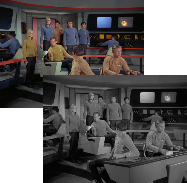
I'm curious... could someone post some images of the "Where No Man" uniforms in black & white? I'm wondering how easy the colors would've been to tell apart on B&W sets, which I'm pretty sure would still have been the majority of TV sets in 1965.
 
Ahh, here he is:

http://tos.trekcore.com/hd/albums/1x03hd/wherenomanhasgonebeforehd461.jpg

So it's not a fourth uniform color, it's just the sort of enlisted-fatigues jumpsuit we occasionally saw background characters wearing, but in green.

I know it's a shadow, but the tech looks like he's wearing a goatee.

Given how many times we saw them, the coveralls could be a uniform, just like class C fatigues. The green could be a divison color like the reds and blues that came late. Green was later dropped.
 
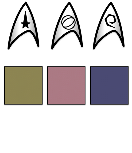
Another interesting difference is it seems all the sciences people have that squiggly like scorpion-tail design in their delta patches (Piper, Dehner, Sulu), associated with operations in the later shows (Scotty, Uhura), while all the operations people have that oval in a circle design in their delta patches (Scotty, Mitchell, Kelso), associated with sciences folks later on (Spock, McCoy).
In the pilots the insignia icon seems to have denoted rank rather than division. This is a graphic I put together a while back of my best analysis of what they were aiming at...

wnmhgb_uniforms.png

I'm curious... could someone post some images of the "Where No Man" uniforms in black & white? I'm wondering how easy the colors would've been to tell apart on B&W sets, which I'm pretty sure would still have been the majority of TV sets in 1965.

wnmhgb_uniforms-2.png
 
We need to figure out what a gold/green/avacado shirt with no stripes and with "command/star" patch means:

3913471557_267ebd6d5c.jpg
 
We need to figure out what a gold/green/avacado shirt with no stripes and with "command/star" patch means:

3913471557_267ebd6d5c.jpg
I think it means that Kirk's stunt double wore one of his shirts (minus the braids) for his shot at getting on screen.

The system wasn't adhered to perfectly... and I'd guess that budget was the contributing factor for most mistakes (like Alden's uniform). In the low resolution, bad picture quality of the 1960's, such mistakes were given a pass if they didn't think it was fully visible... and in the case of Kirk's stunt double, I hadn't noticed the uniform or insignia in the years I had watched on tape on TV, but started seeing the issue on the DVD version on better computer displays.

I'd bet that at the time they were wondering if the public would ever see any of what they were doing at all... much less being analyzed by fans more than four decades later. :eek:
 
I'm curious... could someone post some images of the "Where No Man" uniforms in black & white? I'm wondering how easy the colors would've been to tell apart on B&W sets, which I'm pretty sure would still have been the majority of TV sets in 1965.

wnmhgb_uniforms-2.png

Okay, they seem easier to tell apart that way. Now, how about one with blue uniforms? I linked to a shot from the bridge above, one where there were crewmembers in all three colors.
 
^Dang, in that one the colors all kind of blend together. You can't even tell Scotty and Sulu are wearing different colors, or that Sulu and Piper are in the same color. No wonder they switched to more vivid, distinctive uniform colors in the series proper.

(Selecting colors for black & white film/TV was more of a science than one would think; colors were chosen carefully for their monochrome look and weren't always the ones you'd expect. The reason Karloff wore green makeup as Frankenstein's Monster was because that color translated to black & white as a pasty, cadaverous look better than anything else; the monster was never meant to be actually green.)
 
Well, I got the impression that they picked colors that appeared the same on most B&W TVs so that people would be surprised at what they were missing when they saw color images from the show (like on the cover of TV Guide).

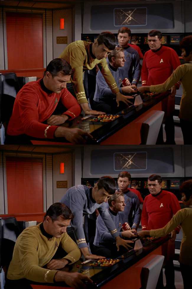
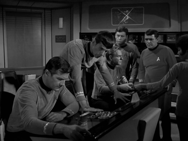
Here are some samples of normal series shots in B&W...

trek_bw.jpg


It is the fact that the colors are so close to each other when desaturated that makes it easy to switch the uniform colors around... like this.

capt_spock_4a.jpg


Because the B&W version turned out like this...

capt_spock_4b.jpg


Personally I didn't mind watching on a B&W TV (after watching the episodes a few hundred times in color)... I had a small B&W TV in my bedroom while growing up and it was great. :techman:
 
^Hmm, you're right... they are all similar in brightness. I'm surprised I don't remember that; I grew up watching the show in B&W, and I definitely remember being amazed at how colorful it was when I got to see it over at a friend's house or at a hotel. (I still remember a time when I got to see "The Immunity Syndrome" in color for the first time on a hotel TV. It must've really left an impression on me. On that same vacation, I also got to see Jason of Star Command in color for the first time, and was startled to learn that Commander Stone had blue skin!)
 
If you are not already a member then please register an account and join in the discussion!

Sign up / Register


Back
Top