• Welcome! The TrekBBS is the number one place to chat about Star Trek with like-minded fans.
    If you are not already a member then please register an account and join in the discussion!

Abram's Enterprise, Version 4

Definitely borderless. My personal preference would also be to reduce the delta in colors between the various shades of blue and gray... but that's just strictly a personal preference.
Ok, borderless it is. :)

I think I might tone down the blue some also... It does look really too blue sometimes.

I'll have some updates out shortly...
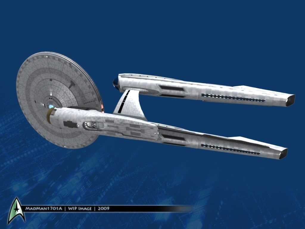
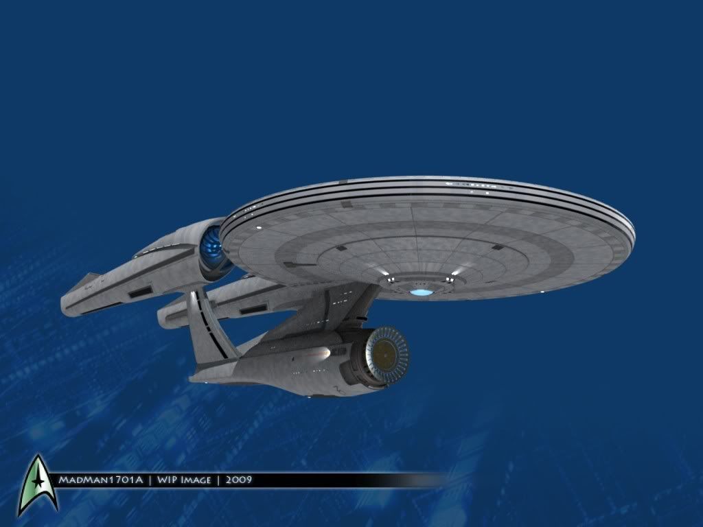
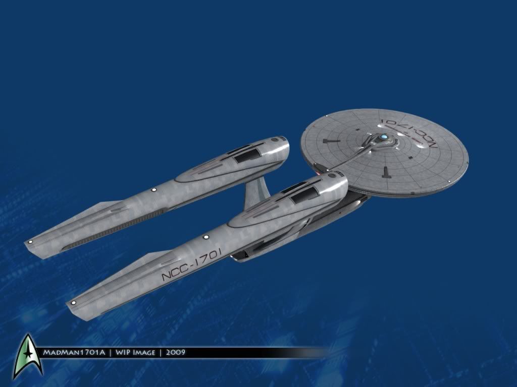
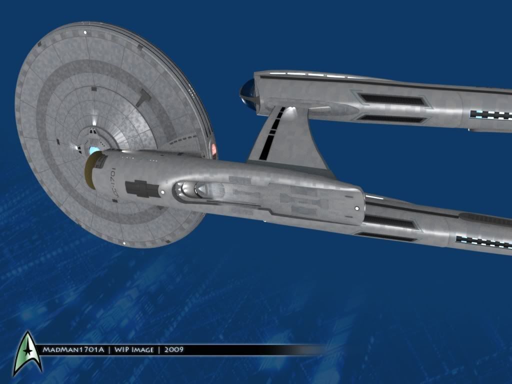
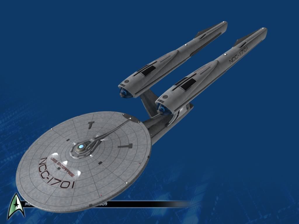
Updates, as promised.... I took out some of the blue, and I think it looks more like natural metal, now. I also took a little of the bright red out of the lettering, and make it more burgundy.

STXI_V4_WIP_082.jpg


STXI_V4_WIP_081-1.jpg


So far, I replaced all my old textures on the saucer. The secondary hull will be a little more complicated. :)
 
OK...finally some updates. I had a small crisis... I moved the old textures to a different folder, to clean up, and forgot one was still assigned to a material! It was causing renders to blow up, and look like all the textures were missing. It took me 3 hours to figure that out...

Anyway... All main textures are done.

STXI_V4_WIP_087.jpg


STXI_V4_WIP_085.jpg


STXI_V4_WIP_086.jpg


is the specular setting a little high, or is it just me? I might tweak it some.
 
Ya know, looking at your version of this ship, as well as seeing the toy of it, makes me like it a whole lot more than I did when the first pics were released. It kinda grows on ya.

--Alex
 
Looking at the new pictures, I think it would benefit a lot from a lower contrast between the dark and light plates and an overall lighter color.
 
Looking at the new pictures, I think it would benefit a lot from a lower contrast between the dark and light plates and an overall lighter color.

If you look at the TMP Enterprise as an example, the paneling shows up mostly in the specular reflections. elton has a thread up in the movie forum showing off caps from the BluRay release of TMP and they give many good reference shots of the surfacing on the model.
 
Well, part of the problem with these latest images is because I didn't know what I was doing with the specular settings. :) Once I figured out which settings to adjust (the "hard" setting, specifically) things look better, and much more subtle. I like the multi colored plates, though... I was aiming at something in between the very subtle plates on the actual ship, and the heavy defined plates on TobiasRichter's model.

Here are the pics...

STXI_V4_WIP_091.jpg


STXI_V4_WIP_092.jpg


STXI_V4_WIP_093.jpg


Much better, I think. :)
 
It looks okay on the saucer, but on the rest of the ship it is distracting to the eye to process all those shapes on already complex forms..
 
It looks okay on the saucer, but on the rest of the ship it is distracting to the eye to process all those shapes on already complex forms..
Hmm. Normally I do go for a lighter, more subtle look... but it makes the ship look like it's plastic, or untextured when it's light really brightly, or if it's rendered from any distance away. The lighting in these images isn't that bright, and is positioned right now mainly so I can see how the specularity works. I think you'll like it better when I render it with a better lighting rig, and it's actually in space. :)
 
OK, I tweaked it a little more...I made the color map not as obvious.

STXI_V4_WIP_094.jpg


STXI_V4_WIP_095.jpg


This looks a little more realistic.
 
Well, part of the problem with these latest images is because I didn't know what I was doing with the specular settings. :) Once I figured out which settings to adjust (the "hard" setting, specifically) things look better, and much more subtle. I like the multi colored plates, though... I was aiming at something in between the very subtle plates on the actual ship, and the heavy defined plates on TobiasRichter's model.

Here are the pics...

STXI_V4_WIP_091.jpg


STXI_V4_WIP_092.jpg


STXI_V4_WIP_093.jpg


Much better, I think. :)

Hideous!

I mean, awesome!

:devil:

Great work. I wish I could wrap my head around Blender, even with manuals.
 
wow!! i love your skills!!

The only parts i dont like about the new enterprise is that the nacelles are too close together and the deflector dish being bigger than the engineering hull

But this is amazing!! good job :D
 
Looking at the new pictures, I think it would benefit a lot from a lower contrast between the dark and light plates and an overall lighter color.
Concur.

(edited to add: Oops--didn't see the latest updates. Looks much better with the specularity enhancements!)
 
The nacelles seem a little long to me, but you can't exactly call me an expert. Otherwise, I like this design better than Abram's version. Seriously. Ask for a job at Paramount. :techman:
 
wow!! i love your skills!!

The only parts i dont like about the new enterprise is that the nacelles are too close together and the deflector dish being bigger than the engineering hull.

But this is amazing!! good job :D

Hideous!

I mean, awesome!

:devil:

Great work. I wish I could wrap my head around Blender, even with manuals.

Thanks, guys.

It's taken be about 5 years to get this proficient with Blender, and I think I have a long way to go still...
 
The nacelles seem a little long to me, but you can't exactly call me an expert. Otherwise, I like this design better than Abram's version. Seriously. Ask for a job at Paramount. :techman:

Well, I've tried to stay as close to the real thing as I could, so there shouldn't be any glaring changes from the real thing from STXI.

A job at Paramount or ILM would be awesome...even though I am way below their level. :)
 
Thanks. :) I think I was just trying too hard. Subtle is better. :)
Always. The trick is to have detail that the viewer doesn't quite see... that we "perceive" without really "noticing." That's what fools us into thinking that we're seeing something real. Too vivid, and it looks cartoonish. Too blank, and it looks cartoonish. Reality is full of subtlety, and the trick is to mimic that sort of subtlety.
 
I totally love this ship after gazing at yours and Tobias wonderful models! The playmates Toy is great but i can't wait for a company like Art Asylum to do up a super detailed and accurate toy/model of this beauty.

Your newest version there MadMan is reaching towards film quality....at least imho. :D
 
If you are not already a member then please register an account and join in the discussion!

Sign up / Register


Back
Top