Ugly design, IMHO. Too many TMP refit parts and the secondary hull is flat out horrible. And to think the Excelsior was once called the "Pregnant Guppy". This one has, hands down, stolen that trophy. I guess they don't have a shuttlebay - a problem considering all those shuttles flying around.
-
Welcome! The TrekBBS is the number one place to chat about Star Trek with like-minded fans.
If you are not already a member then please register an account and join in the discussion!
You are using an out of date browser. It may not display this or other websites correctly.
You should upgrade or use an alternative browser.
You should upgrade or use an alternative browser.
Here it is - no bloody "A", "B" "C" or "D"
- Thread starter Admiral Buzzkill
- Start date
- Status
- Not open for further replies.
Here you go M'Sharak:
Madkoifish's designs:


I don't remember seeing this before. It is much more in line with what I was thinking we'd get: Enterprise on steriods. What we got looks so awkward and quaint I just can't bring mysef to like it. It's like the...grandma car of Enterprises or something. It's 50's nacelles look meek.
Here's hoping the movie is good and the Grandma'prise looks better from other angles.
Lets just call it the Uglyprise!
Lets just call it the Uglyprise!
Ugly would still be prettier than that thing.

I would have went for that one totally Ancient.
My thoughts on the new movie E is like many, disappointment. Im someone who doesnt mind visual continuity not being adhered to exactly. I didnt mind the interior of the TOS-E being mucked with and loved the new uniforms. BUT they really have messed up on the E. It looks like the saucer is exactly like the TMP refit. It even has some of the paint markings, except instead of yellow and red they are gray and black. Looks like someone just took the saucer off TMP and put it on a smaller scale engine section and big ass nacelles. I remember when Enterprise came out everyone said that ship was a lazy design. This one looks like alot of time was spent on the engineering hull and nacelles.(both ugly) and the saucer isalmost an exact copy from TMP.
My thoughts on the new movie E is like many, disappointment. Im someone who doesnt mind visual continuity not being adhered to exactly. I didnt mind the interior of the TOS-E being mucked with and loved the new uniforms. BUT they really have messed up on the E. It looks like the saucer is exactly like the TMP refit. It even has some of the paint markings, except instead of yellow and red they are gray and black. Looks like someone just took the saucer off TMP and put it on a smaller scale engine section and big ass nacelles. I remember when Enterprise came out everyone said that ship was a lazy design. This one looks like alot of time was spent on the engineering hull and nacelles.(both ugly) and the saucer isalmost an exact copy from TMP.
Here you go M'Sharak:
Madkoifish's designs:
I don't remember seeing this before. It is much more in line with what I was thinking we'd get: Enterprise on steriods. What we got looks so awkward and quaint I just can't bring mysef to like it. It's like the...grandma car of Enterprises or something. It's 50's nacelles look meek.
Here's hoping the movie is good and the Grandma'prise looks better from other angles.

Nah, it just looks like the 1701-A with a few bits added on, the movie Enterprise is more along the lines of what is needed. Grandma??? You mean the ship that looks like a muscle car with chrome and souped up engines?? Are we really looking at the same ship??
RAMA
It is horrible.
I was sure that there would be plenty of unnecessary changes for the sake of making the ship look cool, but I did not anticipate that they would utterly fail the "looking cool" part. It is a bloody ugly kitbash.
Madkoifish's and Vektor's designs are way superior, hell, I would even take Koernerprise over this.
Someone above said that this new design lacks grace and I couldn't agree more.
What I love so much about the original look of the Enterprise was that she looked great from every single angle.

And she looked even better after her refit in TMP.
I'm going to hold off on any major criticisms for the moment. It's only this one shot. I would love to have a look at her from a different angle. Although having said that won't change the fact that the secondary hull is far too small, sticks out too far in front and those nacelles are just... I don't know what to think.
I was talking about it with a friend of mine and while we both agree it has that sort of a retro look, why must it? So many people who have seen the trailer, worked on the film, etc have mentioned adding a stroke of realism to the movie. Well, if that's the case, I don't see that reflected much in their design of this new Enterprise. Retro is an interesting word to use though since this looks more retro than the TOS Enterprise.
They want to attract a mainstream audience? They'll see this and probably think it looks silly. Back in 2002 when I saw Nemesis, a friend, who is not a Trek fan at all, saw it with me and he told me that while he didn't care much for the movie, he did think the Scimitar and the Enterprise "looked really awesome."
Hm. I guess I didn't hold off any major criticisms.
What I love so much about the original look of the Enterprise was that she looked great from every single angle.
And she looked even better after her refit in TMP.
I'm going to hold off on any major criticisms for the moment. It's only this one shot. I would love to have a look at her from a different angle. Although having said that won't change the fact that the secondary hull is far too small, sticks out too far in front and those nacelles are just... I don't know what to think.
I was talking about it with a friend of mine and while we both agree it has that sort of a retro look, why must it? So many people who have seen the trailer, worked on the film, etc have mentioned adding a stroke of realism to the movie. Well, if that's the case, I don't see that reflected much in their design of this new Enterprise. Retro is an interesting word to use though since this looks more retro than the TOS Enterprise.
They want to attract a mainstream audience? They'll see this and probably think it looks silly. Back in 2002 when I saw Nemesis, a friend, who is not a Trek fan at all, saw it with me and he told me that while he didn't care much for the movie, he did think the Scimitar and the Enterprise "looked really awesome."
Hm. I guess I didn't hold off any major criticisms.
It is horrible.
I was sure that there would be plenty of unnecessary changes for the sake of making the ship look cool, but I did not anticipate that they would utterly fail the "looking cool" part. It is a bloody ugly kitbash.
Madkoifish's and Vektor's designs are way superior, hell, I would even take Koernerprise over this.
Which is the Vektor design?

For some reason I am sitting here thinking that in 1979 people were having the same reactions to the TMP Enteprise:
Why are the pylons swept back!? That makes no sense!
Where is the dish!? And why is it glowing!?
And WHY WHY WHY ARE THE KLINGON ENGINES ON THE ENTERPRISE?!! AUGH!
While I do have criticisms of the new ship, I think that she looks a lot better then the picture that was posted. If you refer to the side view that was posted from hobbytalk.com, you can see that is is a pretty balanced design when looking at the orthographics. For some reason I don't think this shot does it justice.
number6
Vice Admiral
That middle picture, posted above ... what portion of the ship is that?
The top of one of the nacelles, back near the "fins."

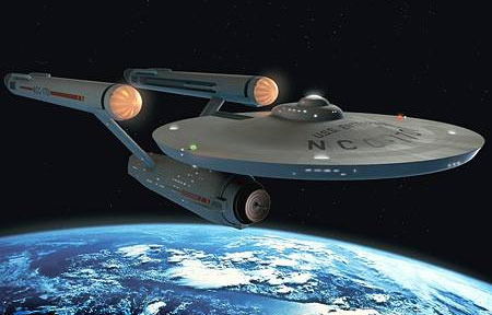
I like the look of the new Enterprise, but damn does the refit from TMP ever look nice!
The primary hull is the most unchanged of all the components of the ship, but I still think it manages to fit in with the rest of the design. I like the way the primary hull connects more towards the middle rear of the secondary hull, allowing the deflector dish to protrude outwards. The connecting strut also seems to be more sturdy looking than either the TOS or TMP design, which is an issue I always felt needed to be resolved. The entire frontal deflector assembly reminds me of an old hot rod, with the engine components exposed to the open air. The tapered design on the secondary hull is nice, and I am assuming the tapered end is the shuttle bay entrance. The connecting struts for the Nacelles, and the Nacelles themselves can be viewed in very much the same manner. The struts look more sturdy, but also have a bow in them which reminds me of the Boeing 787 Dreamliner's wing design. They are connected at the rearmost of the secondary hull to accommodate the recessed primary hull connector strut, which I think looks fine, especially with how the Nacelle struts are designed. The Nacelles themselves are very beefy in the front, and fit well with the hot rod analogy. They seem to have some sort of glass covering on the front, and some have mentioned it looks to be chromed, but I think that might just be a reflection in the glass.
Overall, I like the design of the new Ent. as I think it looks cool while also remaining true to the original design. I cannot wait for the trailer on Friday, and I hope we get a couple of shots of the Ent. in motion from different angles.
btw: Is it me or does this Enterprise look a lot bigger? I guess not that it matters much how large the ship is, but I get the feeling that if you were to place the TOS or TMP Ent's beside the J.J. one, it would dwarf them by a considerable amount.
ST-One
Vice Admiral
That middle picture, posted above ... what portion of the ship is that?
The nacelle - viewed from stern to bow.
ST-One
Vice Admiral
... but damn does the refit from TMP ever look nice. ...
Agreed.
Even after 30 years this is THE most elegant, beautiful starship-design.
Is that registry number visible in the picture anywhere?
- Status
- Not open for further replies.
If you are not already a member then please register an account and join in the discussion!