• Welcome! The TrekBBS is the number one place to chat about Star Trek with like-minded fans.
    If you are not already a member then please register an account and join in the discussion!

Bridge Layout guess

Status
Not open for further replies.

ancient

Vice Admiral
Admiral
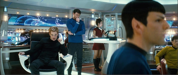
This sketch is based off of the bridge shot with the captain's chair and the group shot in front of the viewer:
stxibridgete9.png

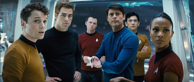
Before anyone says it, yes this is about 75% assumption. I assume the bridge is perfectly symmetrical, for example. I assume there's nothing special just off camera. The proportions, size, and positions are all very loose guesstimations. I assume the nav/helm consol is just a bigger version of that podium since it's not in any shot.

EDIT: This is also slightly oval: 20ft radius on the fwd axis, 22ft radius on the prt/stbd axis.

So...what'd you think?
 
Last edited:
WOW, nice job. Although I think you give it too much area forward in the viewscreen location. I understand why you may have added it, but I think it is forced perspective making it look more recessed then it is.

What are the blue lines?

Also, I think your lift locations are correct I just think the angle is off. I think the doors open roughly in the same plane as the front edge of the sciences console and that the alcove is at an angle which would tuck the turbolifts up next to the outer perimeter of the bridge section instead of extending outwards as they currently are illustrated.
 
The forward section is was a really hard thing to make look reasonable. That picture gives away very little in terms of size, distance. and proportion.

What are the blue lines?
Oh, whoops. The blue lines are the glass circuit-board partitions. The one in the front is the main view-screen.

The red lines are railings.
 
Ok, just to make it absolutely clear where this layout came from:

PHOTO 1:
trk2.jpg


PHOTO 2:
trk6.jpg


What those photos are seeing is in green here:

stxibridgewa2.png


Roughly. The little teal dots are about where the people are standing.
 
I would guess there are probably two less banks of stations (or four of those red dots for seats) and the turbolifts are further back. I think the angle we got in the shot with Kirk in his chair is misleading as well as the one with the viewscreen. But it sounds like a reasonable guess.

Cool.
 
Take a closer look at the sloping area above the rear stations, and then angle that the turbolift doors and the Helm/Nav chairs.

I think the camera angles chosen might be a little off.
 
I think there could be only one turbolift and still be more-or-less symmetrical, just like in TOS. The turbolift in the publicity shot is a bit more "off the centerline" than the TOS lift, but I don't think the difference is too great.
 
Ok, just to make it absolutely clear where this layout came from:

PHOTO 1:
trk2.jpg


PHOTO 2:
trk6.jpg


What those photos are seeing is in green here:

stxibridgewa2.png


Roughly. The little teal dots are about where the people are standing.

The Port turbolift door (behind and to the right of the hostess station) appears to be in the same plane as the aft wall. Follow the makeup mirror lights and the ceiling joint above, and you will see that the vertical door joint is only separated from the ceiling by a piece of molding and not set back much at all. The lift access door needs to be moved in and forward to the circular plane.

ETA: Over Chekhov's shoulder appears to be a - treadmill? Some kind of station anyway.
 
A size comparison to the original bridge: (keep in mind that I guessed the size of the new bridge)
stxibridgecompna4.png

Not much larger. About 120-130%
 
Ok, just to make it absolutely clear where this layout came from:

PHOTO 1:
trk2.jpg


PHOTO 2:
trk6.jpg


What those photos are seeing is in green here:

stxibridgewa2.png


Roughly. The little teal dots are about where the people are standing.

I think the perspective angle on the top shot is really rotated a bit counter-clockwise. Look at the chair at the navigator position. On top of that, your green cone of vision doesn't grab the environmental station like the top picture does. I think the right boundary of your cone of vision should be perfectly vertical in your picture, grabbing both the navigator and helm chairs equally and the environmental station should be where the turbolift is in your picture. Therefore, I think that the turbolift is closer to the TOS position than your picture makes it out to be.

I agree with Eric Cheung about having less stations, too.
 
I don't get the sense there's QUITE as much space between the glass panels and the stations behind them as you have here. Looks like it's probably a tighter squeeze in the pic.

The other thing that seems off, is that for the bridge being as expansive as you have it, Sulu should be a little closer to the camera. Unless the navigation console is really damn long...

But I do like your idea of there being two "hostess stations" instead of just the one. The bridge would look a lot more balanced and the console wouldn't stand out as much as it does now.

In any case, it's a cool looking layout. :)
 
so we had two Sulu pictures with some a few more teases at the bridge
2947578325a2abd14158kq9.jpg


this is the back of the ship. You can kinda of see the hostess.

then sulu's station

31544757np7.jpg
 
Ok, here is version 2.0:

stxib2pw3.png

This is at twice the scale size of the last, hopefully making it easier to read. This version lines up more closely with the two bridge shots. Still not perfect, this is trial and error, but MUCH closer than the first, I think.
 
i am very happy with how the bridge looks like. glad there isn't that "lava lamp" look/lighting to it like the original lol.
 
they've updated those lava lamps with snake lamps

From sulu's station to the view screen that's alot of space up front.

I'd add a line inbetween to depict a step.
 
And also:
stxib2camangleaj7.png

Sorry if the little letters are a bit hard to read. The red spots are about the position of the people in picture 1 and 2.

The green is what we can see in each pic. Anything not in green is total guess-work. Still, I'm getting a bit better of a feel for it.
 
Ok, here is version 2.0:

http://img291.imageshack.us/img291/4946/stxib2pw3.png

This is at twice the scale size of the last, hopefully making it easier to read. This version lines up more closely with the two bridge shots. Still not perfect, this is trial and error, but MUCH closer than the first, I think.
I like this one.

Not exact, as you say, but I think very much in the same ballpark as what we see in the pictures.
:techman:
 
Status
Not open for further replies.
If you are not already a member then please register an account and join in the discussion!

Sign up / Register


Back
Top