-
Welcome! The TrekBBS is the number one place to chat about Star Trek with like-minded fans.
If you are not already a member then please register an account and join in the discussion!
You are using an out of date browser. It may not display this or other websites correctly.
You should upgrade or use an alternative browser.
You should upgrade or use an alternative browser.
First look at Phase II Enterprise for...wait for it...Phase II
- Thread starter Rat Boy
- Start date
Interesting. I wonder if the sets will also be redone to reflect move toward a TMP-era design sensibility.
Interesting. I wonder if the sets will also be redone to reflect move toward a TMP-era design sensibility.
I think they'll at least be adding a second turbolift to the bridge since the computer model looks like it also has the "Mickey Mouse ears" on the top.
It kinda feels a bit early to me for the Big E to look like that. Phase II (fan film series, not aborted series) is said to take place during the unmade 4th season. I'm fine with a refit, I just think it should still be TOS like and during the 5th season gradually move to TMP style. But then again I'm not in charge of this so I'm just stating opinion. I do like the design, however. I just feel it's too early.
Unless they still count TAS as canon, which puts Phase II near the end of Year 4 and the beginning of Year 5, in which case this refit works fine for me.
Unless they still count TAS as canon, which puts Phase II near the end of Year 4 and the beginning of Year 5, in which case this refit works fine for me.
I like it, a nice gap between the two eras. However, does anyone one else feel that she looks, strange? I donno, something about her makes her seem out or proportion. Not a knock on the modeler or anything, he did a fantastic job, but it was something that was bothering me.
I think its the extra windows on the saucer section that make it look a little odd.
I know Dochterman was going off the source material(s) but there's a uniformity to the original Enterprise Design and those windows look a little haphazard to me.
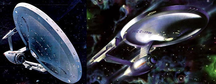
http://trekmovie.com/images/PIIent0000_st.jpg
http://trekmovie.com/wp-content/uploads/Enterprise_5_hr.jpg
Its still a great design, but I'm not sure why Starfleet would cut some extra windows out and board some others up.
I know Dochterman was going off the source material(s) but there's a uniformity to the original Enterprise Design and those windows look a little haphazard to me.
http://trekmovie.com/images/PIIent0000_st.jpg
http://trekmovie.com/wp-content/uploads/Enterprise_5_hr.jpg
Its still a great design, but I'm not sure why Starfleet would cut some extra windows out and board some others up.
but there's blue in the nacelles
I think its the extra windows on the saucer section that make it look a little odd.
I know Dochterman was going off the source material(s) but there's a uniformity to the original Enterprise Design and those windows look a little haphazard to me.
http://trekmovie.com/images/PIIent0000_st.jpg
http://trekmovie.com/wp-content/uploads/Enterprise_5_hr.jpg
Its still a great design, but I'm not sure why Starfleet would cut some extra windows out and board some others up.
I did notice that, but it is something else. I think maybe the nacelle pylons are causing the nacelles to be too low, and that is making the saucer look too big or something.
I know Dochterman was going off the source material(s) but there's a uniformity to the original Enterprise Design and those windows look a little haphazard to me.
Haphzard? Those windows look like shite. Those on the saucer *should* be just like that on TOS. Matt's blue prints reflect that as did Minor's production paintings. That teaser poster for TMP should be disregarded for its psychotic window placement.

Seriously, I hope this is not the final design. You can even see the segments in the saucer!
The nacelle caps should not have lighting.

It's been my dream to see the Phase II Enterprise on screen and now that it is, it's going to look like crap. And from Dochterman no less?

I'd have given body parts to see him do this ship right.

I'm gutted.
Ugly. It looks like a bad kitbash.
-and-
I'd point out that the first use of that design is three episodes away... which can be quite some time in fan productions. Plus (like many of the actors in New Voyages) we haven't exactly seen a consistent version of the Enterprise from episode to episode.I know Dochterman was going off the source material(s) but there's a uniformity to the original Enterprise Design and those windows look a little haphazard to me.
Haphzard? Those windows look like shite. Those on the saucer *should* be just like that on TOS. Matt's blue prints reflect that as did Minor's production paintings. That teaser poster for TMP should be disregarded for its psychotic window placement.
We have a lot of time and nothing is set in stone yet.
Given that, maybe someone with sufficient expertise on the Phase II Enterprise will have a chance to make some helpful suggestions.
It kinda feels a bit early to me for the Big E to look like that. Phase II (fan film series, not aborted series) is said to take place during the unmade 4th season. I'm fine with a refit, I just think it should still be TOS like and during the 5th season gradually move to TMP style. But then again I'm not in charge of this so I'm just stating opinion. I do like the design, however. I just feel it's too early.
Unless they still count TAS as canon, which puts Phase II near the end of Year 4 and the beginning of Year 5, in which case this refit works fine for me.
Actually the pilot script they wrote for Phase II ended up being TMP. So, you've got the En coming out of refit the same way as in the film. I would guess the 2.5 year gap would have existed in the series as well as it did in the film.


Ugly. It looks like a bad kitbash.-and-I'd point out that the first use of that design is three episodes away... which can be quite some time in fan productions. Plus (like many of the actors in New Voyages) we haven't exactly seen a consistent version of the Enterprise from episode to episode.I know Dochterman was going off the source material(s) but there's a uniformity to the original Enterprise Design and those windows look a little haphazard to me.
Haphzard? Those windows look like shite. Those on the saucer *should* be just like that on TOS. Matt's blue prints reflect that as did Minor's production paintings. That teaser poster for TMP should be disregarded for its psychotic window placement.
We have a lot of time and nothing is set in stone yet.
Given that, maybe someone with sufficient expertise on the Phase II Enterprise will have a chance to make some helpful suggestions.
If you look at the segmentation on the saucer's edge, it's pretty clear that it isn't "final edition" stuff. This is WIP.
As for the "suggestions," I wouldn't exactly count on Cawley to care.
I think a big part of why the ship looks out of proportion is that the nacelles are shorter than they are on the original or refit versions of the ship. I'm not sure if that's the way they are on Matt Jeffries' original schematics, but I do remember them looking that way in some of the Mike Minor paintings.
The problem with the Mike Minor paintings is that they are all based on the original 18" study model which was made out of an AMT Enterprise model kit. That study model was done for shapes and shapes alone... Minor improvised the windows and even included the AMT's lower primary hull dimples in his art work.I think a big part of why the ship looks out of proportion is that the nacelles are shorter than they are on the original or refit versions of the ship. I'm not sure if that's the way they are on Matt Jeffries' original schematics, but I do remember them looking that way in some of the Mike Minor paintings.
As for Matt Jefferies' plans, they aren't especially hard to find anymore (here for example), and I put together a raw source reference that I've shared a number of times...
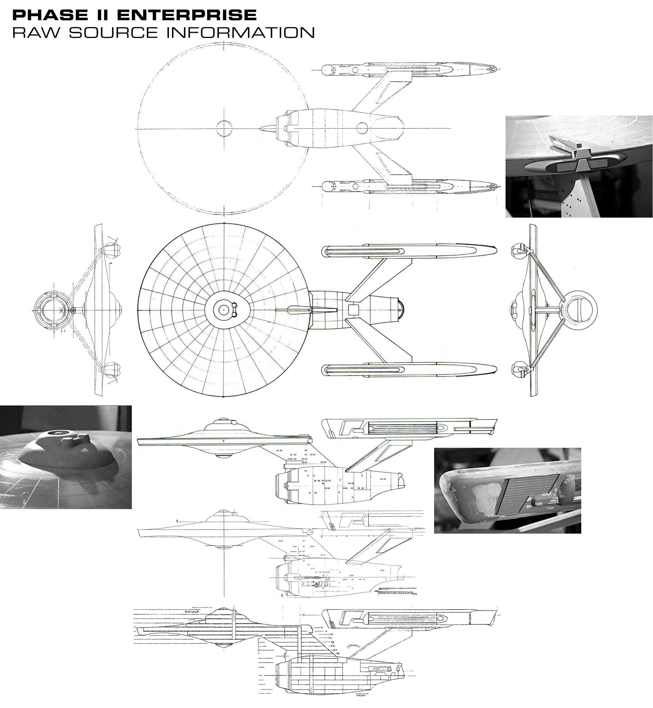
I also did a study of the TOS 11 foot model, the TMP and Phase II Enterprises to get some idea where each of the artists were coming from, and where things might have gone if everyone had worked straight through from the original.
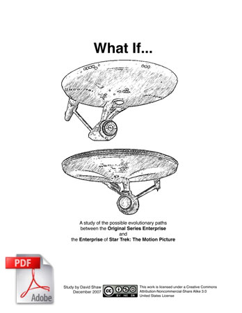
What If? (PDF, 2.3 MB)
So none of this stuff is exactly a secret anymore. And there are any number of people with the expertise to help create an accurate version of the Phase II Enterprise (with Dennis being a perfect example as seen by his work displayed here).
I like it, although the blue saucer domes and nacelle caps are going to take some getting used to.
ST-One
Vice Admiral
I like it, although the blue saucer domes and nacelle caps are going to take some getting used to.
Red/orange phaser-beams in your 'Doomsday'-version?
")
Similar threads
- Replies
- 31
- Views
- 4K
- Replies
- 17
- Views
- 3K
If you are not already a member then please register an account and join in the discussion!