-
Welcome! The TrekBBS is the number one place to chat about Star Trek with like-minded fans.
If you are not already a member then please register an account and join in the discussion!
You are using an out of date browser. It may not display this or other websites correctly.
You should upgrade or use an alternative browser.
You should upgrade or use an alternative browser.
Laura's Paint art
- Thread starter Adventerprise
- Start date
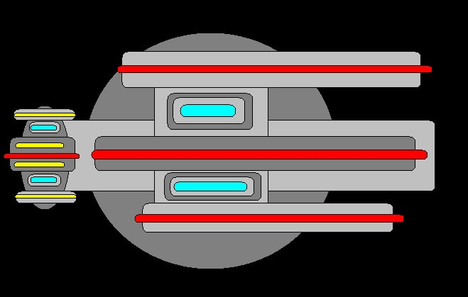
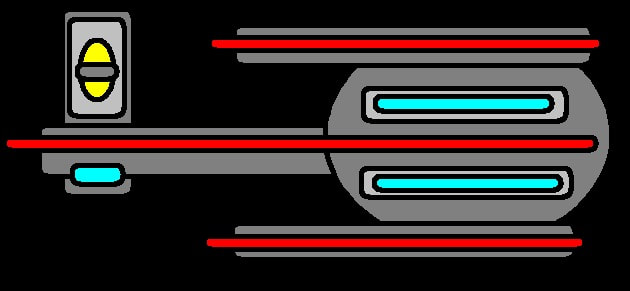
I was originally trying to design a Klingon blade, but I liked it as a ship better.
Last edited:
This could be the underside of a ship, I suppose, rather than the top side.
Last edited:
I’m not sure I understand. The underside of what ship? The one you posted immediately before that? If so, I don't see any way that they could connect. Is the first one a sideview or from what perspective are we seeing the ship?
This could be the underside of the ship, I suppose.
Sorry, I didn't mean the previous ship - I meant that it may resemble an underside more than a top side.
The previous one was a different ship, from above.
The previous one was a different ship, from above.
Ah, gotcha. And I agree, this could be a cool underside. Why don’t you try drawing the same ship but from a different view?Sorry, I didn't mean the previous ship - I meant that it may resemble an underside more than a top side.
The previous one was a different ship, from above.
I also wonder about the colors: Most of your designs are supposed to be Starfleet ships, right? I mean, grey for the hull, glow-y blue bits for warp thingies etc. If so, I feel the yellow and red areas don’t fit the Starfleet vibe too much. As markings, sure. Like on the Cerritos you’ll find red and yellow markings. But they are much more subtle and less in your face compared to how you are using these colors.
Or am I completely off and you’re not trying to emulate Starfleet ships at all?
Yes, Starfleet. The red and yellow are lights or markings. I do these designs with simple shapes on Paint, so if they're not subtle, that's the limitations of the program (which I do like using for this purpose).
Nice artwork.
Ah, cool. It’s a bit like pixel art then, the more I look at it. Having a tool with limitations is actually not the worst thing in the world, because it usually challenges the artist to come up with creative and unique ways to realize their vision.Yes, Starfleet. The red and yellow are lights or markings. I do these designs with simple shapes on Paint, so if they're not subtle, that's the limitations of the program (which I do like using for this purpose).
I think what you could try with your designs – just as a hopefully helpful suggestion – is zoom in on some of the areas and try to make some of those elements (like markings and lights) more subtle and thus clearer to make out for the onlooker.
And I actually think it’s a really good idea to block out your designs with simple shapes like squares, circles and ellipses. But again, I think what you could try is go one level further, zoom in a little and make those shapes come together a little more organically, almost like creating a flow between them. Because what you will end up with is a design that can be read more clearly and looks more like Starfleet ships.
Sorry for the unsolicited advice. I work with creative people on a daily basis, so talking about the creative process with them and how their work could be improved is almost like second nature at this point. I can’t help it.
")
Here’s my try at illustrating what I mean …

Now I’m having some fun with this. Going one step further in bringing the shapes together … looks almost like a relative to the Defiant now …

EDIT: What’s also cool is that in Adobe Illustrator this can quickly be turned into a simple 3D shape. Definitely an interesting combination of forms …

Going one step further in bringing the shapes together … looks almost like a relative to the Defiant now …
EDIT: What’s also cool is that in Adobe Illustrator this can quickly be turned into a simple 3D shape. Definitely an interesting combination of forms …
Wow, @Michael - that's a great extrapolation (and advice) 
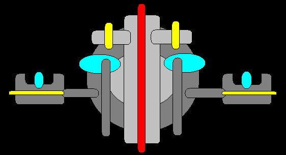
@Laura Cynthia Chambers, I rather enjoy looking at your Paint art and working out what's what and how everything works together. What Michael's illustrated is pretty much what I do in my head. Although, I must admit, I interpreted that particular view as being the aft end of a cylindrical ship with a warp nacelle on either side, but I prefer Michael's Defiant-like take now.
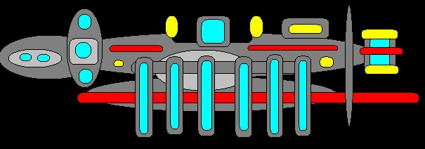
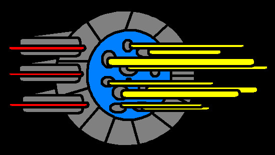
I like this one, too. I imagine this is the side view, with the grey ovals on the left being the front of the ship, and the six vertical bars are large, exposed warp coils (or small, in-line warp rings like the Vulcans use).
@Laura Cynthia Chambers, I rather enjoy looking at your Paint art and working out what's what and how everything works together. What Michael's illustrated is pretty much what I do in my head. Although, I must admit, I interpreted that particular view as being the aft end of a cylindrical ship with a warp nacelle on either side, but I prefer Michael's Defiant-like take now.
I like this one, too. I imagine this is the side view, with the grey ovals on the left being the front of the ship, and the six vertical bars are large, exposed warp coils (or small, in-line warp rings like the Vulcans use).
An interesting long-term project for Laura, if she's interested, would be to produce orthographics; top, bottom, front, back, and side of a single ship. Just to see if she can make it consistent enough to look right. If nothing else, Laura, it will make you a better artist.
An interesting long-term project for Laura, if she's interested, would be to produce orthographics; top, bottom, front, back, and side of a single ship. Just to see if she can make it consistent enough to look right. If nothing else, Laura, it will make you a better artist.
Maybe someday. Most of these designs take about 5-10 minutes to do because I'm mostly using the Paint shapes (circle, oval, rectangle) and fill.
That's kind of why I said long-term. Start with one of the designs you already do, then see if you can figure out how to do other angles for the same design. That, if you have any interest in doing it, would take time, partly from figuring out how you want the other side/end/whatever to look, and then from figuring out how to draw it.Maybe someday. Most of these designs take about 5-10 minutes to do because I'm mostly using the Paint shapes (circle, oval, rectangle) and fill.
It's not an easy thing to do, and people like architects and professional designers go to school learn how to do it, lasting years. I wouldn't expect you to do that. I just wanted to suggest what is essentially a thought exercise, made digital reality, just to see if you could do it. If you're not interested, or if you don't think you will be, you don't have to. I draw with pencil and ink. I know how difficult it can be to come up with good ideas, let alone how to make them real.
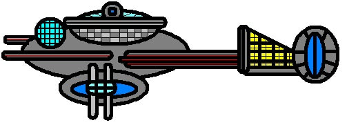
~ Ooh, now this is a special one! I'm going to have fun extrapolating different viewpoints in my head with this unusual ship

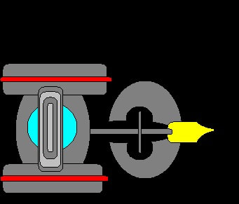
It kinda looks like it's stuck with plungers, doesn't it? 
Similar threads
- Replies
- 5
- Views
- 756
- Replies
- 1
- Views
- 195
- Replies
- 3
- Views
- 607
If you are not already a member then please register an account and join in the discussion!