• Welcome! The TrekBBS is the number one place to chat about Star Trek with like-minded fans.
    If you are not already a member then please register an account and join in the discussion!

Differences between the novel and Lower Decks versions of the U.S.S. Titan.

What version is your overall preferred version of the Titan?


  • Total voters
    20

Borg Queen

Lieutenant
Red Shirt
52133729234_8f3a27a0e0_c.jpg
52133513253_70fce04e3a_c.jpg
52133490141_27457f0781_c.jpg
52133988240_2a3667d684_c.jpg
52132472602_8c0d261a29_c.jpg
52133729564_c880d3bffb_c.jpg
I recently acquired the Lower Decks xl version of the U.S.S. Titan. There are some majorish differences as shown by the pictures of the Eaglemoss models. So, which version or even elements are personally preferred and most importantly, what is cannon?

The differences:

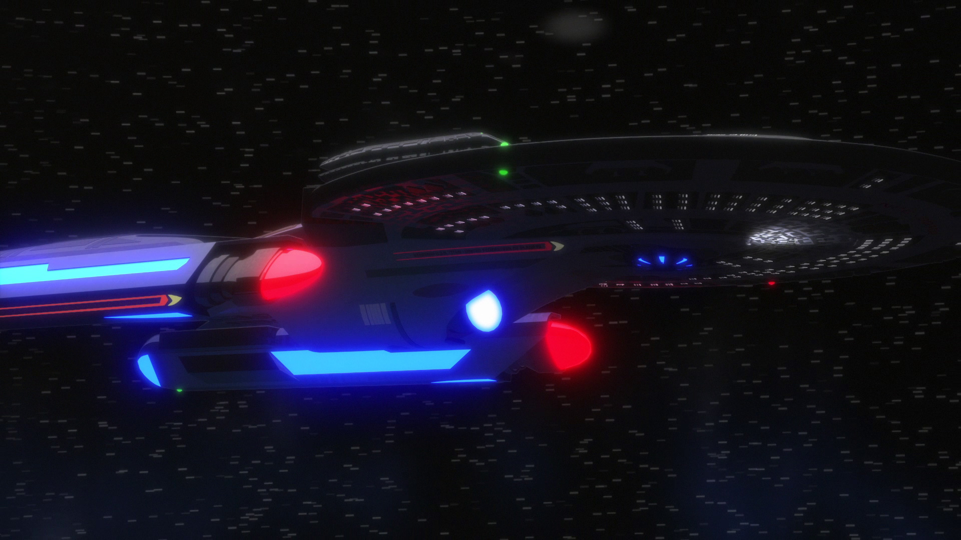
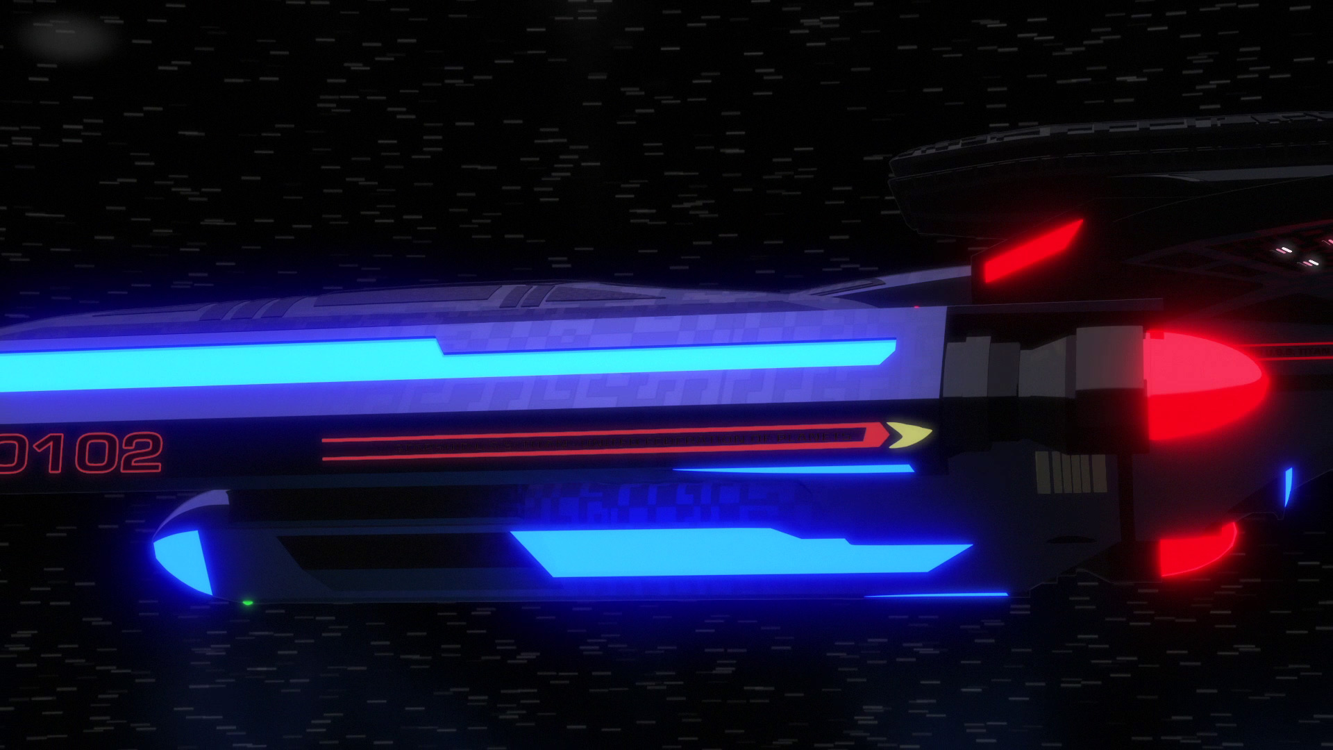
•overall colour scheme is either mostly light grey [novels] or dark purplish grey [Lower Decks].

•with areoshuttle [novel] or omitted [LD].

•Bussard collectors with cowlings [novel] or without [LD]. Also similar in style to the U.S.S. Cerritos' cowlingless engines.

•slight curve to the Titan's name and more space from the registry number [LD]

•the location of the nacelles' pedant and pin stripping is an error on the novels' version so they don't count.

I personally prefer the Lower Decks version of the ship overall except the exclusion of Riker's personal joyride and the colour is a lil too purple.
photo.php
 
Last edited:
I prefer the crew of the novel. Mainly because Tuvok was there.
The ship itself is pretty similar, but the mission of it was different in the books.
 
I was asking about the differences between Eaglmoss models but yeah since you read the novel(s) you can have an opinion on what crossed over. It would've been even cooler if Tim Russ had a cameo in any of the LD episodes featuring the Titan.
 
I don’t think you can properly compare them since the new one is more detailed. It wouldn’t be fair
 
Look at the pics I finally got to post. There's real differences. Especially for Riker and Troi has they don't have an areoshuttle to have private getaways to Risa.

I had to get a Flicker account just to accomplish this!
 
Last edited:
110-no-small-parts-794.jpg
110-no-small-parts-795.jpg
No, that's just it. The lack of an areoshuttle and no cowlings was the bigger xl version. So, it's not a scale/size effect on detail. The xl has all the same detail of the smaller one. Even more detail than the animated version which also has no nacelle cowlings or areoshuttle detail.
 
Last edited:
The purple hue doesn't fit the rest of the fleet though. And it's darker than the Akira, which was designed as a much more militaristic vessel, and that one is darker than the novel Titan. The Titan was supposed to be a return to peaceful exploration, with teeth though.
52134541687_77e12cb91a_c.jpg
52135804759_4eeea5bf5d_c.jpg
 
Last edited:
most importantly, what is cannon?
The Lower Decks version of the ship is canon, since it actually appeared on screen in a canon TV show.
The other one existed in novels set in an alternate timeline which has since been destroyed and had its existence negated.
 
The Lower Decks version of the ship is canon, since it actually appeared on screen in a canon TV show.
The other one existed in novels set in an alternate timeline which has since been destroyed and had its existence negated.

There you go!
Lol.

But, if it's shown on screen in a life action scene...
Oh yeah, Picard "The Stargazer..."

fleet1.jpg
Can't quite make it out...:wtf:
 
I prefer the crew of the novel.

I clicked on the thread because I thought it was going to be about the differences in the crew! :lol: Of course I prefer the novel version of the crew, but it's not really fair to compare a series of novels against a few scenes in a handful of episodes in a half-hour show. What little of the Titan crew we saw in LD weren't fleshed out at all... most of them didn't even have names.

I don't really have an opinion on the models shown. Other than the colour, the main difference seems to be that the book version is somewhat blurrier. ;)

But if I have to pick something to have a preference over, I prefer the modified font based on Microgramma Bold Extended from the book version, which was used in the pre-Kelvin movies and TNG through VOY, over the baseline Microgramma Bold Extended on the LD version, which the new streaming series prefer.

titan-font-comparison.jpg


Does that count? :lol:
 
They look the same to me. One's animated the other live action-style CG. I doubt any of the differences "really" exist any more than the Enterprise in TAS had a few differences from how it looked in TOS.
 
I clicked on the thread because I thought it was going to be about the differences in the crew! :lol: Of course I prefer the novel version of the crew, but it's not really fair to compare a series of novels against a few scenes in a handful of episodes in a half-hour show. What little of the Titan crew we saw in LD weren't fleshed out at all... most of them didn't even have names.

I don't really have an opinion on the models shown. Other than the colour, the main difference seems to be that the book version is somewhat blurrier. ;)

But if I have to pick something to have a preference over, I prefer the modified font based on Microgramma Bold Extended from the book version, which was used in the pre-Kelvin movies and TNG through VOY, over the baseline Microgramma Bold Extended on the LD version, which the new streaming series prefer.

titan-font-comparison.jpg


Does that count? :lol:
Good question.
 
But which one is canon?
I think some guy already answered that one above.
The Lower Decks version of the ship is canon, since it actually appeared on screen in a canon TV show.
The other one existed in novels set in an alternate timeline which has since been destroyed and had its existence negated.
 
If you are not already a member then please register an account and join in the discussion!

Sign up / Register


Back
Top