-
Welcome! The TrekBBS is the number one place to chat about Star Trek with like-minded fans.
If you are not already a member then please register an account and join in the discussion!
You are using an out of date browser. It may not display this or other websites correctly.
You should upgrade or use an alternative browser.
You should upgrade or use an alternative browser.
Favorite Trek Book Covers of All Time – and Why!
- Thread starter Arpy
- Start date
I always loved the Foul Deeds Will Rise cover. It reminded me of those great 90s novel covers.
What’s memorable about the book? I know it’s one of a few that also tell the final tale of the TOS crew, right?
This book is really about McCoy and he's my favorite character, one of the reasons it always stuck with me. You can listen to the episode review, we talk all about it.
I always loved the Foul Deeds Will Rise cover. It reminded me of those great 90s novel covers.
By Joe Corroney, to give it credit where it's due.


I loathe NEM, but the cover of Titan Book I: Taking Wing, a cover largely comprised of images from that movie, looks gorgeous. I remember being at the bookstore and being compelled to pick it up. The reptilian character on the cover of Orion's Hounds also did the same for me -- again, I like seeing the new characters especially as I know what the regulars look like -- and I loved that book inside and out.
Another cover that instantly grabbed my attention was the one for The Buried Age. You want to know what Picard is looking at, what age was buried and why, and just the overall presentation of artwork and text is strong.
A cover that I didn't initially like was that for A Context of Principles. It offers nothing we haven't seen before, but the graphic design just works. It looks like an image in motion, like you're looking at a promo for next week's episode, and you want to tune in.
The first two books in the Stargazer series had these amazing painted covers, text issues notwithstanding. (Young Picard was a total hunk on the cover of Valiant. I've never seen a better image of Stewart with hair. No comment about the rest of the cover.)
Whoever did Do Comets Dream? mentioned above must have also done Gemini. I'm a sucker for "celestial glow," so the covers for that, the Constellations TOS anthology, and the reprint of Strangers from the Sky also did it for me. Beautiful. I was going to throw the VOY anthology Distant Shores on this list too, but looking at it again, it's mostly the dazzling background image that does it for me. The ship needed work to better fit with the rest of the cover.
Speaking of VOY, I think the cover of the Voyager Companion is probably the best of all the companions. I loved a lot of the painted early VOY novels (Violations, Cybersong, Marooned, Echoes, The Nanotech War), but the bold simple one for Full Circle also I think is amazing. (Children of the Storm too.) Perfect book to throw in our bag and take old friends with you.
I think of the Prometheus as a toy Berman dreamed of selling as three separate pieces that kids would have to combine like a Transformer, but the cover of the German novel The Root of All Rage is admittedly kind of stunning. The font for the title "Prometheus" itself could have used more character.
This IS the Tellarite homeworld to me.
This WAS the 1990's to me.
It's difficult for me to separate these books from their covers, as they took my love for Treklit into overdrive, but, yeah, these two. Taran'atar never looked better. "His eyesss...his eyessss..."
Last edited:
Another cover that instantly grabbed my attention was the one for The Buried Age. You want to know what Picard is looking at, what age was buried and why, and just the overall presentation of artwork and text is strong.
I saw the cover early enough that I was able to rewrite the scene it depicts to work in some of its visual details and tone, and it improved the scene considerably. (I often fall short when it comes to describing the settings in my fiction, so the original version was quite bland.)
Another cool thing is that the teaser excerpt on the first page inside the front cover picks up exactly after the moment depicted on the cover. So they go together perfectly.
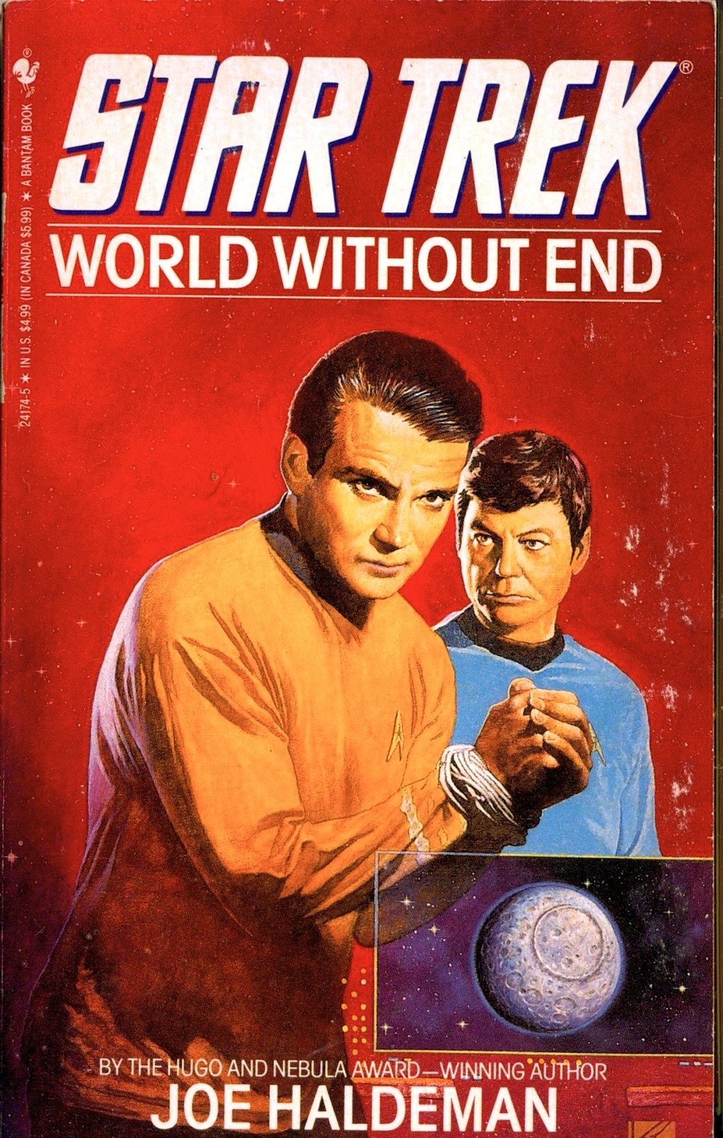
i didn't feel the book was top tier but the cover was astounding. this was the era of big font titles on hardcover releases, which was a shame when you see the detail that ended up being covered. if this were being printed today we'd see the title at a third of that size in a more reserved font.I've always loved the cover for Shadows on the Sun. A beautiful cover and I love the book.
we lost one of the Star Trek greats when Mr. Birdsong passed
i felt like that was the weakest element - along with The Fearful Summons, Ashes of Eden and the Last Roundup, there were a number of competing versions all trying to shoehorn in additional missions taking place in the Undiscovered Country/Generations interim. if i recall correctly the opening scene is right as the signature credits were rolling, President Red Foremanaii calls them up and say 'oh darn i know you just retired, but we got a stop we need you to make, there's literally no other ships' i know the consensus was to tell them to 'go to hell' regarding the decommissioning, it just struck me as really hokey.What’s memorable about the book? I know it’s one of a few that also tell the final tale of the TOS crew, right?
granted, of the short list i just cited, it probably one of the better post-ST6 contrivances, as it really deals with McCoy at the retirement-from-Starfleet phase of his life (although even then we knew he wasn't retiring)
A strange alternate future where captains, commodores and admirals wore greenI really like the cover art for Shadows on the Sun and The Tng cover art Imzadi by Keith Birdsong.
i felt like that was the weakest element - along with The Fearful Summons, Ashes of Eden and the Last Roundup, there were a number of competing versions all trying to shoehorn in additional missions taking place in the Undiscovered Country/Generations interim.
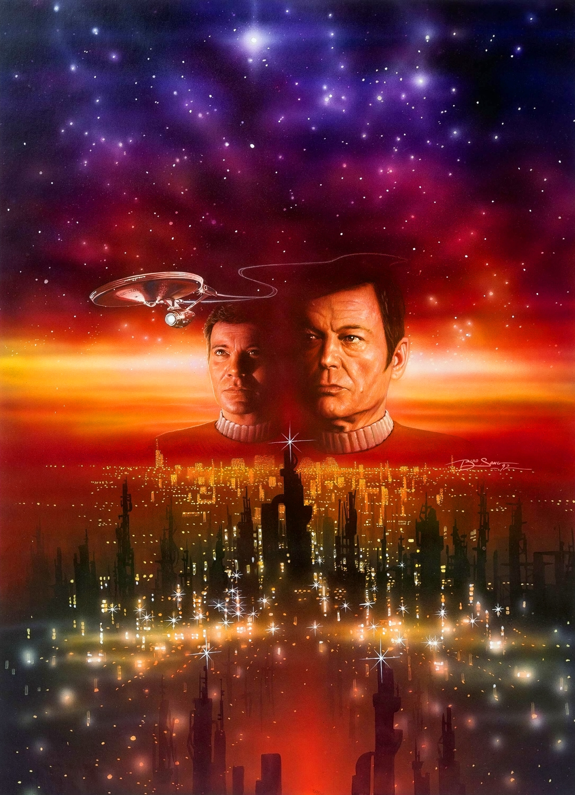
Shadows on the Sun was one of three that came out soon after TUC and before GEN, the others being Best Destiny and Sarek. Best Destiny actually reverses the Enterprise's decommissioning at the end, something I'm surprised Diane Carey was allowed to do. Sarek just ignores it and has the ship still in service after TUC without comment. Shadows merely inserts one last mission as a "detour" on the way back to Earth for decommissioning, so it's the only one that doesn't conflict with the movie's ending. The three you mention came later and all took place after the E's decommissioning. I don't think Roundup even involves the Enterprise.
if i recall correctly the opening scene is right as the signature credits were rolling, President Red Foremanaii calls them up and say 'oh darn i know you just retired, but we got a stop we need you to make, there's literally no other ships' i know the consensus was to tell them to 'go to hell' regarding the decommissioning, it just struck me as really hokey.
No, I just checked, and it's a commodore who contacts them some time after the movie ends. And it's justified because the mission involves a species McCoy has a history with.
Thank you, i had forgotten Best Destiny and Sarek.Shadows on the Sun was one of three that came out soon after TUC and before GEN, the others being Best Destiny and Sarek. Best Destiny actually reverses the Enterprise's decommissioning at the end, something I'm surprised Diane Carey was allowed to do. Sarek just ignores it and has the ship still in service after TUC without comment. Shadows merely inserts one last mission as a "detour" on the way back to Earth for decommissioning, so it's the only one that doesn't conflict with the movie's ending. The three you mention came later and all took place after the E's decommissioning. I don't think Roundup even involves the Enterprise.
Enterprise or not, I'm just saying that going on a half dozen more missions is the opposite of retirement. its not a matter of continuity or being contradictory, its more of a thematic thing - Kirk regretting being retired in Generations, in the same calendar year, doesnt make as much sense when he hasnt actually spent any time being retired. The whole curtain call with the signature sequence loses a bit of punch when they just keep going with an entire new series. it rubbed me the wrong way.
Enterprise or not, I'm just saying that going on a half dozen more missions is the opposite of retirement.
Except that none of those books were written to be in continuity with each other, because the books didn't do that in those days. Indeed, the first three all take mutually contradictory approaches to what happened after TUC. And IIRC, both Ashes and Roundup show Kirk actually going ahead with his retirement before getting dragged into events which are not official Starfleet missions.
i didn't feel the book was top tier but the cover was astounding. this was the era of big font titles on hardcover releases, which was a shame when you see the detail that ended up being covered. if this were being printed today we'd see the title at a third of that size in a more reserved font.
we lost one of the Star Trek greats when Mr. Birdsong passed
i felt like that was the weakest element - along with The Fearful Summons, Ashes of Eden and the Last Roundup, there were a number of competing versions all trying to shoehorn in additional missions taking place in the Undiscovered Country/Generations interim. if i recall correctly the opening scene is right as the signature credits were rolling, President Red Foremanaii calls them up and say 'oh darn i know you just retired, but we got a stop we need you to make, there's literally no other ships' i know the consensus was to tell them to 'go to hell' regarding the decommissioning, it just struck me as really hokey.
granted, of the short list i just cited, it probably one of the better post-ST6 contrivances, as it really deals with McCoy at the retirement-from-Starfleet phase of his life (although even then we knew he wasn't retiring)
Thank you so much for sharing this picture! I’ve wanted a large size of it for years!
I saw the cover early enough that I was able to rewrite the scene it depicts to work in some of its visual details and tone, and it improved the scene considerably. (I often fall short when it comes to describing the settings in my fiction, so the original version was quite bland.)
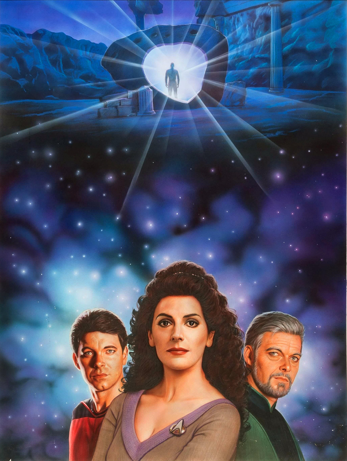
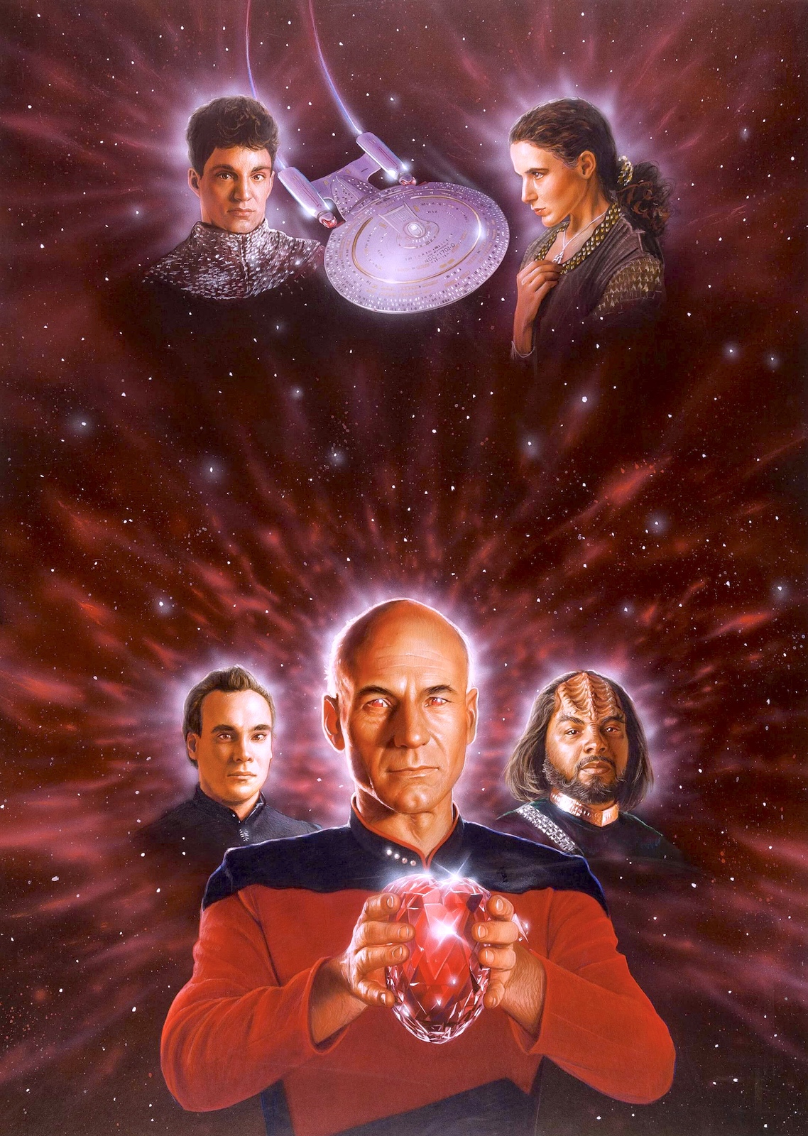
I saw the cover of DRAGON'S HONOR early enough that I actually beefed up Beverly's part since I knew she was going to be one of the floating heads on the cover.
You're welcome! if you want to PM me i could tell you a thing or two about it that i might not want to put on the public webThank you so much for sharing this picture! I’ve wanted a large size of it for years!
With all due respect*, Mr. Bennett, i know you like to be a contrarian and follow every post i make with an opposing view; as well as take the role of continuity police to explain and overexplain points like this, but i am well aware of the nature of continuity in that era - and my comment was that thematically, the placement of this and other novels in that period of time rubbed me the wrong way (regardless of the fact that they may or may not have been in continuity with each other, they were all published)Except that none of those books were written to be in continuity with each other, because the books didn't do that in those days. Indeed, the first three all take mutually contradictory approaches to what happened after TUC. And IIRC, both Ashes and Roundup show Kirk actually going ahead with his retirement before getting dragged into events which are not official Starfleet missions.
Now i understand you've taken it upon yourself to police all mentions of continuity here, but one thing you don't get to do is tell me how i feel or should feel about books i read. this thread is not for analyzing continuity or even placing reviews. my initial contribution to the thread was that i loved the cover and wanted to show the large art, but i thought the book was "meh" (not even bad, just that it rubbed me the wrong way).
you corrected me that i was remembering a scene from Best Destiny and not from Shadows On The Sun, and i thanked you for doing that and clarified what i meant. and you could have left it at that.
*as to "with all due respect", there's a Peter David book with a nice bit about how this phrase is used, if you feel like looking things up
as to THE TOPIC of the thread - the works of Kazuhiko Sano are excellent and they bear an honorable mention - for a consistent application of "the artist read the book and crafted details of the art to fit the story" - these were covers for the 1990s re-releases of the Bantam line so obviously lead-time was a factor - but the artist pays close attention to settings and and visual descriptions in the text - down to the tailoring of the costumes
With all due respect*, Mr. Bennett, i know you like to be a contrarian and follow every post i make with an opposing view;
Huh? Sorry, but I have no idea who you are or what comments of yours I might have responded to in the past. I don't generally pay much attention to posters' names except for the more familiar ones, since they're mostly just a bunch of indistinguishable aliases -- also because they're on the left side of the screen and I don't see well out of my left eye. I respond to what is said, not who says it. Most of the people here are complete strangers to me, and all I see are words on a screen, so there's no reason I should have any personal intent or stakes in any of it.
A couple already mentioned above that I want to highlight again are Articles of the Federation and Immortal Coil. Both are memorable from the moment you first see them....the phrase "platonic ideal" comes to mind, but I may be overhyping.
Another like this for me is Day of the Vipers, which you love even more seeing it with the rest in the series.
Some covers just trigger something in your brain and demand that you read them. Seeing Evil Picard on the cover of Dark Mirror totally did that for me. I'm still scared of that man. Of the Evil Picard that we never saw but know is out there in some parallel universe somewhere...waiting...planning. And Picard's eyes in The Devil's Heart still haunt me decades later.
Worf's First Adventure is darling, and I would totally have read it as a kid if my parents weren't so stingy.
Imzadi Imzadi Just a great solid cover, especially if you've read the book inside.
I've been looking at a lot of TNG covers today. love it when the text and art are in harmony with one another. Rogue Saucer, The Death of Princes, and Intellivore all look great. And then there's Maximum Warp Book II, with gorgeous art and WTF text and rainbow bars. Metamorphosis is another good one for that. It does look like a fun book, but the cover screams late 80's pulp.
Though "period" can be fun. There's something cool about The Children of Hamlin. Now, Survivors and I look at and think "tender coming-of-age novel," like a 70's reprint of A Separate Piece or something. Though that's more on my "so bad it's good" list...along with Battle of Betazed, and my personal favorite To Storm Heaven.
Graphic novels: I don't actually like a lot of these ships, aliens, tech in-universe, but the covers for Ill Wind are undeniably spectacular. The Worst of Both Worlds #4 is one of the earliest comics I ever bought for myself, based on that title and cover. I looked for the other three after picking up 4.
Some covers just trigger something in your brain and demand that you read them. Seeing Evil Picard on the cover of Dark Mirror totally did that for me. I'm still scared of that man. Of the Evil Picard that we never saw but know is out there in some parallel universe somewhere...waiting...planning. And Picard's eyes in The Devil's Heart still haunt me decades later.
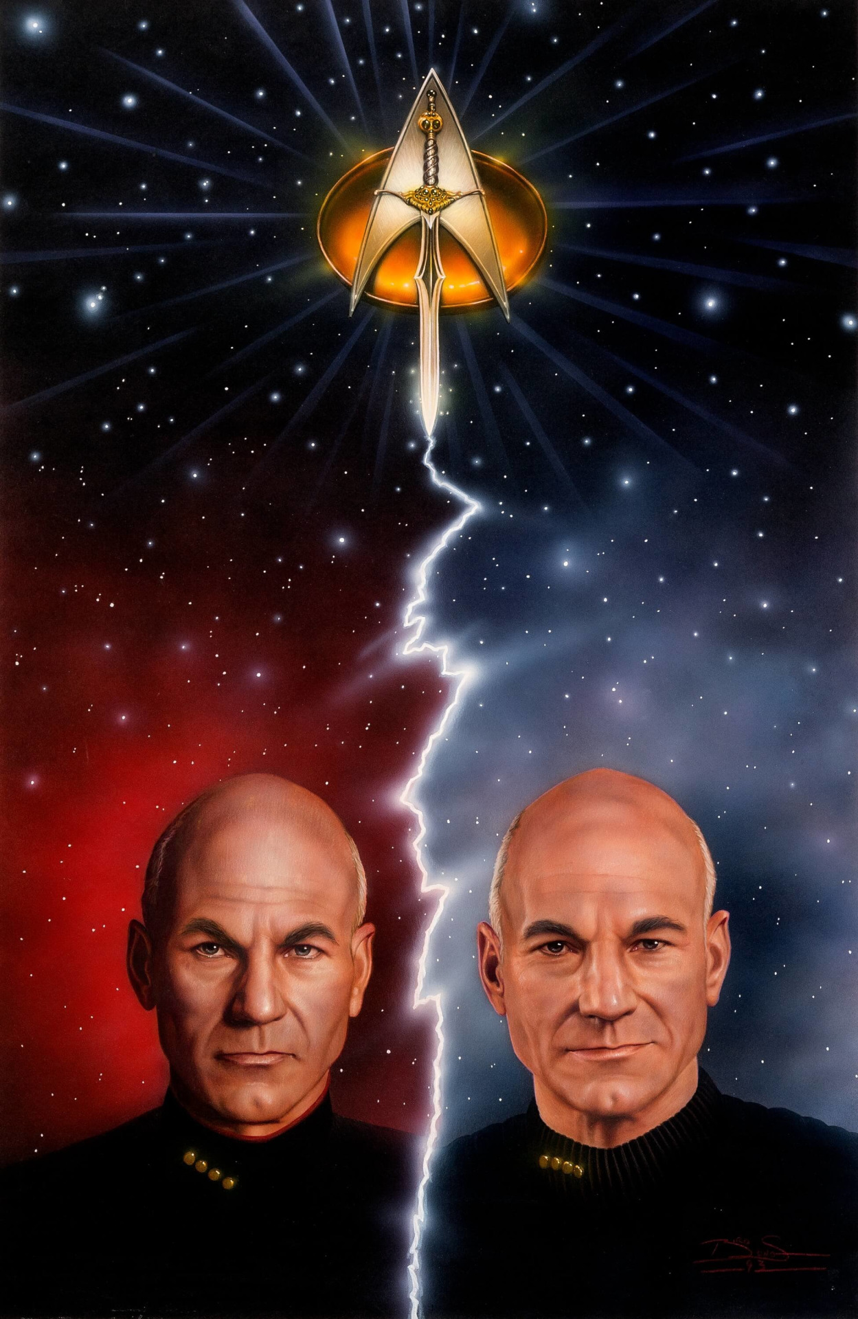
^ Those are great! I usually take in the whole cover together. It’s an interplay of text and art, foreground and back, font and color, yadda and yadda. But I love looking at the art separately too because it’s all just good. Also, tell me that Klingon on the Devil’s Heart cover doesn’t look like Uncle Phil from Fresh Prince of Bell Air.
Similar threads
- Replies
- 129
- Views
- 5K
- Replies
- 19
- Views
- 1K
- Replies
- 6
- Views
- 3K
- Poll
- Replies
- 22
- Views
- 2K
- Replies
- 28
- Views
- 5K
If you are not already a member then please register an account and join in the discussion!