and I think a 32nd century starship would look that radically different after another 800 years of spacecraft evolution.
Apart from the registry number font, that stays the same
and I think a 32nd century starship would look that radically different after another 800 years of spacecraft evolution.

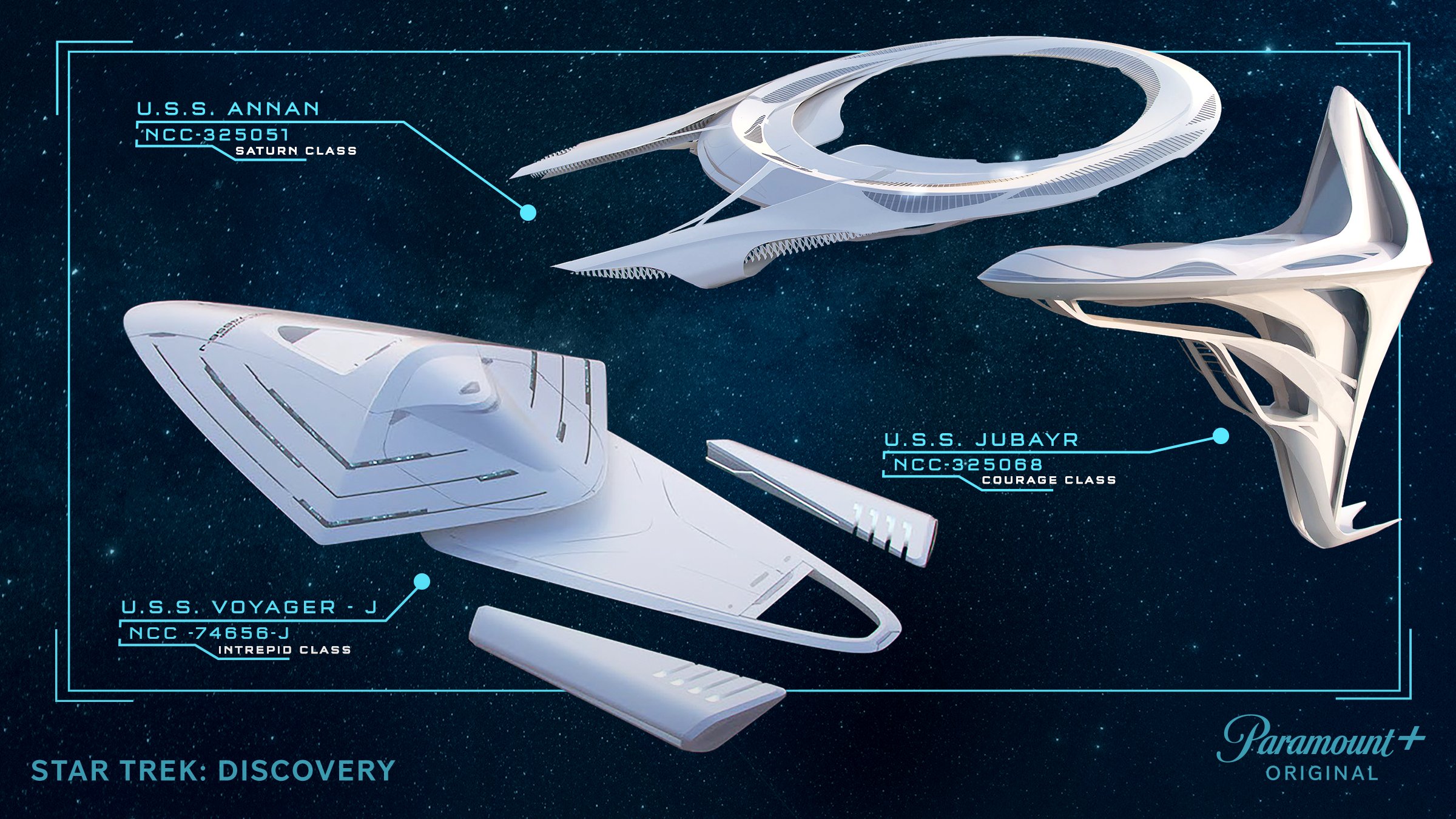
Courage Class in STO. In game. In Season 3 you see this ship flying in both directions, so they built that into an ability in the game.
")
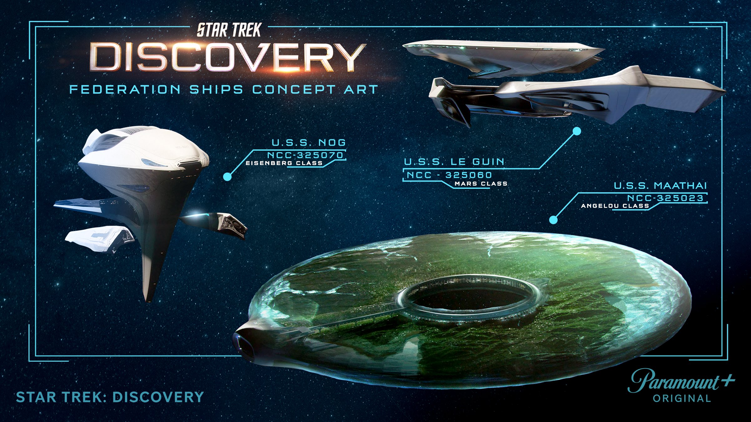
I've always said, TNG-onward era Trek should have the bridge be a forest, where they all sit in comfy outdoor sofas all fly the ship with their iPads.I'm sure this has been posted already, but I want to see a show set on the Maathai (maybe the show after Discovery they can do that), that would be insane...
Or any of those ships for that matter.
Or any of the other ships...
In a movie set in the 32nd century they could do something with the Maathai, probably... That U.S.S. Nog could be the main ship for a movie though.
So much cool stuff.
Hooray, future!
 BUT I googled them to see if in-universe they happened to look better and it's so noticeable just how terrible the space visuals are on these new shows. Barely any clear, WELL LIT shots of them. Everything so contrasty and blurry it's hard to see anything.
Not a fan of most of those designs, they're a bit non-sensical from a practical pov (a trademark of Eaves), the Mars and Eisenberg Classes are just
Eaves isn't on Discovery anymore, he only worked on Season 1. He's over on Picard and Prodigy now.(a trademark of Eaves),
Eaves designs make sense, they're not non-sensical.
The giant shuttlebay and enormous impulse engines on the Inquiry Class?
The cutouts on the 1701 nacelle pylons?
The paper thin Romulan ships on Picard?
Those weird knives sticking out of the Klingon raider in Discovery?
The cutouts on the Discovery saucer?
To be fair I didn't realise he didn't design those 31st century ships. In hindsight, they don't look like his work at all. Light hull colouring + smooth lines is as far away from his style as possible, so it should have been obvious.
I can see it just fine.Good ships. Bad lighting. I mean, come on DSC, your producers have $7 million per episode to spend and you light starships like a guy with a candle walking into a cave.

The giant shuttlebay and enormous impulse engines on the Inquiry Class?
The cutouts on the 1701 nacelle pylons?
The paper thin Romulan ships on Picard?
Those weird knives sticking out of the Klingon raider in Discovery?
The cutouts on the Discovery saucer?
We use essential cookies to make this site work, and optional cookies to enhance your experience.
