Except for all the times in World War 2 that ships were so drastically refit from keel to outer hull that they were practically unrecognizable.
People have already argued that point with him several times, he doesn't budge.
Except for all the times in World War 2 that ships were so drastically refit from keel to outer hull that they were practically unrecognizable.
Except for all the times in World War 2 that ships were so drastically refit from keel to outer hull that they were practically unrecognizable.
People have already argued that point with him several times, he doesn't budge.
Interesting. I find John Eaves to be the best Trek designer there has ever been. His stuff just does it for me. The Enterprise-E alone is a masterpiece. I hope he's tasked with the modernization of the 1701 if we see it.


He is a good designer, but all his designs are very samey. They're angular and full of sharp edges, regardless of the era or the faction.
I like his art.
But as a Star Trek ship from the 23rd century? Well, it's really busy, with racing cutouts - elements of organic curves, and sculpted cowlings that look like they could be something out of Halo - and all three other examples of ships from this era - JJ Abrams Kelvin Timeline, The Original Series, and The Motion Picture era - they are not. If the problem is not with the artist, who cannot help but do what they always do, then perhaps the producers should consider what message they want to send through designs. The USS Kelvin, for me, was a perfect connecting design, for the era - looking detailed enough for modern audiences, yet feeling perfectly like a 23rd century design.
That's my problem with Eaves' Federation designs, they're way too angular, samey and unmemorable, with a few saucer cut-outs thrown in (cause why not). Give me the clean lines and classic beauty of the Excelsior, Constellation, Miranda, Oberth, Nebula etc over anything he's done.
The Klingon ships are pretty bad too. Not a single memorable shape to them, and way too messy in terms of detailing.
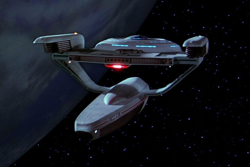
I kinda like the idea that on the Grissom - basically a science scout ship - the entire secondary hull is one big unmanned sensor pod.i can't think of a ship more stupid than the oberth-class - there are three ways to get into the secondary hull
- through a nascelle
- by shuttle
- beaming
I kinda like the idea that on the Grissom - basically a science scout ship - the entire secondary hull is one big unmanned sensor pod.

I kinda like the idea that on the Grissom - basically a science scout ship - the entire secondary hull is one big unmanned sensor pod.
I don't know if this is the same one he is referring to, but the only MSD-like drawing I saw was the turbolift indicator map as Saru and Burnham were riding up to the bridge during the battle simulation.@Timo, how did you conclude that Discovery's shuttle bay is five decks tall?
Also, in what scene is the MSD visible?

Well maybe not in those fan-made and entirely uncanon deck plans.not gonna happen

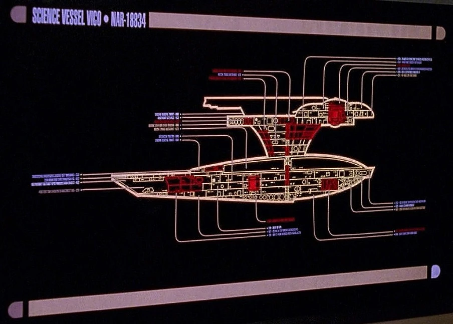
They were on-screen (TNG: Hero Worship), but it's worth noting that they were contradicted by the shots of the SS Vico where the saucer had four decks rather than two.Its not. We have seen deckplans on screen. 13 decks total, that whole secondary hull is deck space
Well maybe not in those fan-made and entirely uncanon deck plans.
They were on-screen (TNG: Hero Worship), but it's worth noting that they were contradicted by the shots of the SS Vico where the saucer had four decks rather than two.
I'm not suggesting my idea is official in any way, but it does kinda fit the general shapes, mission profile and lack of a connecting dorsal.
i knew someone would say that - unfortunately it's next to impssible to read anything on thisone
Here's the HD, perspective-corrected version:i knew someone would say that - unfortunately it's next to impssible to read anything on thisone


USS Yeager. And yes.Both the Europa and the four nacelled ship are amazing. I can't read the name on the four nacelled on though, does anyone know which ship that is?
Also, is it me, or does it look like the bridge is actually completely in front of the saucer. Not on top, but in between those edges in the front?


We use essential cookies to make this site work, and optional cookies to enhance your experience.


")