• Welcome! The TrekBBS is the number one place to chat about Star Trek with like-minded fans.
    If you are not already a member then please register an account and join in the discussion!

3rd Season Command Uniforms

BillJ

The King of Kings.
Premium Member
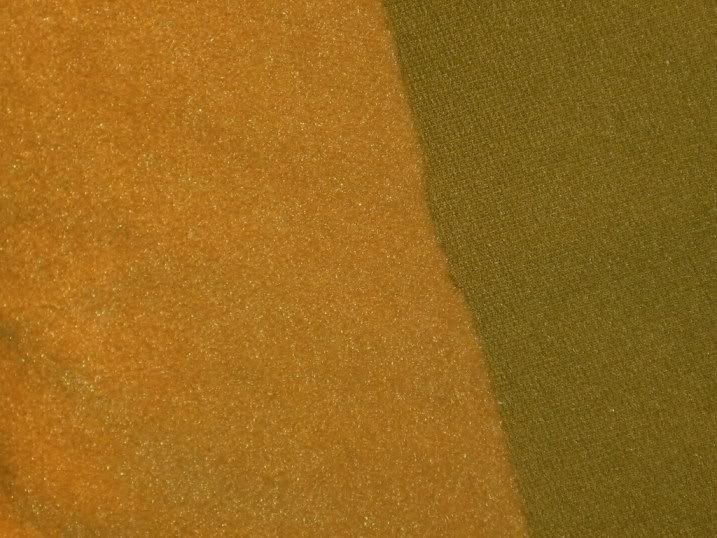
With the first two season of TOS, the command uniforms were suppose to be more of a green that ended up looking gold on film. My question is: When they changed the uniforms for the third season, did that fabric have the same look to it as the first two seasons and just looked yellow on film, or were they actually made from a yellow material?
 
I believe that I read somewhere that the 3rd season command uniform color was closer to the gold color that the appearance of the uniforms from the 1st two seasons had.

I can't remember where I read that though...but it was fairly recently.
 
1st/2nd season velour on the left, 3rd season diamond weave double knit on the right. In truth, the two colors are a little bit closer to each other than these 50-year-old swatches might seem to indicate. (They used to be closer.) The gold has faded to a brighter yellow, and the avocado has faded to a slightly darker greenish color.


P255_7.jpg
 
All fabric for Starfleet uniforms, velour and synthetic, was purchased in white and then Theiss dyed it. The dye he used for Command division was a light shade of green that was really chartreuse.

Under bright light it looked yellow. In softer light, it looked green. This was true for both fabrics. It was true for indoor lighting and sunlight. It's true for film footage, digital photography, and seeing the fabric in person.

http://www.startrekpropauthority.com/2009/03/star-trek-exhibition-in-detroit.html

It wasn't the fabric or the film stock that acted funny. It was a chemical property of the particular dye Theiss was using. You won't get the effect without that dye.

Kirk's wrap-around tunic and the dress uniform got a darker green dye for some reason. I suspect Theiss originally did that because the wrap-around was introduced to help Shatner achieve two separate identities in "The Enemy Within." Two different colors made the situation (two Kirks) clearer to casual viewers. Then Theiss went on with the pronounced green dye for future wraps and the dress uniform simply because it looked good and added something to the show's color palette.

One thing I'm not happy with: in the remastered edition, CBS Digital seems to have shifted the Command "gold" uniforms to look more green in many cases. They shouldn't have messed with that.
 
Last edited:
If you are not already a member then please register an account and join in the discussion!

Sign up / Register


Back
Top