-
Welcome! The TrekBBS is the number one place to chat about Star Trek with like-minded fans.
If you are not already a member then please register an account and join in the discussion!
You are using an out of date browser. It may not display this or other websites correctly.
You should upgrade or use an alternative browser.
You should upgrade or use an alternative browser.
Picture the Novelverse - Characters, Ships and More !
- Thread starter Relayer1
- Start date
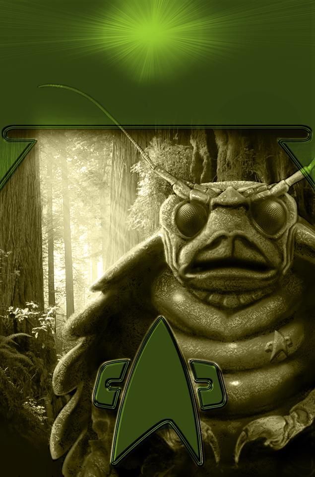

It looks one of the propaganda posters from the movie Starship Troopers.
Yeah, that is really creepy. While alot of the Cross Cult covers using pre-existing photos of cast members and ships have been really good, I haven't been as thrilled with stuff that they come up with completely on their own, like this version of Patty or their M'Ress.
EDIT: Actually I took another look at their M'Ress and she wasn't as bad as I was thinking.
EDIT: Actually I took another look at their M'Ress and she wasn't as bad as I was thinking.
Last edited:


Still not a fan of CrossCult's updated Voyager though.
Still not a fan of CrossCult's updated Voyager though.
Yeah, that is a really bad image of it.
^^^
I dunno, I kind of like it. Never was a fan of the original tiny nacelles.
Well, the thing is, Mark Rademaker, who created the Vesta, was/is working on the Intrepid refit, and the few images he showed actually worked, instead of a shody two pence photoshop. So that's why this image just kinda sucks for me personally.
But O'Brien has certainly deserved a cover, too.
Agree - lovely to see Miles on the cover of a Trek novel

I just looked through Memory Beta, and I could only find 3 other covers with O'Brien, DS9: Vengence, the What You Leave Behind novelization, and the English Aftermath cover. You think as long as the character has been around, and after being on two different series he'd have been on more covers.
Weird.
CrossCults Acts of Contrition cover featering Barclay and a Devore ship as well as the same picture of Voyager for the 6. time. Thanks copyright.

Also if you put all the covers next to each-other you will have a metaphor for the Many Worlds Interpretation.

Also if you put all the covers next to each-other you will have a metaphor for the Many Worlds Interpretation.
Last edited:
^^^
I dunno, I kind of like it. Never was a fan of the original tiny nacelles.
I didn't say anything about the design, I don't like the image, it's actually a nice looking design but the image itself is shite.
Similar threads
- Replies
- 32
- Views
- 2K
If you are not already a member then please register an account and join in the discussion!