-
Welcome! The TrekBBS is the number one place to chat about Star Trek with like-minded fans.
If you are not already a member then please register an account and join in the discussion!
You are using an out of date browser. It may not display this or other websites correctly.
You should upgrade or use an alternative browser.
You should upgrade or use an alternative browser.
What's this...? TOS.5.2
- Thread starter deg3D
- Start date
While I'm not 100% sold on every single "tweak" either you or Vektor have made on your versions, I think that both approaches demonstrate, with absolute clarity, just how SILLY the perpetual comments about how "The TOS design could never have been put up on the big screen without being laughed at."I'm pretty sure I just found my new PC wall paper!
Frakin' excellent work deg!
Q2
Nice work.
")
Thanks, guys.
You should give it a go then, Cary.")
Out of E curiosity, what would you do with her that would be different?
deg
While I'm not 100% sold on every single "tweak" either you or Vektor have made on your versions,...
You should give it a go then, Cary.
Out of E curiosity, what would you do with her that would be different?
deg
Last edited:
awesome.
and, as it seems we're obliged to comment on it now, i also like the XI Enterprise and believe that trekdom is richer for having it than not.
how long until someone does a 'phantom edit' of STXI and puts in the TOS Enterprise?
including, presumably, a scene of a young james kirk seeing the vessel under construction, in orbit, while dying of asphyxiation?
Thanks, guys.
I like XI E. After all, she's still E to me. Don't love her mind you, but I like her, eh.
deg
and, as it seems we're obliged to comment on it now, i also like the XI Enterprise and believe that trekdom is richer for having it than not.
how long until someone does a 'phantom edit' of STXI and puts in the TOS Enterprise?
I like XI E. After all, she's still E to me. Don't love her mind you, but I like her, eh.
deg
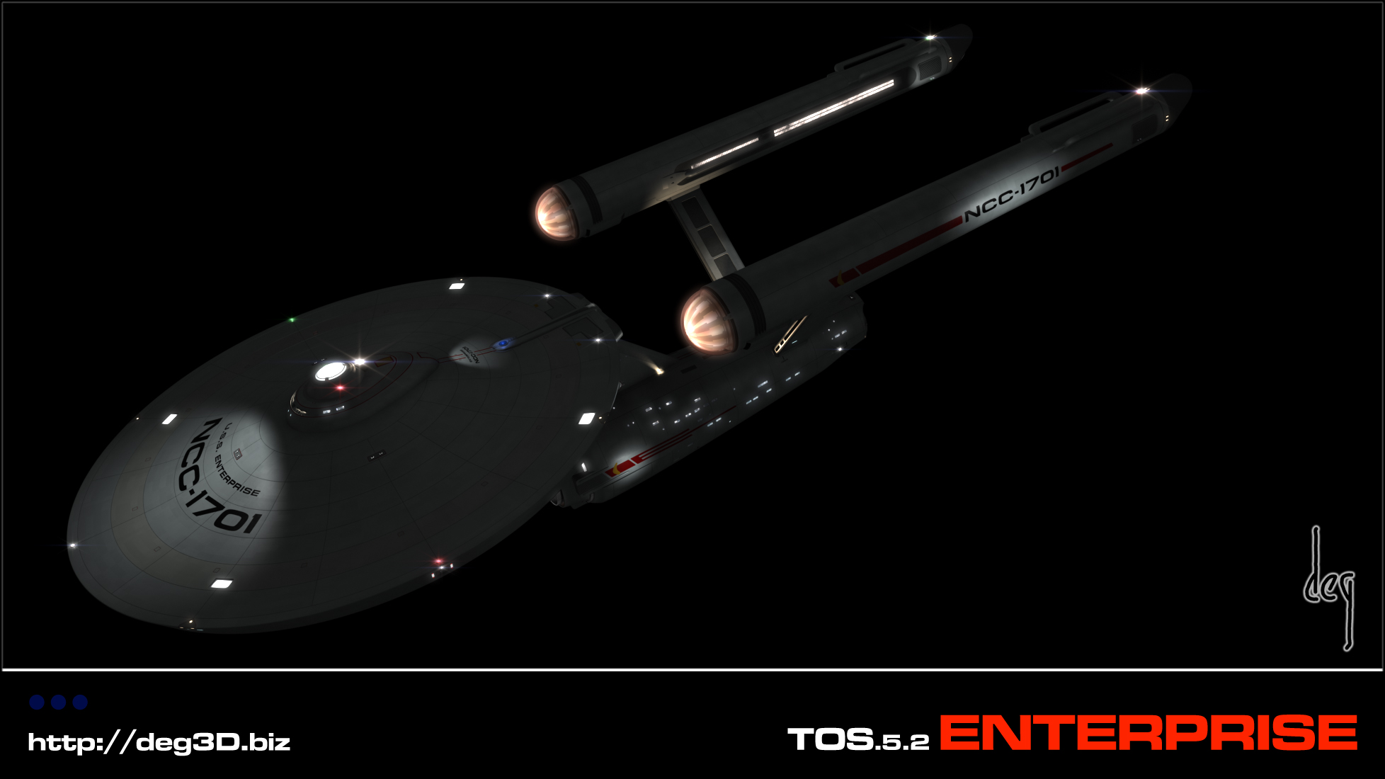
I love this take on TOS Enterprise! Keeping all the lines of the ship, but adding all that wonderful detail! I've seen lots of Enterprise images, but the detail, combined with the way she's lit, and the windows- all just make it look so amazing!
Ditto, on both counts!I'm pretty sure I just found my new PC wall paper!
Frakin' excellent work deg!
Q2


Dang it! Tell me, where is the light source for the spotlight on the outboard nacelle's pennant? Sorry, this is the one nit I have to pick with everyone's lit up CG models of the TOS ship. Don't get me wrong, I really like what you've done with it. It's all very nice. But I just can't get over phantom light fixtures. Just a pet peeve of mine. Carry on.
--Alex
--Alex
Thanks guys.
HAHAHHAA, or the Delta spot on the hull? Or the stern name spot? Where do some of these spots come from on the TMP E?
Where do all the non-real light sources come from in sci-fi, for that matter? LOL
Laddy, transparent aluminum, would that be worth anything to ya?
While we're at it, how about some molecular-level controlled area luminescent steel?
That's how I account for such things anywho.
deg
Dang it! Tell me, where is the light source for the spotlight on the outboard nacelle's pennant? Sorry, this is the one nit I have to pick with everyone's lit up CG models of the TOS ship. Don't get me wrong, I really like what you've done with it. It's all very nice. But I just can't get over phantom light fixtures. Just a pet peeve of mine. Carry on.
--Alex
HAHAHHAA, or the Delta spot on the hull? Or the stern name spot? Where do some of these spots come from on the TMP E?
Where do all the non-real light sources come from in sci-fi, for that matter? LOL
Laddy, transparent aluminum, would that be worth anything to ya?
While we're at it, how about some molecular-level controlled area luminescent steel?
That's how I account for such things anywho.
deg
BTW, I originally had it rigged to have a light source emitting from the intercoolers, but the direction of the light cast aft to forward killed the visual flow of her, thus I went with a non-physical alternative for the sake of aestethics.
I'm with ya Albertese, on tryin' to "keep it real." But sometimes ya gotta go with what looks good. And thus, my mind being what it is, it had to also come up with some logical reasoning behind it. I'm always thinkin', eh.
Hey, what's the smell, burning rubber...?
deg
I'm with ya Albertese, on tryin' to "keep it real." But sometimes ya gotta go with what looks good. And thus, my mind being what it is, it had to also come up with some logical reasoning behind it. I'm always thinkin', eh.
Hey, what's the smell, burning rubber...?
deg
Well, the main quibbles I have with yours are with the "ring around B/C deck" (which seems pretty "forced"), your deflector/sensor dish (I like the bronze/copper appearance... yours is too "gray" for my taste and a bit too "greeblied"... something you don't want when dealing with a parabolic mirror, after all!), and (and this is much less significant) your use of Microgramma as the font. I also would prefer not having the "glowy nacelle panels."Thanks, guys.
While I'm not 100% sold on every single "tweak" either you or Vektor have made on your versions,...
You should give it a go then, Cary.
Out of E curiosity, what would you do with her that would be different?
deg
Overall, I like it. The "ring" and the dish are my big issues (and they're not THAT big).
On Vektor's ... it's the nacelles which are TOO different, and the "artistic" shapes of the "L" panels near the impulse deck which bug me most. But again... I think his work is gorgeous and I don't really "mind" any of these things...
As for "my take," well... if you've been following, you know I've been doing my own version (currently on hiatus, but I'll get back to it). My goal with that is to make something which is really "true TOS" with only those minimal tweaks required to make it all match up and make, with minimal application of "magic," some form of engineering sense.
You HAVE seen that thread, haven't you? It's not "active" at the moment, really... I'm not doing any work on that right now (too much to do at work, too much going on in my personal life - mostly involving someone I hope will be sticking around in my life for a long time to come! - and a technical snag at home as well). But in case you really haven't seen it, feel free to browse it through...
http://www.trekbbs.com/showthread.php?t=89810
Ah nice stuff, dude. I look forward to seeing more. I have indeed seen it, and may have commented as well. I like the cut-away stuff! Your E appears to be more in line with recreating the original in CG. That was not the direction I myself wanted to go in.
You will be happy to know, I am returning to a more copper color for the dish, at least as far as the glow I have around it goes. As to the nurnies, and the parabolic mirror, another lean toward favoring interest and aestethics over reality, which I can reason out for myself anywho, based on, given 300+ years, zero-point amplifiers development, neutral deflection, manipulation of 3D space, or what-not. TBT, a parabolic mirror sounds way to primitive to me.
As to "ring around B/C deck", lost me, eh...
As to V's nacelles, that's my fav part of his design.
Thanks for the feed-back. Again, look forward to seein' more of your take of her, eh.
Great work.I can not wait to see more. This is a very good looking Enterprise and well thought out.
Thanks much, Sarvek. More to come, yes.
deg
Last edited:
Awesome work! I really like what you've done with it. My only 'issue,' if you can call it that is the font. It looks a little stretched horizontally, but it's a really minor niggle.
Regarding the self illumination on the nacelle pennant, what about something similar to the row of lights above and below the pennant as in the Kelvin? A quick google search found this which illustrates ILM's solution nicely.
What you have looks great, but this might work if you're trying to stick with what would be physically possible, glowing panels aside.
Similar threads
- Replies
- 53
- Views
- 9K
- Replies
- 16
- Views
- 559
If you are not already a member then please register an account and join in the discussion!