• Welcome! The TrekBBS is the number one place to chat about Star Trek with like-minded fans.
    If you are not already a member then please register an account and join in the discussion!

This should have been the U.S.S.VOYAGER!

miraclefan

Commodore
Commodore
The link http://johneaves.wordpress.com/2009/03/20/starship-of-the-day/ and the picture!
starship-a-color.jpg
This design is just too COOLLL! I would have loved to have seen this as the VOYAGER! make the saucer section longer like the VGR, and maybe smoth the rough edges, but overall I would have preferd this! what do y'all think?
 
Personally I prefer Rick Sternbach's design. I usually like John Eaves work, but this one looks even too crammed for him.
 
Personally I prefer Rick Sternbach's design. I usually like John Eaves work, but this one looks even too crammed for him.
That's why I said ''smooth the rough edges'' this ship is just one or two small edits away from being AWSOME! Plus this ship seams to be pretty close in size to voyager from the shape of those windows.
 
I like it, but I think it is a little over stylized. I do favor any design that eliminates the silly movable warp engines though.
 
Personally I prefer Rick Sternbach's design. I usually like John Eaves work, but this one looks even too crammed for him.
That's why I said ''smooth the rough edges'' this ship is just one or two small edits away from being AWSOME!
That's not what was in your original post when I replied. ;)
Your right, I said make the ''saucer section longer like vgr and maybe smooth all the rough edges''
 
That's why I said ''smooth the rough edges'' this ship is just one or two small edits away from being AWSOME!
That's not what was in your original post when I replied. ;)
Your right, I said make the ''saucer section longer like vgr and maybe smooth all the rough edges''
Really? Because I could swear it was just the first sentence with the link to Eaves' blog when I hit Post Reply. I just assumed you added the image and the additonal comments after I posted. Sorry if that was not the case. I certainly didn't want to sound like I was insinuating you did that on purpose. :)
 
That's not what was in your original post when I replied. ;)
Your right, I said make the ''saucer section longer like vgr and maybe smooth all the rough edges''
Really? Because I could swear it was just the first sentence with the link to Eaves' blog when I hit Post Reply. I just assumed you added the image and the additonal comments after I posted. Sorry if that was not the case. I certainly didn't want to sound like I was insintuating you did that on purpose. :)
No problem, I added the link first, but I forgot to add the pic before starting the thread! D'OH!:lol:
 
That ship is freakin awesome! Where did it come from?

I thought Voyager often looked quite ugly from quite a few angles, it was too rounded.
 
Personally I prefer Rick Sternbach's design. I usually like John Eaves work, but this one looks even too crammed for him.
That's why I said ''smooth the rough edges'' this ship is just one or two small edits away from being AWSOME! Plus this ship seams to be pretty close in size to voyager from the shape of those windows.
Wouldn't smoothing it make it pretty much what we got?
 
I like the overall shape, but I don't like how it is detailed. All those "fangs" look too aggressive for a Federation starship, save those for the Klingons. Personally, I prefer his design for the USS Mawson: Source

mawson-color.jpg
 
I actually prefer ellipse-shaped saucer sections (a la Voyager) instead of round ones. Round ones look more "toyish".
 
I think it's really cool, but I like the design we ended up with, too. Even lots of people who don't like the show like the ship - she's just so purty.
 
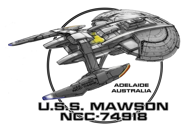
I like both the design in the OP and the Mawson design. (Ironically, the Mawson seems to have a few qualities in common with the study model 'proto-Voyager.') I do prefer the final ship Mr. Sternbach designed though. She's one of my favorite Trek starships. Like JustKate said, no matter what you think of the show, it's purty. :)

The one thing that's always bugged me about the concept of Voyager (not the design) was that it seemed like the producers wanted to have it both ways: they wanted a ship with limitations so being stranded would put them in real danger, yet the ship was completely state-of-the-art and seemed oh-so-conveniently ideally suited for long-term deep-space missions and heavy high-warp travel.

I would have preferred a reworked premise, to either say that:

  1. The Voyager is a brand new prototype testbed starship with a super-advanced suite of experimental systems that don't quite work right or work well together (think the Enterprise-A in ST:V) that has been lost on her maiden voyage, thus allowing for a technological edge yet limitations...
  2. Or the Voyager was 'just another ship' older and less advanced than the Enterprise-D or Defiant but still more advanced than anything in the Delta Quadrant and as suited to the task of returning home as any other Starfleet ship, but not uniquely so.
Either one could have still worked for the 'Caretaker' story. For the former - the mission to retrieve the Maquis is still because Voyager is ideally suited for navigating the Badlants. For the latter, it's because Voyager is the Only Ship in the Quadrant (tm.)
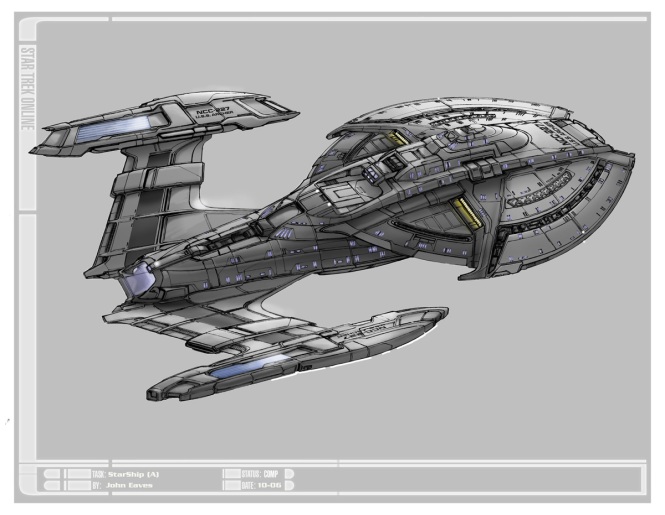
 
Nice but I'm wondering if the detail would be too hard to CGI on a TV show budget.

Yeah, yeah I know, It's all about production & cost with me.:p
 
If you are not already a member then please register an account and join in the discussion!

Sign up / Register


Back
Top