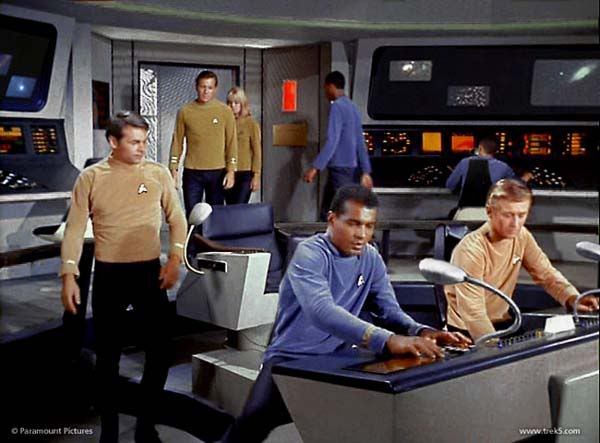
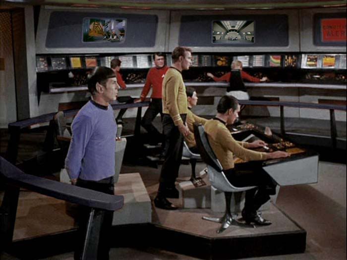
I am watching the Cage on netflix and for some reason I've never noticed how more advanced it appears than the regular bridge. Instead of those static picture monitors there are big panels that have a couple of steady pictures and then graphs and other things pop on. I think I like the color scheme better as well; I guess I need to pay more attention to details! What do you all think?
-
Welcome! The TrekBBS is the number one place to chat about Star Trek with like-minded fans.
If you are not already a member then please register an account and join in the discussion!
You are using an out of date browser. It may not display this or other websites correctly.
You should upgrade or use an alternative browser.
You should upgrade or use an alternative browser.
The Cage bridge.
- Thread starter Rulius
- Start date
I thought the color scheme more closely resembles the TMP bridge.
I´m really quite fond of the somewhat subdued color scheme of that bridge. IIRC the main reason for changing it was, that on b&w TVs (which were still widely in use in the 60s) the red "highlights" of the regular bridge provided a better contrast then the all-gray bridge in "The Cage". For the same reason they probably also changed the colors of the uniforms.
I also liked the "swan-neck" monitors attached to the chairs and consoles, although they might be a bit impractical in-universe.
Mario
I also liked the "swan-neck" monitors attached to the chairs and consoles, although they might be a bit impractical in-universe.
Mario
Ok, so they were impractical both in-universe and production-wise ... but I still like them 

A few other differences...
The captain's chair did not sit upon an elevated dais, just a flate "plate" with a similar "footprint".
The railing (besides being black rather than red) did not have gaps in the sides to access the lower deck plate. It was only open behind the captain's chair and the front framing the main viewer.
There are a lot of other subtle elements, but those are two I never noticed until this year. I'm rather embarrassed I never noticed the railing difference.
Sincerely,
Bill
I thought the color scheme more closely resembles the TMP bridge.
It did indeed.
I liked the black railings in The Cage much better then the red railings.
Agree.Love the bridge in The Cage. It's the TOS bridge design with an added layer of realism.

Stop making me wish for things I can´t have 

I wonder what the Enterprise-E bridge would look like with a light gray/dark gray/ black/ silver color scheme? And with redesigned graphics?
"The Cage" bridge is very nice and if you were doing a show like TOS today then that's the aesthetic you probably go with. But that's also because the times have changed. Today we have televisions that give incredible picture colour and all sorts of nuanced colour. But back in the '60s there were other considerations at work. Most televisions in the home at the time were b&w even while networks and manufacturers were pushing to sell more expensive colour sets. And so on the point the studios were influenced to make their shows more colourful to justify the purchase of a colour TV.
It's not the same thing today, of course, but I do find it amusing that many today seem to prefer more vivid colour on their TV picture rather than more natural and realistic tones. So you get more intense colours such as grass that is rarely (if ever) that green and skies and oceans that are never that shade of blue and the like across the board. My parents are like this and I'm sure they're hardly alone. It's isn't horrible, mind you, but if you think about it the picture is an idealized form of realism rather than actually looking more natural and realistic.
It's not the same thing today, of course, but I do find it amusing that many today seem to prefer more vivid colour on their TV picture rather than more natural and realistic tones. So you get more intense colours such as grass that is rarely (if ever) that green and skies and oceans that are never that shade of blue and the like across the board.
 My parents are like this and I'm sure they're hardly alone. It's isn't horrible, mind you, but if you think about it the picture is an idealized form of realism rather than actually looking more natural and realistic.
As a safety consideration the red on the railings and the console edges make sense.
Well, as a safety concern, the railings are an accident waiting to happen. Until you're actually standing next to it, you don't really get a sense of how insecure they make you feel. If you are "down below," they're great. But if you're on the upper level, you notice that they catch you right at about knee level. They feel more like tripping devices than safety features. UFP OSHA would have a field day.
Similar threads
- Replies
- 157
- Views
- 7K
- Replies
- 8
- Views
- 245
- Replies
- 0
- Views
- 102
- Replies
- 51
- Views
- 4K
If you are not already a member then please register an account and join in the discussion!


