• Welcome! The TrekBBS is the number one place to chat about Star Trek with like-minded fans.
    If you are not already a member then please register an account and join in the discussion!

Starfleet-Wide Arrowhead Insignia Use

Richard Baker

Commodore
Commodore
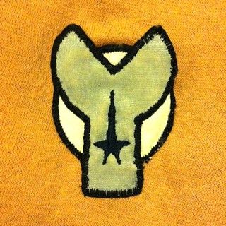
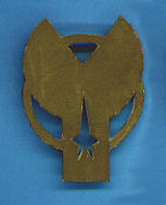
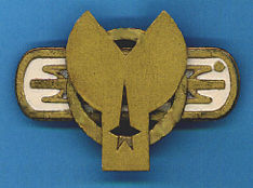
There was a big discussion on this board a while back about whether or not the classic arrowhead shirt insignia was Enterprise specific or fleet wide. The shows broadcast gave the impression that each vessel or posting had a unique one with the departmental symbol being common.

I believe it was settled by a copy of an interoffice memo which made it clear that the arrowhead was supposed to be universal but due to production errors was not- the memo was intended to correct that.

That discussion has either been rolled off the archive or was a secondary one inside a different topic. Could anybody point me to the way to finding the original thread or post a copy of that memo here?
 
I prefer the ship-by-ship different patch idea, myself, not that it matters.
 
I prefer the ship-by-ship different patch idea, myself, not that it matters.

One of those accidents that wound up being cooler than the original plan.

My thoughts exactly. We know now that the original intent was that every starship crew would wear the arrowhead, but somehow the costumer either didn't get that guidance or forgot it. In any case, we got two extremely cool looking insignia's for other starships before Bob Justman took all the fun away again.
 
Thanks!
I tried to use the search within this site but it just seemed to pull up ads..

A little write-up I did--with pictures:

http://web.archive.org/web/20140517172221/http://www.startreknewvoyages.com/?p=2329

Good article. Thank you for sharing. I must confess that the other logos don't particularly look good. Personal opinion , of course. Star base star logos being the exception.

You have a point, from a graphic-deign standpoint. The arrow is simple and looks like an arrowhead, symbolizing progress. Of course we have no idea what it signifies in 23rd c. The rectangle and pretzel of Tracy and Decker might signify pretty cool or important things from Starfleet history to people of that time, and that would affect how the symbols look to them. I usually don't go all in-universe-y, but there it is.
 
When I wanted to design a USS Hood insignia in 1980, I counted the sides of all the insignias featured on TOS, TAS and in the "Star Trek Concordance" and realised no one had done a seven-sided insignia:


USS Hood insignia badge, TMP era by Ian McLean, on Flickr


USS Hood insignia badge - in gold-painted cardboard by Ian McLean, on Flickr

and when ST II was due to premiere:


USS Hood insignia badge, ST II era by Ian McLean, on Flickr

^This was a second effort, using the commercially-available metal ST II insignia to create a new mold. The original was made from a plastic ice cream tub.

(Of course, at the sneak preview, I noticed that USS Reliant was using the Enterprise insignia. Sigh.)
 
One thing I always missed after TMP 'standardised' the uniform insignia was losing the three different symbols for the different branches. Sure, we still got color coding, but it was a shame that every insignia from TMP onwards ended up being the 'command star', rather than retaining the individual symbols for sciences and medical that TOS used.
 
One thing I always missed after TMP 'standardised' the uniform insignia was losing the three different symbols for the different branches. Sure, we still got color coding, but it was a shame that every insignia from TMP onwards ended up being the 'command star', rather than retaining the individual symbols for sciences and medical that TOS used.

Probably a cost savings issue from the producers.
 
If you are not already a member then please register an account and join in the discussion!

Sign up / Register


Back
Top