• Welcome! The TrekBBS is the number one place to chat about Star Trek with like-minded fans.
    If you are not already a member then please register an account and join in the discussion!

Need opinions on a 3D model (picture heavy)

lomitus

Lieutenant
Red Shirt
Greetings one and all!
I'm new to the forums here, so please forgive me for jumping in like this, however I could use a few opinions.

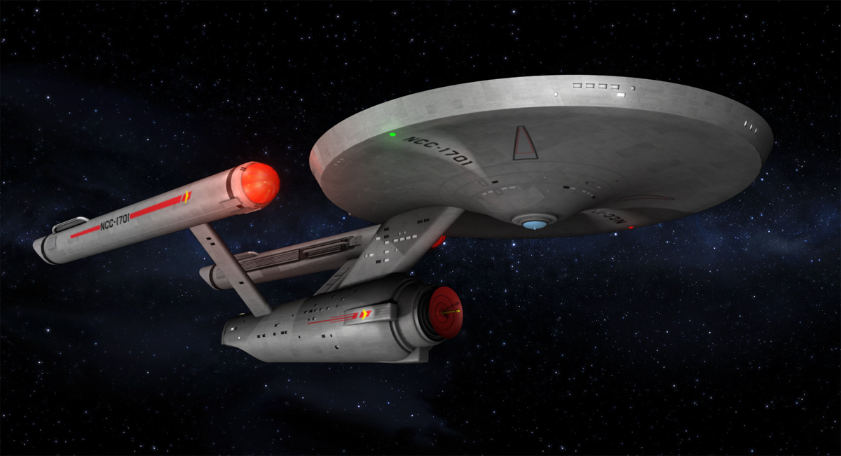
I'm a digital artist and my interests include photography, music, vector work and 3D modeling & animation. I'm working on a 3D animation of the TOS Enterprise...this is actually my second Enterprise animation and the 3rd version of the ship I've created. This little project is mainly for my own amusement as well as learning and practice (I use Autodesk's Maya, so I'm ALWAYS learning, LOL). This new animation is not only going to include the Enterprise herself, but a second ship, the U.S.S. Hathor (Saladin Class Destroyer), the shuttlecraft Galileo and space station K-7 (although I'm still debating that part of the project).

To come to the point here, I could use some "educated" eyes to look over my model of Enterprise. I do have similar posts going in 3D modeling forums regarding geometry, lighting and renderings questions, however I could also use the help of some folks who KNOW Trek. I know we Trekkies (or Trekkers, whichever you prefer) can be a persnickety lot when it comes to details and such...which is exactly what I need.

On that note - please don't feel as though you need to know 3D modeling or anything. If you do, GREAT, if not...it's not important for my needs here. My main concern is if I missed any details regarding this ship herself.

Likewise, please be aware that this is a "mixed era" rendition of the Enterprise...she's not intended to specifically represent Pilot I, Pilot II, etc., as much as simply my idealized vision of this grand lady.

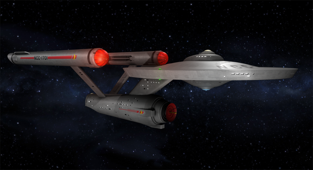
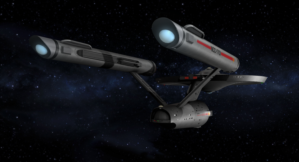
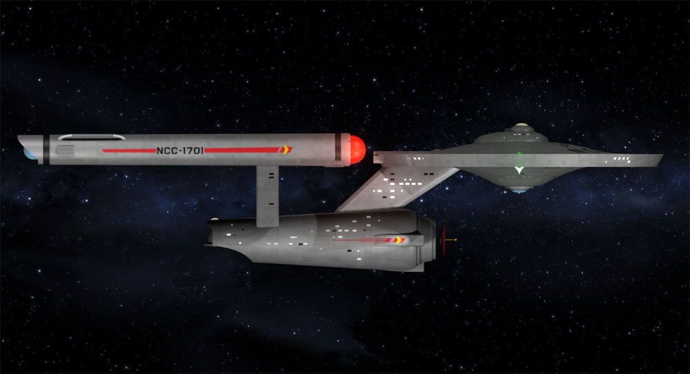
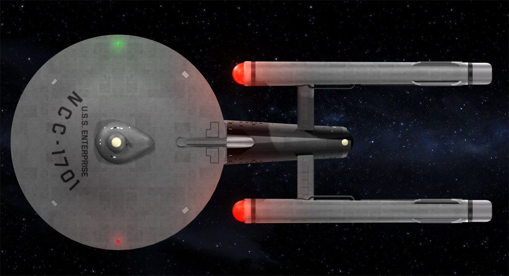
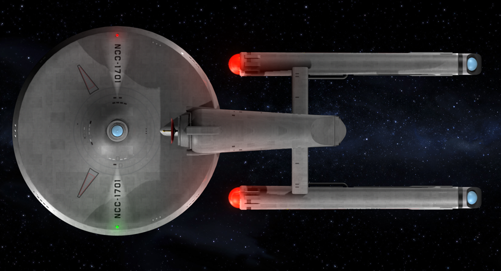
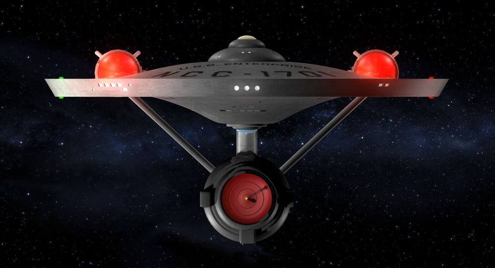
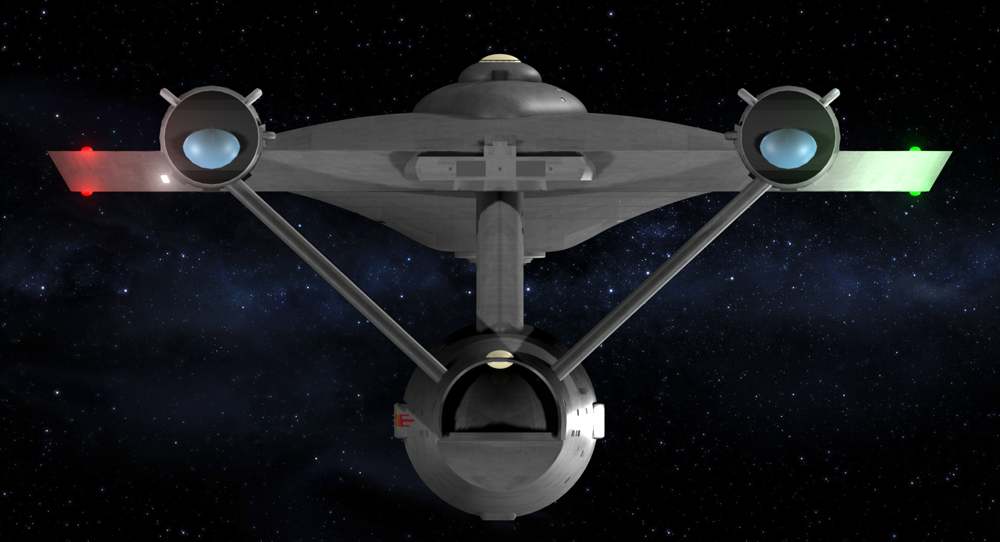
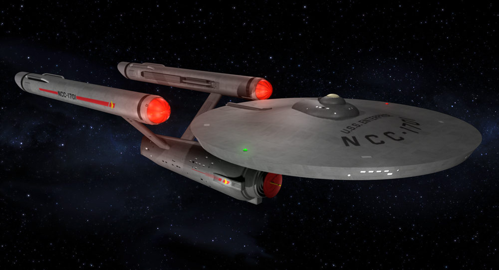
As such, I'm attaching some othergraphic views of the model, as well as a couple of beauty shots...the lighting and rendering are pretty basic in (most of) these shots. Basically I'm just concerned with the details of the ship here. For the sake of reference, this model is created from a variety of reference material including (but not limited to) TOS blueprints, my AMT model kits, stills from the show...and a slight degree of artistic license (such as the running lights and body textures). I am still tweaking a few things...still playing with the textures a bit, need to tweak down those bussard's a bit, need to rig the shuttlebay doors for animation, etc., and I hope to be upping my game when it comes render time...so now is the time to be looking for anything I may have missed.

Again I would like to emphasis that this project is strictly for my own amusement and learning experience. I mean absolutely no infringement of intellectual property here...at most, this should simply be considered as "fan art" and nothing more.

So with no further adieu, I give you my all new 2016 version of the U.S.S. Enterprise...


Enterprise%20Test%2003%20-%20ortho%20side%20-%2001a.png


Enterprise%20Test%2003%20-%20ortho%20top%20-%2001a.png


Enterprise%20Test%2003%20-%20ortho%20bottom%20-%2001a.png


Enterprise%20Test%2003%20-%20ortho%20front%20-%2001a.png


Enterprise%20Test%2003%20-%20ortho%20back%20-%2001a.png


Enterprise%20Test%2003%20-%20beauty%20shot%2001a.png


Enterprise%20Test%2003%20-%2001a%20AC.png


I'm grateful for any comments, opinions or suggestions...I'm not a kid and I have very little ego left to bruise (my wife beat it out of me years ago, LOL!), so please feel free to give my work here a brutally honest critique if you'd like! If I missed something or you think something doesn't look right, please lemme know!

Thanks!
 
As a Blender and iClone user myself, I must say, that's a damn fine looking mesh you've built. :)

Texturing looks beautiful. Love the light sourcing from certain angles. I think the Bussards seem to overcast their light wash a bit in the front facing ortho. But that is a small niggling.

Great job! :)
 
Not too shabby at all! And, I must say, it's WAY better than I could do in any 3D modeling software. However, as one of the guys here who has spent a lot of time with this ship trying to build her in the flesh with plastic, there are some details that jump out at me right away. And it seems like you are asking for that kind of attention so here goes:

First one is the hull texture. I'm sure you realize that adding this paneled look is artistic license, as the original model never had such coloration in any of its versions. Some people have gotten away with adding this kind of detail and making it look good, but what bothers me most of what you've done here is making the pattern rectilinear rather than concentric. One would expect these kind of markings to follow the round contours of (especially) the saucer, and the big squares of dingy hull really break with the over all form and stand out as a big detractor from an otherwise nice looking mesh. You are also missing the rectangular markings behind the bridge and along the keel on the engineering hull, as well as the two red racing stripes along the top of the engineering hull, though, again, maybe that was an artistic choice.

The thing that next jumps out at me is the black ring around the aft collar of the warp engines. That's your own invention as no version of the ship ever had such markings. I'm not saying they look bad, just that they stand out as different, which may be what you're going for anyway.

Third, the three "boxes" around the navigational deflector/main scanner dish: these should be parallel to each other, not flaring out from the hull, and they should be inset from the circular section of the hull, not raised details.

The "neck" area you have shaped like the 18"AMT kit, with parallel sides and round front and back edges, but this really should look more like an airfoil, with a round forward edge, flat sides tapering from the wide front to a narrower aft edge which itself is flat, not curved.

The impulse engine deck should have more curved sides, not the look of parenthesis.

The most things I notice are in the engine nacelles. I'm not sure, but to my eye, the warp engines appear to be ever so slightly too narrow at the front ends. The studio model tapered from noticeably (but subtly) wider on the front to narrower aft ends, so I recommend you doublecheck the measurements here. Also, the engines should have full clearance when viewed from the front ortho. Yours are on too short of struts, and I think may be too small also. Actually, I suspect that your aft diameter and overall length-on-axis are right, but your diameter on the forward end is too small, which is throwing off the proportions of the nacelles entirely. Also the details on the structures coming up from the nacelle bodies near the aft (what Franz Joseph labeled the "final stage intercoolers") are not quite right. The forward ends were more blunt and squared than the aft and, depending on which version, would have a smaller projection from the front end. On the actual studio model, the balls on the aft ends of the engines stuck out more prominently and appeared more fully when viewed from the aft, where yours here looks like the 18" AMT model kit, which make much retracted domes as a compromise in making the steel tooling for the injection molding.

Also, I don't have a good look at the inboard trenches of the engines, but I suspect they are not quite right, due more to the fact that it's a weirdly shaped area than in any fault of your research. I wouldn't even recommend you alter them, as they look fine, I only mention it as an are you might have missed that has some interesting data for.


So, yeah, some opportunities for edits. If you would like one good reference for the 11' model, I would recommend either of the Polar Lights model kits (either 1:1000 or 1:350 scales) as the details are pretty good. As for drawn out 2D blueprints, my go-to one is the set by Alan Sinclar, though there are others out there that are as good and capture a few teensy details Sinclar either missed or got slightly wrong.

Anyhow, I hope that's the sort of critical appraisal you were asking for. I do wish to further praise your skills and encourage you to continue on. AS I mentioned before, I work with plastic, not computers. I envy your abilities!

Keep it up!

--Alex
 
I'm a lay-person when it comes to 3D stuff, having spend a year or three working with 3DS-MAX about 15 years ago and I sucked. So my advice is purely from an asthetic point of view.

And that says that I like what I see. You don't seem to have any huge mesh-problems, things seem to connect properly and I don't see any miss-alignments in the texturing. So yeah, good job as far as I can see.
 
First and foremost, my apologies to all...I didn't realize there was actually a fan art forum here. After getting some good "modeling" feedback on other forums, but very little "Trek" feedback, I just did a Google search for a Trek forum, so "TOS" and just went for it. I will re-post to the appropriate forum here in just a bit, as soon as I get some coffee in my system :-)

That said, thanks to those who have posted comments here and SPECIAL thanks to Albertese - yes, that was exactly the kind of feedback I was looking for! Somehow I had a sneakin' suspicion there I'd find a physical modeler or two. You are correct in that yes, there was some artistic license regarding a number of the things you mentioned, like the textures and the shape of the nacelles...I used the Charles Casimiro layout there as a personal preference for modeling use, however you have indeed caught a few things that I did certainly miss. And yes, I am familiar with the Polarlights kids, they're just far too pricey for my uses...even my old AMT kits got stuff in the attic. That said, I have already copied your post to Notepad and will be referencing it as I continue work here this next week...a VERY big thank you!

BTW...for the sake of nitpicking, if you look at the Sinclair blueprints, there is a consistency error regarding the height of those nacelles. In the front/back view, they do indeed rise above the primary hull, however in the side view...they don't (which seems to be a problem with many of the Enterprise blueprints I've seen)...something that Sinclair addressed later apparently ;). I had noticed this very early on and if I remember correctly, I tried it both ways with my earlier models and preferred the way I have them now. Either way, again great eyes my friend and some good calls there.

EDIT: I'm now fixing the taper on the nacelles...now that it as mentioned, yea...it started bothering me. Thanks!

Anyways, again thanks to everyone and again, I will repost to the appropriate forum here in just a bit.
 
Last edited:
First i would ignore any refs or models except photos of the original studio model. The polar lights kit in both forms are ok if you need a physical ref or to see an area that is just not covered clearly. KIM there are some issues with the polar kit namely positions of some parts so research those and be aware of them.

I would use a blend of 11foot model photos the sinclair and casmiro blueprints. Overlay them and then compare the shapes to the photos, and you should be able to pick out the wrong bits. Also leaves you to interpret some shapes as well.
Here are a mess of refs I have uploaded and used. I would suggest using anything from before the 1970s such as the HD caps of the original SFX these will give the best colour and grime details as this was all destroyed later on and only the top saucer remains relatively untouched from the original paint)
forum here wont allow the code so URL only.

http://imgur.com/a/AmdD1
http://imgur.com/a/U4V19

you should be able to DL these albums as a zip file vs manual saving. ALSO watch out for photos of the 4ft model. The smaller mone they used to shoot promos and some footage with as it has a completely different shape.


Here is the brutal part and this is all by eye and is in the vein of EXACT copy. I am not comparing to orthos or any of my refs. If you are aiming for low poly or specific detail level then it is all grain of salt at that point!

Bridge is not a untouched "dome" It flattens out just prior to the sensor dome/window. Curvature for the sensor is up to argument as it was altered multiple times and then replaced NEW 11 foot photos have a incorrect curvature on it.
Turbolift seems small and a bit short, there are red cone lights flanking the bridge blister too.

B C deck is shaped like the AMT one it should have a curvature on the tapered area (top down view) vs the angular sweep. When seen from the side it also drops off. This is by far one of the hardest parts to decipher from photos and one almost all ortho drawings get wrong.

Curvature of the upper hull is off a bit and should curve more, IE it seems to flatspot too soon thus not getting the alignment to the BC deck.

The impulse spike or whatever that bat thing is is not the right shape. This part though in almost all post 90s restoration is not in it's original shape as the curve on the grooved portion is not ROUND but squared off.
here is a render of mine as I cannot find the photo of the before and after resto. The guy doing it broke it and rounded it off.

Also be aware there is a airgap between this bat thing and the impulse itself. Those HD caps above show it being there during filming.

Impulse housing itself should stick out more and have a curved inward taper. (I did not do this with mine as personal pref) The rounded sides should be a half oval in cross section.

I would round those sharp edges on the saucer or any corners on the ship. Even a basic chamfer would do. Use edge loops to control the smoothing effect if your aiming for low poly.

Lower saucer looks ok, I cannot tell what the undercut looks like though as the planar textures hide it too much. The sensor dome looks small, it could be that it is blue. You are missing the 3 cyl shapes that surround the outer bezel too.

Lower nav lights were white balls. Upper nav lights had smaller teardrop lights just outboard and on the sides of the saucer were more smaller white lights.

NECK: this is a contention area. Some see it as rounded and flat but in the resto you can just barely see a curvature in cross section. Front is fairly halfround it flares out then tapers back to a small profile. This is where most people goof, the top is a half round while where it touches the secondary hull it becomes FLAT.
Secondary hull, is a bit to curved at the front and is too tapered front to back.


The waveguides or whatever those 3 bars around the secondary are called are more rounded at the front (in profile) and are not so soft but very square edged.
The ones on the left and right continue into the hull and do not stop short of the deflector housings. Also they intersect and flatspot the hull they do not prodrude from the hull. This part is a RIGHT PITA to model right too.

Deflector only has 2 rings. It looks like you do have the flat face on the innermost surface. Spike and detail behind I cannot see to comment.

Seems you are missing some port holes on the hull. You have a lit porthole at the back that should be off and are missing the ION pod or nav light (arguments as what it is) but reality it is a auto bulb with a metal bezel. This is what is lit back there aft of that porthole and I think slightly off level.
Rear sensor dome has a bezel that conforms to the hull and bits of colored plexi inside. Under that is a control room in a cyl shape with a rectangular window. The bay doors should be squashed down some for that above control room and to create the right curvature. The tongue or bay protrusion is too thin and should be thickened up and have the landing lights applied. horx bat vert bat horz bar vert and horz bar. Red orange/yellow and green etc. Also missing the greenwhite portholes on either side of the red protruding light that sits infront of the aft sensor dome.


Warp cut in the bottom ortho seems a bit shallow and the curvature of the shuttle bay seems shallow too.

struts, I cannot tell if that is inset detail or not. They are holes with mesh placed in that is flush to the hull with no protrusions.
Nacelles behind the VVV part should have a much greater taper. (too small at the bussard end) I cannot tell how many grooves you have but it should be 3. The painted areas on the bottom to which the struts sorta intersect do not end in a curve but are squared off.

Nacelles sit too low the bottom of the bussard should be level with the top of the saucer. As seen from the front the bussards should have a clear view.
Warp grills are the same in both segments in height and design, the forward grills are just shorter. The intercooler hoops that are in the cutouts are the same parts as on the back of the nacelles They also have those bars on them. The boxes surrounding the bottom of the nacelles are larger. Intercoolers are squared off and not tapered. The front edge of the aft intercoolers have a tab on them as well. OH almost forgot those same tear shaped markers (right of way) lights used on the saucer are ontop of the nacelles between the ribs and the bussards.

Dark ring on the backside of the nacelles is just hull coloured bezel. The endcaps are ribbed. I forget how many though. The "balls" protrude quite a bit more than they do.

TAPER the following parts are not tapered, endcaps both front and rear and the ribbing. Only the body of the nacelle tapers.

Tip on the registries all numbers should be manually placed. Auto kerning will result in bad spacing. as the original decals they were printed without registration meaning they placed each letter by hand and eyeballed the spacing so it does not follow modern rules about typesetting.

Textures, this is all up to the modeler really BUT if you are going to do them UVW them at least with the simple shapes IE nacelles secondary hull etc use a cylrindrical projection. Saucer mapping a trick is to project a sphere and then move it way below the saucer. It will flatten out the projection and make a square oe rectangular map appear as if it was pie cut to the hull. I know this is possible in maya as I stole the idea from a maya user. :D

example here

this saucer map is the same square based one I used on the rest of the ship, this avoids having to have large saucer maps. BUT it does make doing unique markings on the hull harder as you will have to start doing composite shaders and mix maps etc. I would though look at avoiding diffuse and try fooling with gloss aniso and other "surfacing" to create the plated look from TOSR.

Colour on the ship. You really only have 3 main hull colours. the body, the dark gray, and the blue hue stuff on the front and backside of the neck.

Dark gray appears on the impulse drive the bat thing, the ribbing on the bussards, the inner face of the warp grill cut out. The bars on the aft intercoolers the endcaps (not the balls) And those odd shapes on the bottom of the nacelles. As well as the bars that support the warp grills. I was unable to determin of the grills ever got paint. I do know the grill pattern on the ship now is WRONG. There is the red and yellowish pennants and markings all over which you are missing some of. I would also deepen your reds and yellows 2 or 3 shades darker than you think you want them.

Ship lighting is optional, I just lit the lights and bussards but I use LUM shaders so you might want to look at mental ray in maya and the self illum arch design materials or the lum shaders (or whatever they call them as it varies on the mental ray version packed in maya/max etc) Id tone down the bussard if you continue to use a gizmo. A good trick is to place the gizmo inside the dome and make the dome and components of it invisable to that light. Also set the lights to cast shadows. Pref raytrace lighttracer etc do not ever use shadow maps. (no reason unless you pc is from 2001 even then setting high enough for them to look good often were slower than soft raytrace settings)

Some refs
My WIP blong with most of the images I posted on forums
https://bolidecascade.wordpress.com/
KIM mine has many places where I did not use orthos and use photos only. Sadly I did not document all of it so you have to wing it some. I am sure there are inaccuracies on mine as well.

Eyeball work done by
SHAW, EvilGenius180, scifieric, vektor
I think Vektor had released a decent mid polt connie to trekmeshes but I am not sure of what quality the conversion is in maya if there IS one.
I am sure there are other modelers out there too I just know those 4 and the depths they have gone to in the past.

Refs
TOS HD
http://tos.trekcore.com/hd/ You might find some rare B side original SFX in HD here. Some is good some is beyond bad but worth the time.

http://tos.trekcore.com/gallery/index.php?cat=11

recent smith photos. The resto paint is ok but too opaque. Look at the saucer top for examples of the original paint the weathering was all transparent paints. Ignore the ugly green glob around the BC deck though this is resto as those bridge parts were refinished. She was also very glossy too.

http://www.mjtsc.pwp.blueyonder.co.uk/new/1701.htm
misc photos, ignore the deflector spike here this is really wrong. (it was produced using a image full of motion blur so the chess pawn details were blurred into this knob thing they have on it now)

https://bolidecascade.files.wordpress.com/2015/09/0012-ent38.jpg
https://bolidecascade.files.wordpress.com/2015/10/ent09.jpg
show the intercoolers paint colour
https://bolidecascade.files.wordpress.com/2015/10/ent18.jpg
https://bolidecascade.files.wordpress.com/2015/10/ent19.jpg
shows grime levels on the hull of the ship as shot in the 60s.
https://bolidecascade.files.wordpress.com/2015/10/20121111-102216.jpg
https://bolidecascade.files.wordpress.com/2015/10/8023324563_560b1bebc0_o.jpg
https://bolidecascade.files.wordpress.com/2015/10/8023175487_fcc65f64ff_o.jpg

Darn it I cannot find that one physical modeler site with a lot of old photos and modern ones post 90s as well as that blueprint site that would have the sinclair and carismo stuff as those original sites are dead now. Maybe someone else will have them bookmarked.

OH another place to troll for images is hobbytalk. I got a lot of stuff there that I could not find elsewhere. Be ware though of interpretations and hearsay as a lot of people say so and so said this and that and often it is BS or distorted memory. Many things I see people say I find contrary in much older references.
Also go with your gut too, as you may see something entirely different. The whole inverted deflector ring is one of those arguments.

Anyhow hope some of this helps. And it does not mean you need to redo it just make a few alterations or make ones you feel fit. I model for high rez and possible large print. I rarely model with animation etc in mind.

I have to say too the ship while simple looking is a right PITFA to model. I spent way more time researching than I did modeling.
 
Last edited:
Madloifish - Thank you for some GREAT info there! I'm grateful! As with Alex's comments, yes, there are some details there I missed...and a few things I haven't gotten to yet (like the shape of that thingy on the impulse engine). I'm already planning to re-cut the whole bridge section as well...mostly just used that version for reference and placement, but not happy with the shape or the window placement (not sure you can tell, but a couple of the windows got cut rather cockeyed there).

One quick note for reference here; on the shape of the neck, yes it's not the true "air foil" shape (as Alex mentioned)...that specifically was a modeling choice as when I went to cut the windows, the geometry with the correct shape was..well...giving me a rash! LOL! I opted for the flatter sides in this case as is solved a few problems from a modeling stand point.

The truth of the matter is that there are a few parts here that have been done over...in some cases, multiple times...for that exact reason. The lower hull for example; at this point I think I've cut over 40 different versions of that thing and very technically speaking, no...the geometry still isn't right at all (Booleans...gotta love 'em, gotta hate 'em). Same goes for the primary hull (the saucer section). I started that as a 1 piece revolve and it looked BEAUTIFUL, until I tried to apply textures to it...then it became a 2 piece and finally the 3 piece you see here.

As far as reference material goes, yes, in fact I have been referencing my DVD's quite frequently...to the point that I think my wife is about to kill me! ("Honey...could you stop Lord of the Rings for a moment? I need to look at that shot from Doomsday Machine again...", LOL!!!!). That said, again this particular version of the ship/model, does indeed employ a fair degree of artistic license and the full design is based on multiple sources. Think of it as not only a homage to Trek, but to all the fans like us who have taken all of this so far over the years. Again, a lot of this is my own idealized version.

In any case, again, thank you VERY much for some great reference info there! I will be referencing it as I continue working here!

(I knew last night that I came to the right place!)
 
The blue "tail bubbles" on the warp drive don't look right to me on the aft view.

Shouldn't the bottom sensor dome on the saucer be white, not blue?
 
Update...


Alrighty, no orthographic shots this round, however here's a couple of beauty shots and where things stand now...

Enterprise%20Test%2004%20-%2001a%20AO%20comp.png


Enterprise%20Test%2004%20-%2002a%20AO%20comp.png


So far I've corrected the nacelles to include that gentle taper, I've raised the nacelles just a bit, re-cut the bridge section, re-cut the blocks on the side of the lower hull, adjusted/finished the impulse engine section, corrected the size of the vents on the nacelle pylons, corrected the shuttlecraft hanger (and added lights), tweaked some textures...quite a bit of work. Also still tweaking lights as well. The shots here do include an Ambiant Occlusion layer and some slight levels adjustments in Photoshop.


So again, comments/critiques are most welcome! I plan to start the animation work in the next day or two, so if anyone should spot any last minute details, please lemme know!
 
It's certainly improved. The only thing that still really makes me cringe are the boxes surrounding the engineering hull's front end. These should be INSET from the radius of the surrounding hull. Forming shallow trenches. Yours ramp out from the hull. Which looks weird. Also you have them not connecting to the barrel of the drum surrounding the sensor/deflector dish. These should be in physical contact, without any open shelf-space between the structures.

Here's a SUPER quick rough and dirty sketch to convey my meaning. I would have done something fancier and to scale if I weren't already up past my bed time.

20160103_224727.jpg


I hope that helps.

--Alex


I figured someone would say something on that and I may fix it later, but for now I'm gonna write that one off under the artistic license thing...I like the way it looks on my version :-)
 
...ok...ok...I fixed the stupid blocks on the lower hull. The more I thought about it, the more it bothered me.

Enterprise%20Test%2004%20-%2003a%20AO%20comp.png


Also, while you probably can't see it at all in this shot, I tweaked out the detail on the inside of the nacelles a bit. I don't really have any GOOD specific references on this, so there's a bit of artistic liberty there. Also tweaked the textures just a bit more this morning as well.

I'll probably start working on some animation stuff this afternoon...I want to do a quick animation test on the nacelles so I can get the look of the bussards refined a bit better.
 
If you are not already a member then please register an account and join in the discussion!

Sign up / Register


Back
Top