• Welcome! The TrekBBS is the number one place to chat about Star Trek with like-minded fans.
    If you are not already a member then please register an account and join in the discussion!

Improved TOS Wraparound Tunic

aalenfae

Commander
Red Shirt
Not exactly fanart, but something that I've always wanted to depict.

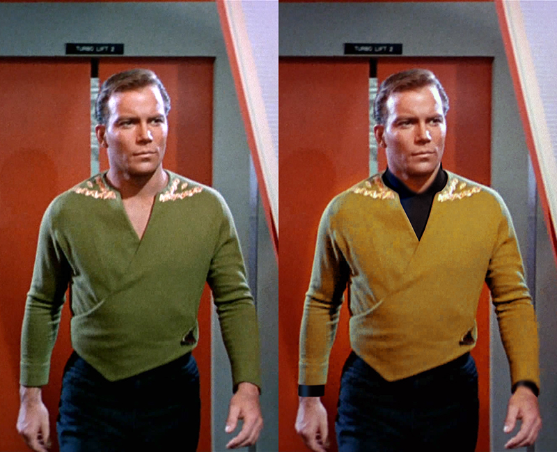
I know that the TOS yellow uniforms were supposed to be "avocado" color, and only the wraparound and the dress uniforms reflected this. But now that the color is canonically accepted as yellow, I feel that the wraparound would be greatly improved if it were also yellow.

Then, throw an undershirt under that baby, and suddenly you have a pretty elegant-looking uniform. Though Kirk - wanting to show off a bit - might "forget" the undershirt anyways.

wraparound_by_aalenfae-d87keuk.jpg
 
By making it gold with a black undershirt, it is almost indistinguishable from his regular tunic. Which kinda defeats the point of its existence for me.
 
With that deep "V" plunge? I have no problems distinguishing it from his standard "pull-over", though I'd keep the distinctive olive hue.

Translation: I rather like it.

Sincerely,

Bill
 
By making it gold with a black undershirt, it is almost indistinguishable from his regular tunic. Which kinda defeats the point of its existence for me.

I guess part of my intent was harmonizing it with the rest of the uniforms. It was never meant to be a different color than the other "gold" uniforms, and now that it is, it kind of retroactively became a lot more unique than intended, and seems a lot more like a custom piece of clothing than a uniform at all.

As for the black undershirt, I theorized that it's always meant to be there, but Kirk's a little too immodest for it.
 
Well...the whole point of the wraparound when it first showed up was to make it easier for us to tell Good Kirk from Evil Kirk in "The Enemy Within." Therefore, the different color is pretty important when both are seen from behind. In fact, I recall the two shirts even reading as different tones on my old black and white set, so it worked well as it was.

--Alex
 
I always saw the TOS wrap-around tunic as a double-edged fashion statement for Captain Kirk.

1: the tunic showed a little skin, and looked more physical than the standard duty uniform shirt. This gave it a casual look.

2: The casual look, and the fact that no other officer ever wore one, told me that this was a "rank hath its privileges" statement, tailored for William Shatner's (and James T. Kirk's) ego.

All this having been said, I'll respectfully pan the new style. It's neat to see the brighter color, but the photoshopping of Kirk and the untouched archival Charlie X exercise does nothing for me. What's the point of a casual wrap-around tunic for the captain if the captain isn't showing off his skin? Think about it: TOS was a 60's show, so we never got to see a woman ship captain. If we had, and if she had the figure for it, wouldn't you want to see her in the original wrap-around tunic, semi-plunging neckline and all? This tunic is a styling exercise, after all. The undershirt clearly undermines that styling exercise.
 
Here's an interesting challenge:

Leave the structure of the wrap-around tunic as-is, no undershirt. Now try to envision of tunic without any rank stripes. Instead, try using the TMP2-era rank insignia for captain either on the shoulders (similar to Capt. Kirk's Mirror-universe muscle shirt) or on the collar TNG-style.

For me, the tunic was always very interesting, but the stripes were incongruous. The Year One stripes just in front of the shoulders always shouted "Hi-Ho Silver!" to me; they looked way too country-western for TOS. The Year Two tunic was toned down, which was an improvement, but the stripes were back down on the sleeves which contradicted the casual look.

Can someone photoshop that?
 
If you are not already a member then please register an account and join in the discussion!

Sign up / Register


Back
Top