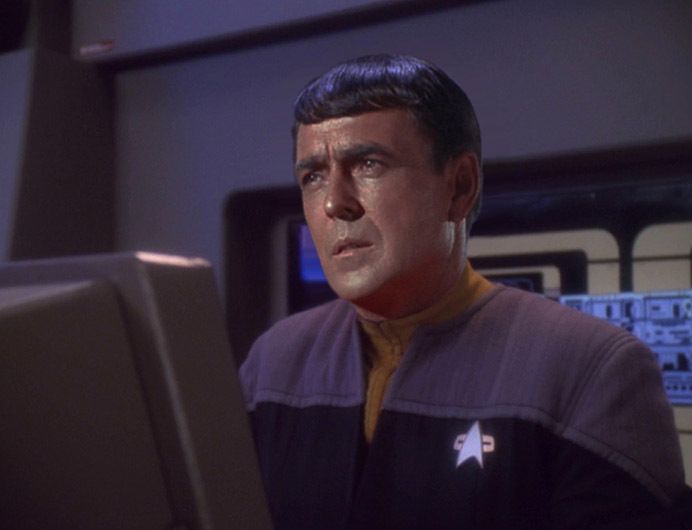
I just saw some photoshops of TOS characters in DS9 uniforms, like this one.
I think if William Ware Theiss had offered this up at the start of TOS, it would have been rejected as a costume "designed for b&w TV-- get it out of here!"
As part of its mission, TOS was supposed to get more people to buy color TV sets. I think there was even a business deal between NBC and RCA, but I'm vague on that. Anyway, If you saw TOS uniforms on a neighbor's color set (and people did have the neighbors over to see a new set in those days), you knew you were missing something at home, and that was the point.
Did they go too far with the color saturation? I never thought so in the 1970s. The day we got our first roof antenna (a huge one, with a motorized rotor) and first color TV, and STAR TREK was suddenly clear and in color, was like Christmas to me. And TOS looked utterly futuristic, like nothing else could.
I can still see TOS through those eyes, or I can shift to modern-guy and then TOS looks dated. I know the movies did not dent the old look for me. Maybe TNG did. Definitely by VOYAGER I was adopting the new aesthetic and finding that if I squinted just right, TOS looked out of date. I wasn't too happy about it.
The classic Bridge set, especially as seen in S2 and S3, will never look bad to me, ever. I was shocked one day in the early 2000s when I had a very good CGI picture of the Bridge as wallpaper on a work PC, and a young woman asked what it was. She was gorgeous and her personality was all about fashion, hair, make-up, decor-- she was a person very dialed-in to what looks good and what doesn't. I joked (not that she'd know) that it was the design for our new Data Center. She said, "It's hideous."
Has your eye for the TOS look changed over time?


