• Welcome! The TrekBBS is the number one place to chat about Star Trek with like-minded fans.
    If you are not already a member then please register an account and join in the discussion!

Art in Star Trek Comics

JD

Fleet Admiral
Admiral
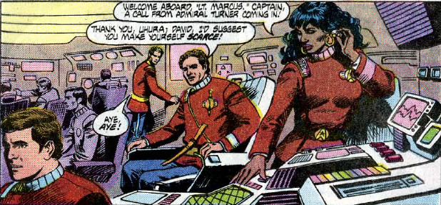
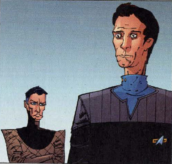
I'm in the process of reading TNG: Ghosts, and I've noticed that there are a lot of weird inaccuracies in the art, like they have the bridge a tiny fraction of the size it is on the show, the back consoles are practically right up against Worf's back, and at one point Riker was sitting in the command chair, and it looked like his knees were practically between the ops and conn stations. And it has the same kind of oddities in Sickbay, the only thing in there is the biobeds along the wall, the one in the middle isn't there, and neither is the big display on the wall next then. And then they also have giant console screen behind the biobeds that were never there on the show.
I'm not necessarily expecting everything to always be photo accurate down to every detail, but these are some pretty massive inaccuracies, and I've found it highly distracting. I know artists are going to take some liberties from time to time, but for me this is just to different for me to be able to ignore it, and it's driving me crazy every time a scene is set in one of these locations. I could see something like this happening 30 or 40 years ago where it was a lot harder to get a hold of reference material, but this was created in 2009, which would have been well into the internet era, where it should have only taken seconds to pull up pictures or clips on sites like Youtube or Memory Alpha.
It also seems strange to me that this would have gone through multiple layers of approval and no one noticed or cared enough to get the artists to fix it.
I have even more of a problem with the DC TNG series that came out while the show was on the air, a lot of the locations on the ship looked absolutely nothing at all like they do on the show. I can maybe understand this happening in the first few issues if they came out before the episodes were done, but this kept happening for years into the series, well after the show had started airing. I know this was preinternet, but I would think once the show had started airing the artist would have been able to see the episodes and know what the sets look like.
I guess to me if you're going to a comic book tie-in to a show or movie, you should do everything you can to make as much of it as possible match the original source material. Unless of course it's set in a different era or alternate universe where things are meant to look different.
Does this kind of thing bother other people this much, or is it just me?
 
Does anyone remember an old Star Trek comic that featured an odd alien character who spoke in a weird patois and fell into a bottomless pit?
 
Does this kind of thing bother other people this much, or is it just me?
It bothers me on a basic level, but I tend to either ignore it or just laugh it off. Many, many, many of the comics have oddities. I think it maybe comes from some of the people working on them not being...'mega fans'? (For want of a better term. I'm not talking about any of that 'true fan' bullshit.)

I don't mean that as some kind of gotcha or diss...just a guess of how and why. It's hard to imagine someone really invested in the minutiae making some of the changes/mistakes that pop up.
 
If the mods want to they can. But I thought that was more about silly stuff, while this was meant to be a more serious conversation about inaccurate art.
It bothers me on a basic level, but I tend to either ignore it or just laugh it off. Many, many, many of the comics have oddities. I think it maybe comes from some of the people working on them not being...'mega fans'? (For want of a better term. I'm not talking about any of that 'true fan' bullshit.)

I don't mean that as some kind of gotcha or diss...just a guess of how and why. It's hard to imagine someone really invested in the minutiae making some of the changes/mistakes that pop up.
I could laugh off a few little things, but these were just to big for me to be able to just ignore.
You'd think an artist who was hired to do tie-in would do everything they possibly could to make sure they at least got the regular locations from the source material correct.
 
All the weird stuff in the comics is collected here:

:D
 
I could laugh off a few little things, but these were just to big for me to be able to just ignore.
You'd think an artist who was hired to do tie-in would do everything they possibly could to make sure they at least got the regular locations from the source material correct.
Don't get me wrong. Some of it bothers me enough to take me out of it. :)
 

All the weird stuff in the comics is collected here:

:D

I mean, I don't really consider these the same topic. That thread is to showcase actual comic art that is "funny, odd, or amazing", and this one seems to be a discussion around whether members are bothered by the art in the comics not accurately depicting the shows. They are distinct subjects, and no need to merge.

Does this kind of thing bother other people this much, or is it just me?

For me, it depends. If the art for the locations on the ship don't exactly match the shows, I can't say that really bothers me, as long as it conveys the general idea of where it is supposed to be. Of course, I couldn't really tell you how many biobeds are supposed to be in the sickbay set, so maybe I'm not the best judge. :lol: To be honest, I don't really even remember the art from Ghosts, I just remember that I didn't really enjoy the story that much. The story is usually more important to me than realistic art. (Not that I'm not impressed with realistic art, I am; but it's not going to cause me to enjoy a story I don't like, and in most cases, non-realistic art isn't going to make me dislike a story I enjoy.)

I've got the Complete Comic Collection that GIT put out back in 2008, so I've read a lot of older works, and I really enjoyed the DC first series, and one could hardly call those realistic to the movies at all! But the stories were good, and the art has a certain charm, so the fact that it wasn't realistic didn't bother me in the slightest. :) (I'm not usually good at remembering names of the comic artists--apologies to those of you in the biz!--but I looked it up on MA and apparently the artist for this series was Tom Sutton, who @Allyn Gibson mentioned above.)

That being said, the art can sometimes make it hard to get into the story if it's an art style I don't particularly care for. For example, I remember it being really difficult to get into N-Vector, because I just didn't care for the art style at all. That one is a rare case of not being able to remember the story at all; all I can remember about it is not liking the art style much.
 
Can anyone include an image that shows an example of what they mean?

Not sure if you're referring to anyone specific here, but sure, I can show some examples of what I was mentioning in my post.

DC Series 1:

excelsior-bridge-issue-13.jpg

USS Excelsior Bridge
Issue #13 - New Frontiers, Chapter 5: Masquerade
Artists: Tom Sutton & Ricardo Villagran / Writer: Mike W. Barr / Letterer: Carrie Spiegel / Colourist: Michele Wolfman

uhuras-station-issue-24.jpg

Uhura's Station, USS Excelsior
Issue 24 - Double Blind, Part 1
Artists: Tom Sutton & Ricardo Villagran / Writer: Diane Duane / Letterer: Agustin Mas / Colourist: Michele Wolfman

There was a specific bridge shot that I wanted to include, but although I can see the image in my mind, I don't remember what issue it was in, and am having trouble finding it.

N-Vector

These sample images are all from N-Vector, Chapter 2, just because.
Pencils: Toby Cypress / Inks: Jason Martin & Mark Irwin / Writer: K.W. Jeter / Colours: Bad@ss (not a joke, that's the actual credit) / Letters: Naghmeh Zand

n-vector-1.jpg

Nog observing the aftermath of an explosion

n-vector-2.jpg

Nog and Quark

n-vector-3.jpg

Bashir and Senay
 
For me, it depends. If the art for the locations on the ship don't exactly match the shows, I can't say that really bothers me, as long as it conveys the general idea of where it is supposed to be. Of course, I couldn't really tell you how many biobeds are supposed to be in the sickbay set, so maybe I'm not the best judge. :lol: To be honest, I don't really even remember the art from Ghosts, I just remember that I didn't really enjoy the story that much. The story is usually more important to me than realistic art. (Not that I'm not impressed with realistic art, I am; but it's not going to cause me to enjoy a story I don't like, and in most cases, non-realistic art isn't going to make me dislike a story I enjoy.)
Yeah, after reading it some more, I think part of the problem with Ghosts is the story is only OK, and I'm not a huge fan of the art style. I know I said in my first post I was enjoying it, but as I'm going along, I'm liking it less and less and kind of losing interest. I think I'd probably be more forgiving if I liked the art and the story more.
For anyone who hasn't read it, the page for it on Amazon has a sample.
https://www.amazon.com/Star-Trek-Next-Generation-Ghosts-ebook
I've got the Complete Comic Collection that GIT put out back in 2008, so I've read a lot of older works, and I really enjoyed the DC first series, and one could hardly call those realistic to the movies at all! But the stories were good, and the art has a certain charm, so the fact that it wasn't realistic didn't bother me in the slightest. :) (I'm not usually good at remembering names of the comic artists--apologies to those of you in the biz!--but I looked it up on MA and apparently the artist for this series was Tom Sutton, who @Allyn Gibson mentioned above.)
I've got the DVD too, and been using it to read a lot of older comics.
, the writing for the TOS DC series was good enough that it distracted from the art being so far off from movies. And even though it was almost nothing like what the movies looked like, I actually liked that art style.
That being said, the art can sometimes make it hard to get into the story if it's an art style I don't particularly care for. For example, I remember it being really difficult to get into N-Vector, because I just didn't care for the art style at all. That one is a rare case of not being able to remember the story at all; all I can remember about it is not liking the art style much.
Yeah, even though it's on the DVD, and I love DS9, I haven't tried to read N-Vector because I skimmed it when I first got the DVD and couldn't stand the art.
 
For anyone who hasn't read it, the page for it on Amazon has a sample.

Hmm. I can't say I'm fond of the art style overall, but the bridge doesn't seem any more off-model than the characters. It does look a little compressed, but that could be taken as the "camera lens" being on a zoom setting that compresses the apparent distance of things.
 
There's one panel which makes it real obvious how tiny the bridge is but it's later in the book, Riker is sitting in the command chair and his are practically touching Data and the person at the conn.
 
There's definitely a smallification going on in some panels, but I think it's (at least partially) due to the artist wanting to cram as much as possible in. The whole book feels "crowded".

02.jpg
01.jpg
 
As I said, I think you could create that effect with a camera with the right focal-length setting. It's like the "Hitchcock zoom," where the camera moves back while zooming in or vice versa, so that the person seems to stay at the same distance from the camera while the background appears to close in or recede.

Still, yes, there is obviously a degree of impressionism and approximation going on here, with the actors' faces as much as with the sets.
 
I could have sworn there was also a panel looking back past Data at Riker, and it looked like his knees were right there in the "camera".
But, I'll admit, I could have been mixing things up and exagerating them in my memory, I know I have a bad habit of doing that.
EDIT: I found the one I was thinking of, and it's not quite as bad as I was thinking it was at first. For anyone who has a copy, it's the top right panel on page 73.
 
Last edited:
If you are not already a member then please register an account and join in the discussion!

Sign up / Register


Back
Top