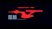
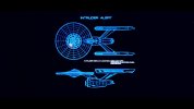
So the other day I was watching TWoK and was really struck by the CONDITION: RED graphic that appears after Kirk's return from Regula and his call for battlestations right before the Enterprise's run to the Mutara Nebula. I'd noticed it before, of course, but I suppose back in the VHS days it just didn't strike me as hard as now.
Rumor has some part of this (either the graphic or the shot itself) was made for TMP. I presume based on the CONDITION: RED font that it wasn't the whole shot, since TMP was all about some Helvetica, not Microgramma. Either way, the decks get numbers and very interesting labels such as BRG 0001 and QTR 0005, which was discussed on a prior occasion when @Maurice brought up the graphic, largely to crickets.

Here's a little enhancement of the base image . . . you should be able to see the decks pretty well . . .

Maurice did this one better, with labels and such:
As interesting as the three-letter deck labels from the CONDITION: RED graphic are, what's really blown my mind here is the fact that, with this as the apparent canonical deck count, so much other stuff is entirely nullified, from my perspective.
- Many try to squeeze eleven decks into the saucer, for instance, but here we see there are only nine.
- I've seen folks try to do deck layouts and complain about the portholes on the bridge superstructure not fitting, or else they end up with weird tortured layouts to accommodate them (e.g. Mr. Scott's Guide). But, those windows are simply the windows of deck two.
- Many try to have the widest saucer decks be six and seven, but here we see it is five and six.
. . . and so on.
I was curious to see if the 20 decks would match up nicely with the exterior details like windows and airlocks more generally, as this has been a constant point of complaint among folks trying to work out the decks. I'm no expert on the topic of which drawings are superior . . . I grabbed a couple that enjoyed ease of access, so I used the first set I found and one that was identified as not too bad in some comments I found. Note also that I wasn't above some manual fitting insofar as fiddling with aspect ratio, though I didn't go too overboard trying to get the fit just right. This is a broad sweep . . . your meterage may vary.
First, this one:

This appears to work like gangbusters, for the most part. There can be quibbling with some window levels but there aren't any obvious zomg-what's-a-deck-doing-there sorts of issues. (And indeed, just comparing with the model, I see the smaller porthole windows on the arboretum deck are too high, nullifying the seeming problem there.) It is interesting that the cargo bay seems to reside on Deck 16 rather than 17, as per Probert's drawing.

However, that's a minor quibble, and easily resolved provided one goes with the extendable floor for Deck 16 that would cover up the "ground level" of Deck 17 seen in TMP.

I'm less enthused by this one, though I think some of the details like secondary hull window placement are more accurate. Deck 17 and 18 are great, but the Deck 16 windows are landing a bit wonky. This one needs more than this quicky fit and glancing on my part.
In any case, I was also curious to see if this sort of thing backported to the TOS Enterprise.

While a lot of people tend to ignore it, Matt Jefferies had done a drawing of the Enterprise with nine decks in the saucer, just like the TMP ship canonically has, with the deck counts matching up pretty well . . . a submerged bridge squishes most of Deck 2, but Deck 5 and Deck 6 are the widest decks again, and feature variable height in different sections. There are 21 total decks, arguably just due to the refit torpedo launcher Deck 12 being two decks when there wasn't a launcher there. Decks 17 and 19 are rather tall, though we don't seem to get the same sort of multi-deck space as for the refit's cargo bay on Deck 17.
The only real issue here is Drexler's Defiant cutaway from "In a Mirror, Darkly, Pt. II", but fortunately that's so busy that the fact it was so bungled is easily disregarded. The wide view without quite so much detail gives an appearance of a saucer deck count, but if you look at the lower engineering hull it looks, on-screen, like four decks below the level of the bottom of the deflector dish (his "cargo bays", per a labeled version he posted). Then, once the shot zooms in you just end up with a whole lot of jumbled mess other than a teeny tiny misscaled shuttle that doesn't fit the bay as it should, et cetera. So, the Drexler cutaway doesn't seem like a deficit, as far as I'm concerned.
Thoughts? Complaints?
Rumor has some part of this (either the graphic or the shot itself) was made for TMP. I presume based on the CONDITION: RED font that it wasn't the whole shot, since TMP was all about some Helvetica, not Microgramma. Either way, the decks get numbers and very interesting labels such as BRG 0001 and QTR 0005, which was discussed on a prior occasion when @Maurice brought up the graphic, largely to crickets.

Here's a little enhancement of the base image . . . you should be able to see the decks pretty well . . .

Maurice did this one better, with labels and such:
Speaking of which, this is the deck layout as seen on the CONDITION: RED image seen in TWOK (made for TMP but only seen in trailers).
View attachment 14227
As interesting as the three-letter deck labels from the CONDITION: RED graphic are, what's really blown my mind here is the fact that, with this as the apparent canonical deck count, so much other stuff is entirely nullified, from my perspective.
- Many try to squeeze eleven decks into the saucer, for instance, but here we see there are only nine.
- I've seen folks try to do deck layouts and complain about the portholes on the bridge superstructure not fitting, or else they end up with weird tortured layouts to accommodate them (e.g. Mr. Scott's Guide). But, those windows are simply the windows of deck two.
- Many try to have the widest saucer decks be six and seven, but here we see it is five and six.
. . . and so on.
I was curious to see if the 20 decks would match up nicely with the exterior details like windows and airlocks more generally, as this has been a constant point of complaint among folks trying to work out the decks. I'm no expert on the topic of which drawings are superior . . . I grabbed a couple that enjoyed ease of access, so I used the first set I found and one that was identified as not too bad in some comments I found. Note also that I wasn't above some manual fitting insofar as fiddling with aspect ratio, though I didn't go too overboard trying to get the fit just right. This is a broad sweep . . . your meterage may vary.
First, this one:

This appears to work like gangbusters, for the most part. There can be quibbling with some window levels but there aren't any obvious zomg-what's-a-deck-doing-there sorts of issues. (And indeed, just comparing with the model, I see the smaller porthole windows on the arboretum deck are too high, nullifying the seeming problem there.) It is interesting that the cargo bay seems to reside on Deck 16 rather than 17, as per Probert's drawing.

However, that's a minor quibble, and easily resolved provided one goes with the extendable floor for Deck 16 that would cover up the "ground level" of Deck 17 seen in TMP.

I'm less enthused by this one, though I think some of the details like secondary hull window placement are more accurate. Deck 17 and 18 are great, but the Deck 16 windows are landing a bit wonky. This one needs more than this quicky fit and glancing on my part.
In any case, I was also curious to see if this sort of thing backported to the TOS Enterprise.

While a lot of people tend to ignore it, Matt Jefferies had done a drawing of the Enterprise with nine decks in the saucer, just like the TMP ship canonically has, with the deck counts matching up pretty well . . . a submerged bridge squishes most of Deck 2, but Deck 5 and Deck 6 are the widest decks again, and feature variable height in different sections. There are 21 total decks, arguably just due to the refit torpedo launcher Deck 12 being two decks when there wasn't a launcher there. Decks 17 and 19 are rather tall, though we don't seem to get the same sort of multi-deck space as for the refit's cargo bay on Deck 17.
The only real issue here is Drexler's Defiant cutaway from "In a Mirror, Darkly, Pt. II", but fortunately that's so busy that the fact it was so bungled is easily disregarded. The wide view without quite so much detail gives an appearance of a saucer deck count, but if you look at the lower engineering hull it looks, on-screen, like four decks below the level of the bottom of the deflector dish (his "cargo bays", per a labeled version he posted). Then, once the shot zooms in you just end up with a whole lot of jumbled mess other than a teeny tiny misscaled shuttle that doesn't fit the bay as it should, et cetera. So, the Drexler cutaway doesn't seem like a deficit, as far as I'm concerned.
Thoughts? Complaints?


