Yep. In all three films. I can forgive the two replicators, but It seems weird to have two dedication plaques.Is it correct the bridge has two replicators and two plaques?
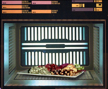
I wanted to go ahead and generate a "holographic" viewscreen for the First Contact version of the bridge while I had some spare time after creating the replicators tonight. I actually like how it turned out better than I thought it would (although I still prefer the traditional viewscreen seen in INS and NEM). Here are the results:


In-game, the left and right orange strips have a linear panning texture over them to give them the slight movement they had in the film.
In 3D space, the viewscreen has to curve slightly so that the top and bottom edges meet with the orange "holographic emitters" on the floor and ceiling (which are neither directly above/below each other, and have a curvature to them). In the film, the holographic viewscreen is depicted as a flat plane, but due to the fact we only see it from a straight-on angle, they got away with that. Taking this revelation into consideration, it is probably why they chose to opt for a traditional viewer for the next films, as it was more difficult to pull this effect off at the time if they wanted to show the screen (which would then have to appear curved) from other angles.


")