Reiterating something I've said here before several years ago, but which others may not have seen: Dennis, I think maybe you understand the proper proportions of the Constitution class cruiser better than any modeler out there, including those who have worked at Paramount/CBS. You can do any number of variations on this theme, from subtle to bold, and yet they all still manage to maintain this "golden mean" that Matt Jefferies set forth. My personal favorite has been the Venture NCC-1946/Challenger NCC-2099, which looks (probably intentionally) like a Constitution class refit refit, to keep going into the era of the Ambassador class. Although your slightly retro Phoenix NCC-800 is also strong.
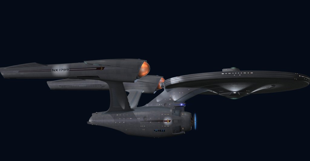
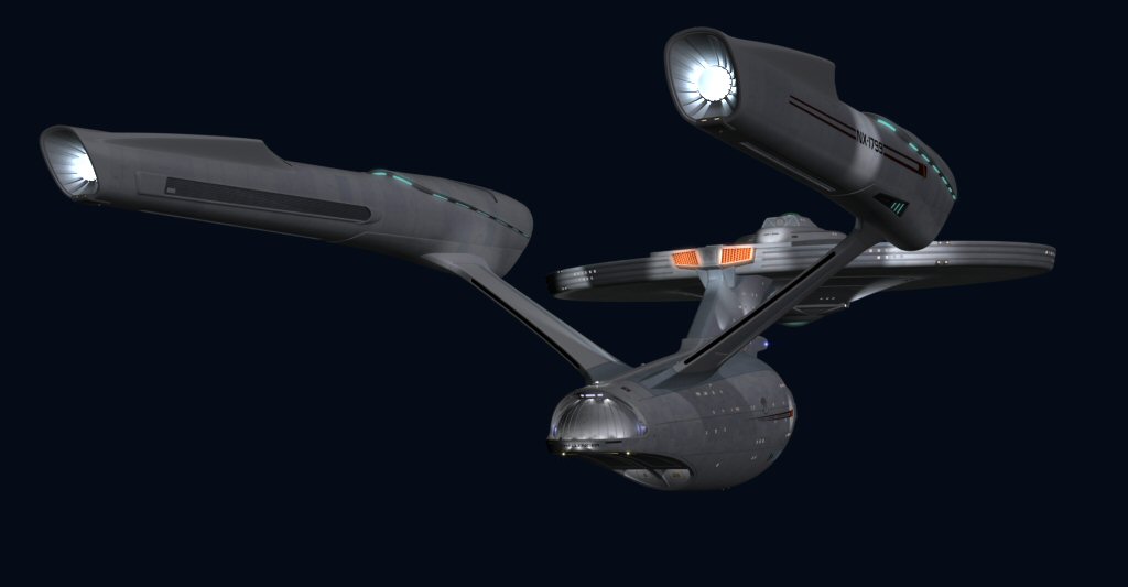
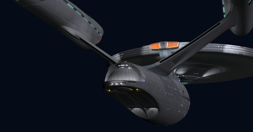
So looking at this version of Challenger NX-1799, my first thought is. . . ah, that's better. I cannot get over the whap-jaw appearance of the STXI Enterprise, like it has baggy eyes and an overbite. This rendition, at least, applies some of Abrams' "hot-rod" ideas to a model at the correct proportions.
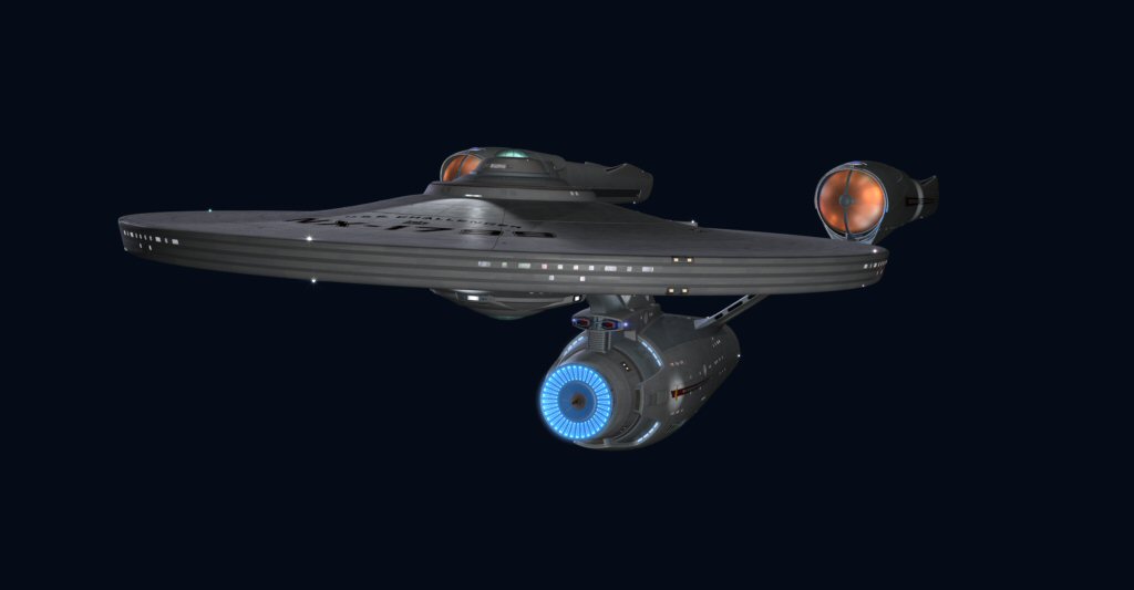
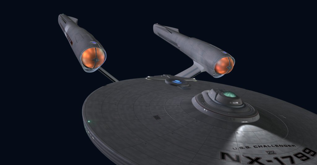
But you know. . . Even with the 1799's pylons seated at the proper angle, with round, red Bussard collectors, they're still not my favorite. Compared to the 2099's red bullet-nose pylons with the Sovereign-like struts, I still can't get a feel for Ryan Church's design choices of baggy, Bill Clinton-like eyes, and the half-shell with the cyan lights peeking through. With every other "official" design, I could always ascertain some purpose for the visible design elements; these things still look like poorly planned disco lights to me.
What I think your new model proves is that the Enterprise didn't need these particular design additions; and that the jutting forward of the nose, extension of the dish, and flapping up of the wings didn't justify their existence. Even something whose differences are more aesthetically subtle, like your Intrepid NCC-1986, would have been more pleasing for me to look at on-screen. Making the Enterprise wear these bags on the big screen is like casting Sophia Loren in the starring role but making her wear a chicken costume. Sure, it's still Sophia, but why ruin such graceful lines with poor adornment?
DFS-2010/A


")
")