• Welcome! The TrekBBS is the number one place to chat about Star Trek with like-minded fans.
    If you are not already a member then please register an account and join in the discussion!

Why the love for Ralph McQuarrie?

JRoss

Commodore
Commodore
I don't understand why people are happy to see McQuarrie's work featured in Star Trek. All I see from folks are comments about his legendary status, but not actually praising the shape of the ship. Just because someone did well on some things doesn't mean that all of their work automatically becomes perfect.

Look at George Lucas. He did very well with the first three Star wars films, and horribly on the next trilogy. The initial quality of the original films does not elevate the prequels.

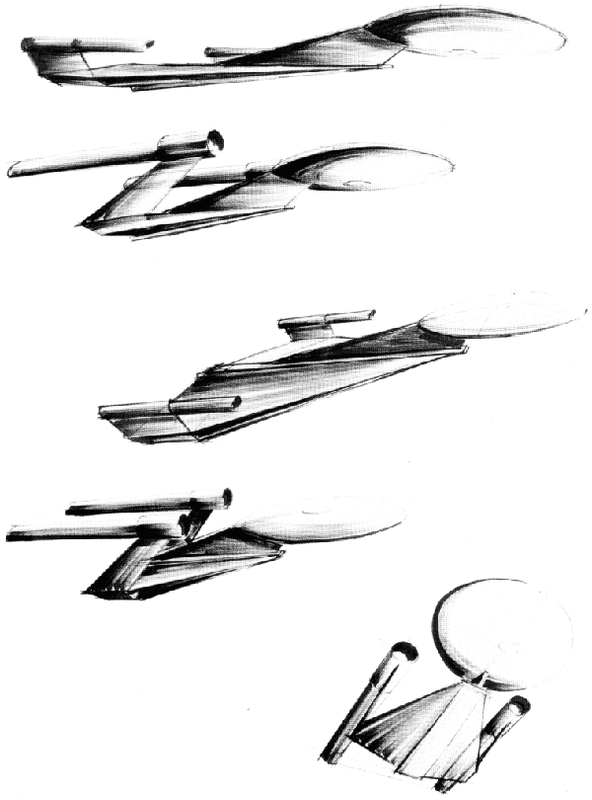
Much as I detest the look of the Discovery, it is actually an improvement on RM's design. His concept has nacelles and a saucer that are way too small.

McQuarrie's designs for Star Wars were effective, but for the most part they are not attractive. Only the A-wings, TIE interceptors, super star destroyers and maybe the X-wing are "sexy". The rest are intimidating, but nothing to look at, especially the Y-wings, Millennium Falcon and Victory-class star destroyers.
 
It and the story it was written for where rejected outright for good reason back in the day.

This is a troll from CBS, I'm sure of it. If not, they've gone round the fucking bend.
 
It has to be. And I want to make it clear that I'm not denigrating the man's Talent. He can obviously do well but I don't think that he has in this case. And I don't think it's good practice praise someone's designs based on their previous work. Starfleet ships are supposed to be sleep and sexy and Powerful looking. Star Wars ships are supposed to be boxy and pointy and fearsome.
 
Maybe there's a reason within the story they are telling for it to look that way and it's not just reusing an old design for the sake of it.
 
Ralph McQuarrie was a great artist, and his visionary work helped to make Star Wars a great success.

His work for Trek however does not appeal to me. The design was rejected for a reason, and it just does not fit the vision of Star Trek.

I have a great fear that this series of Star Trek will have a low budget. I would like to know who they have brought in for designing craft, and sets. Have some of the veterans been contacted? Andrew Probert, Rick Sternbach, John Eaves etc.

Instead we seem to be getting recycled rejected designs.

All with the caveat that we know next to nothing about the series so far.
 
I'd be perfectly happy to see Trek go forward in the next TV incarnation with a different aesthetic, and Adams/McQuarrie's concept work is a fine general direction for it. In many ways the somewhat more industrial look might help them to use their relatively limited budgets more creatively without having to be compared directly with the vastly better-resourced feature film series. That said, the ship in the teaser will need a lot of design refinement to work well for the series.
 
I liked the other MacQuarrie deisgn - the swan-like one.

pott-1a-jpg.1639

But I think this one has some good features - its just the warp nacelles that look odd.

Maybe if they were shorter....

sBXAlhN.jpg
 
Last edited:
I never liked the concept, and I don't understand this desire to mine from the past. Disappointed in this direction.
 
McQ is legendary but that doesn't mean all his designs are spectacular, nor does an ugly design detract from his legendary status.
 
has anyone else noted the IDIC resemblance? I actually like the design (original and current), but I'm in the minority of Trekkies who pretty much like everything Trek, new and old.
 
As is, I think an ugly looking ship mainly because of the disproportionate size between the saucer section and the secondary hull. The design also seem to break the rule that warp nacelles should have line of sight with each other. However, I think the design can be improved to a point where it can be a decent looking ship.

From the detailed analysis the guys at Trekyards have made, it does seem like an interesting design. The ship's styling places it somewhere between Enterprise-(no ABCDEFGHIJ) and Enterprise-C. The ship is a lot more heavily armed than any other ship we've seen from that era, studded with very visible NX-01 style pulse cannon turrets on both the saucer section and under the secondary hull.

Assuming the saucer section's size is roughly similar to the Enterprise-A's saucer, the secondary hull is HUGE. It has 8 impulse engines in the rear and an extremely large shuttle bay. The internal volume of the Discovery is easily 3-4 times that of the Constitution class ships. The shuttle bay doors themselves look as if its 3 times wider than a Connie shuttlebay door, although the Connie's bay doors are much taller.

To view this content we will need your consent to set third party cookies.
For more detailed information, see our cookies page.
 
It's not the most beautiful design imaginable, but being a fan of the Titan ships, I think the negative reaction by 50% of fandom is way out of proportion to the reality of it's aesthetics. Again we see what happens when you mess around with the narrow visions of many Trekkies.

The design is very close to these Adams' views.
7845366_orig_zpslxgbdjfn.png
 
If you are not already a member then please register an account and join in the discussion!

Sign up / Register


Back
Top