• Welcome! The TrekBBS is the number one place to chat about Star Trek with like-minded fans.
    If you are not already a member then please register an account and join in the discussion!

Planet of the Titans U.S.S. Enterprise

LordSarvain

Lieutenant Commander
Red Shirt
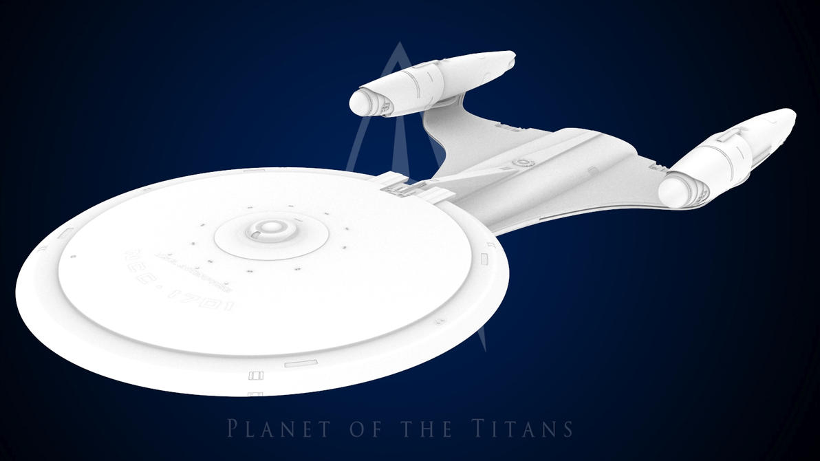
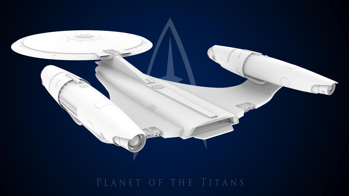
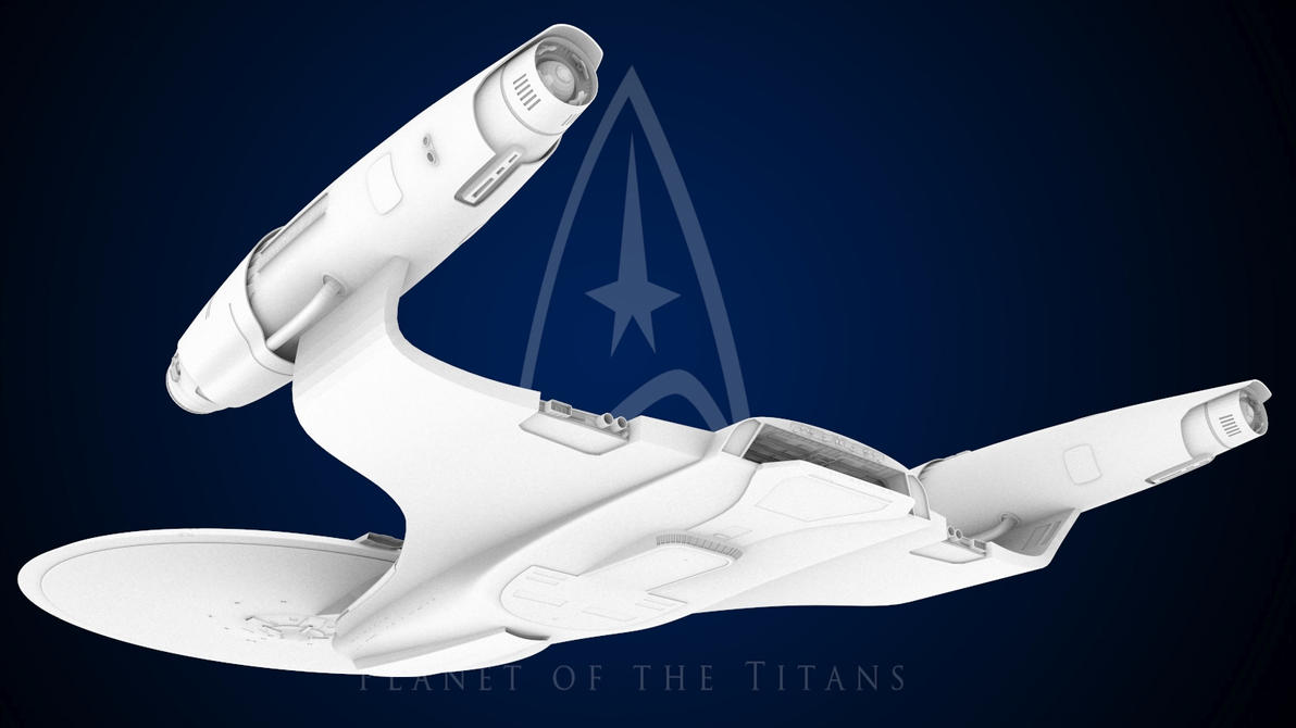
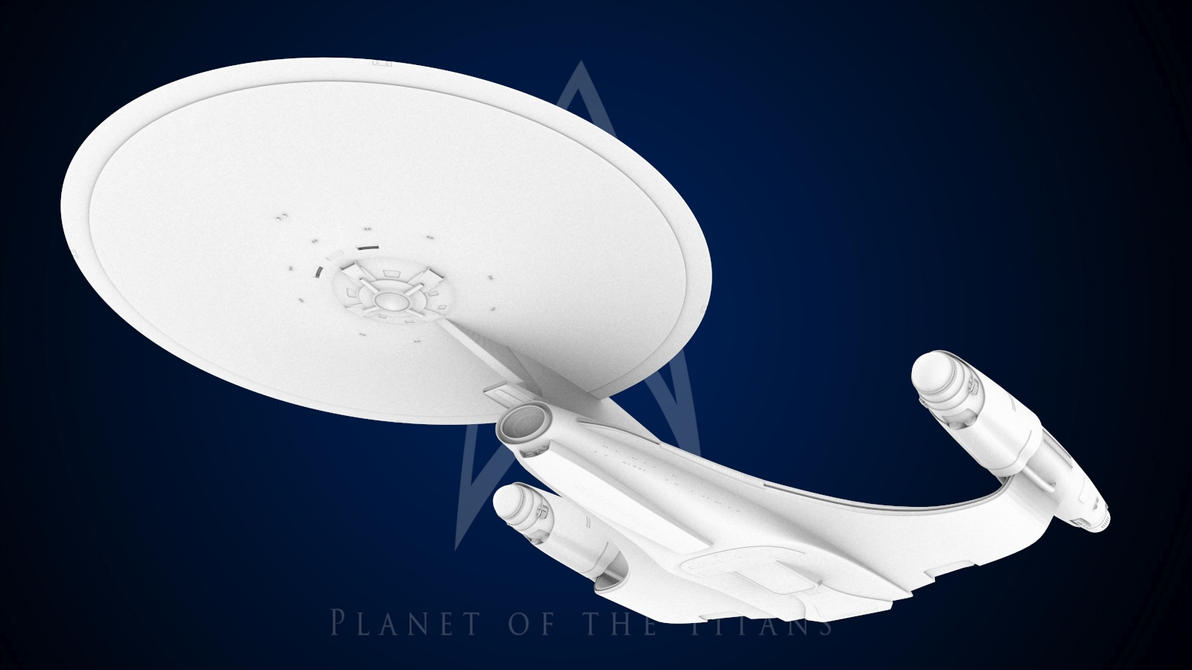
I've been working on this for a while now and thought I'd share it over here. It's based on the Ralph McQuarrie & Ken Adam designs for the Enterprise for Planet of the Titans. Obviously I've gone my own direction with the details but I've tried to retain some elements to keep it at least faintly similar to it's original designs. So after a lot of wondering what if this is what I came up with. There's some more pics at my deviantart page http://lordsarvain.deviantart.com/

new_entperprise_wip_072_by_lordsarvain-d31ckf7.jpg


new_enterprise_wip_069_by_lordsarvain-d31ck0z.jpg


new_enterprise_wip_070_by_lordsarvain-d31ck6w.jpg


new_enterprise_wip_071_by_lordsarvain-d31ckar.jpg
 
:techman::techman::techman::techman::techman:

WOW! That is really awesome! Way superior to the actual design and definitely Trek like, unlike the original.
 
I've seen this over at SFM for a few years, and all that time i've absolutely adored it.

This baby deserves to be animated.
 
LordSarvain, this is a wonderfully executed update of the rather clunky original McQuarrie design. You took a turd and pulled off the impossible. You polished it. ;) Fantastic work - I love it!
 
This is beautiful work and an amazing continuation of that original design.

Dennis, the Adams/McQuarrie design never really got out of the art/tubes & cardboard phase, did it? For all we know, LordSarvain's design is pretty close to what they might have ended up with, only way more detailed.

And this makes me think of the E-D, which the "original" did too. As in, they might have had the Adams/McQuarrie look in mind when they were designing the new Enterprise in the mid-80's.

Edit: sorry, meant Enterprise D, not E
 
Last edited:
I really like the attempt to realize the earlier concepts.
And the work is very well done indeed. I like!
However...

I'm not too keen on the style of the nacelles.
Maybe I'm getting the bad aftertaste of the nacelles off the Abramsprise. Or perhaps they look too much like the engines off a Tomcat or Phantom jet fighter.
The intakes, the cowlings, seem too much like conventional propulsion elements rather than warp drive components. Just my personal take.
And yet...the nacelle work IS quite nicely done!

Look forward to seeing more art on the model.
 
This is beautiful work and an amazing continuation of that original design.

Dennis, the Adams/McQuarrie design never really got out of the art/tubes & cardboard phase, did it? For all we know, LordSarvain's design is pretty close to what they might have ended up with, only way more detailed.

And this makes me think of the E-D, which the "original" did too. As in, they might have had the Adams/McQuarrie look in mind when they were designing the new Enterprise in the mid-80's.

Edit: sorry, meant Enterprise D, not E
I've always thought the E-D was initially inspired by the McQuarrie design.
 
A lot of people don't agree, but I think the similarity is in the flattened back end and the pylons.

The concept had a much smaller saucer. I think LordSarvain did a good thing making the saucer a little bigger. More proportional this way.
 
If you are not already a member then please register an account and join in the discussion!

Sign up / Register


Back
Top